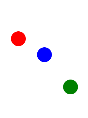
This challenge animates an element to replicate the movement of a ball being juggled. Prior challenges covered the linear and ease-out cubic Bezier curves, however neither depicts the juggling movement accurately. You need to customize a Bezier curve for this.
The animation-timing-function automatically loops at every keyframe when the animation-iteration-count is set to infinite. Since there is a keyframe rule set in the middle of the animation duration (at 50%), it results in two identical animation progressions at the upward and downward movement of the ball.
The following cubic Bezier curve simulates a juggling movement:
cubic-bezier(0.3, 0.4, 0.5, 1.6);
Notice that the value of y2 is larger than 1. Although the cubic Bezier curve is mapped on an 1 by 1 coordinate system, and it can only accept x values from 0 to 1, the y value can be set to numbers larger than one. This results in a bouncing movement that is ideal for simulating the juggling ball.
练习题目:
Change value of the animation-timing-function of the element with the id of green to a cubic-bezier function with x1, y1, x2, y2 values set respectively to 0.311, 0.441, 0.444, 1.649.
练习代码:
 1 <style>
 2   .balls {
 3     border-radius: 50%;
 4     position: fixed;
 5     width: 50px;
 6     height: 50px;
 7     top: 60%;
 8     animation-name: jump;
 9     animation-duration: 2s;
10     animation-iteration-count: infinite;
11   }
12   #red {
13     background: red;
14     left: 25%;
15     animation-timing-function: linear;
16   }
17   #blue {
18     background: blue;
19     left: 50%;
20     animation-timing-function: cubic-bezier(0.311,0.441,0.444,1.649);
21   }
22   #green {
23     background: green;
24     left: 75%;
25     animation-timing-function: cubic-bezier(0.69, 0.1, 1, 0.1);
26   }
27
28   @keyframes jump {
29     50% {
30       top: 10%;
31     }
32   }
33 </style>
34 <div class="balls" id="red"></div>
35 <div class="balls" id="blue"></div>
36 <div class="balls" id="green"></div>
效果如下:
