粘连布局
所谓粘连布局就是当内容容器没有超出时,footer是紧贴咋底部的,当内容超出的时候,footer紧随在内容容器之后,并不会超出容器。
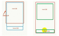
OK,我们来看一副图,来了解粘连布局的效果
方法一
min-height: 设置最小高度,用于挤开footer,margin-top:-100px;使footer向上移动100px,占据了inner的地区,但是此时,内容盒子内容还是会超出容器,但是内容只能在内容盒子中显示,所以我们给main盒子设置paddin-bottom:100px;,使其内容永远都不会,超出父级容器
css
			*{
				margin: 0;
				padding: 0;
			}
			html,body{
				height: 100%;
			}
			.outer{
				height: 100%;

			}
			.inner{
				min-height: 100%;

			}
			.main{
				padding-bottom: 100px;

			}
			footer{
				height: 100px;
				background: red;
				margin-top: -100px;
			}
html
<div class="outer">
			 <div class="inner">
				 <div class="main">
					 我是内容盒子 <br>
					 我是内容盒子 <br>
					 我是内容盒子 <br>
					 我是内容盒子 <br>
					 我是内容盒子 <br>
					 我是内容盒子 <br>
					 我是内容盒子 <br>
					 我是内容盒子 <br>
				 </div>
			 </div>
			 <footer></footer>
		 </div>
方法二
给inner设置padding-bottom: 100px; 用于撑开内容区域,但是需要给inner设置ie(框架盒子)使得,盒模型的计算发生改变,此时,inner的高度是等于min-height + padding-bottom
css
	*{
				margin: 0;
				padding: 0;
			}
			html,body{
				height: 100%;
			}
			.outer{
				height: 100%;

			}
			.inner{
				min-height: 100%;
				padding-bottom: 100px;
				box-sizing: border-box;

			}
			.main{


			}
			footer{
				height: 100px;
				background: red;
				margin-top: -100px;
			}
html的结构还是一样的
方法三
使用 calc css函数,计算min-height。
css
            *{
		    margin: 0;
		    padding: 0;
		}
			html,body{
				height: 100%;
			}
			.outer{
				height: 100%;

			}
			.inner{

				min-height: calc(100% - 100px);

			}

			.main{	}

			footer{

				height: 100px;
				background: red;
				margin-top: -100px;

			}
好的,以下就是这三种办法,