1. subplot()
- 绘制网格区域中几何形状相同的子区布局
函数签名有两种:
subplot(numRows, numCols, plotNum)subplot(CRN)
都是整数,意思是将画布划分为C行R列个子区,此时定位到第N个子区上,子区编号按照行优先排序。
下面就是最喜爱的举例环节
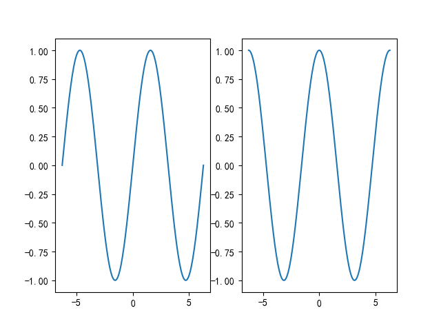
【Example 1】
import numpy as np
import matplotlib.pyplot as plt
import matplotlib as mpl

mpl.use('Qt5Agg')
mpl.rcParams['font.sans-serif'] = ['SimHei']
mpl.rcParams['font.serif'] = ['SimHei']
mpl.rcParams['axes.unicode_minus'] = False  # 解决保存图像是负号'-'显示为方块的问题,或者转换负号为字符串

x = np.linspace(-2 * np.pi, 2 * np.pi, 200)
y = np.sin(x)
y1 = np.cos(x)

plt.subplot(121)
plt.plot(x, y)

plt.subplot(122)
plt.plot(x, y1)

plt.show()
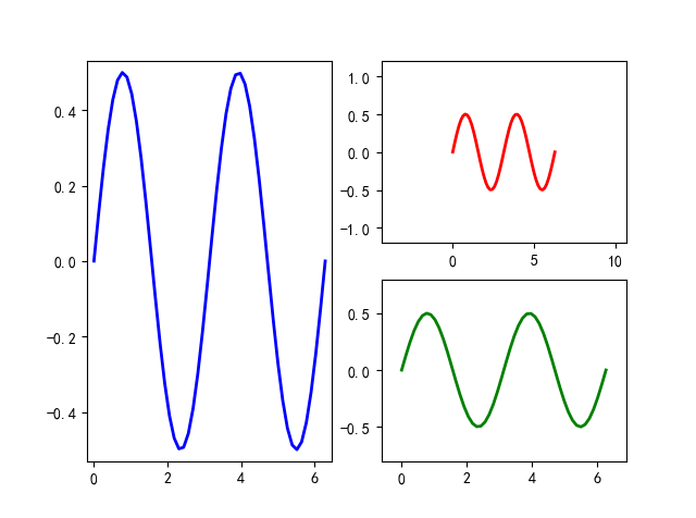
【Example 2】
import numpy as np
import matplotlib.pyplot as plt
import matplotlib as mpl

mpl.use('Qt5Agg')
mpl.rcParams['font.sans-serif'] = ['SimHei']
mpl.rcParams['font.serif'] = ['SimHei']
mpl.rcParams['axes.unicode_minus'] = False  # 解决保存图像是负号'-'显示为方块的问题,或者转换负号为字符串

fig = plt.figure()

x = np.linspace(0.0, 2 * np.pi)
y = np.cos(x) * np.sin(x)

ax1 = fig.add_subplot(121)
ax1.margins(0.03)
ax1.plot(x, y, ls="-", lw=2, color="b")

ax2 = fig.add_subplot(222)
ax2.margins(0.7, 0.7)
ax2.plot(x, y, ls="-", lw=2, color="r")

ax3 = fig.add_subplot(224)
ax3.margins(x=0.1, y=0.3)
ax3.plot(x, y, ls="-", lw=2, color="g")

plt.show()
非等分画布可以多次使用等分画布来实现
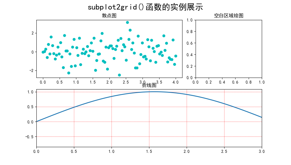
2. subplot2grid()
- 让子区跨越固定的网格布局
直接上示例
import numpy as np
import matplotlib.pyplot as plt
import matplotlib as mpl

mpl.use('Qt5Agg')
mpl.rcParams['font.sans-serif'] = ['SimHei']
mpl.rcParams['font.serif'] = ['SimHei']
mpl.rcParams['axes.unicode_minus'] = False  # 解决保存图像是负号'-'显示为方块的问题,或者转换负号为字符串

plt.subplot2grid((2, 3), (0, 0), colspan=2)
x = np.linspace(0.0, 4.0, 100)
y = np.random.randn(100)
plt.scatter(x, y, c="c")
plt.title("散点图")

plt.subplot2grid((2, 3), (0, 2))
plt.title("空白区域绘图")

plt.subplot2grid((2, 3), (1, 0), colspan=3)
y1 = np.sin(x)
plt.plot(x, y1, lw=2, ls="-")
plt.xlim(0, 3)
plt.grid(True, ls=":", c="r")
plt.title("折线图")

plt.suptitle("subplot2grid()函数的实例展示", fontsize=20)

plt.show()
3. subplots()
-
创建一张画布带有多个子区的绘图模式
-
其返回值是
(fig, ax)的元组,fig是Figure的实例,ax是axis对象数组或者一个axis对象
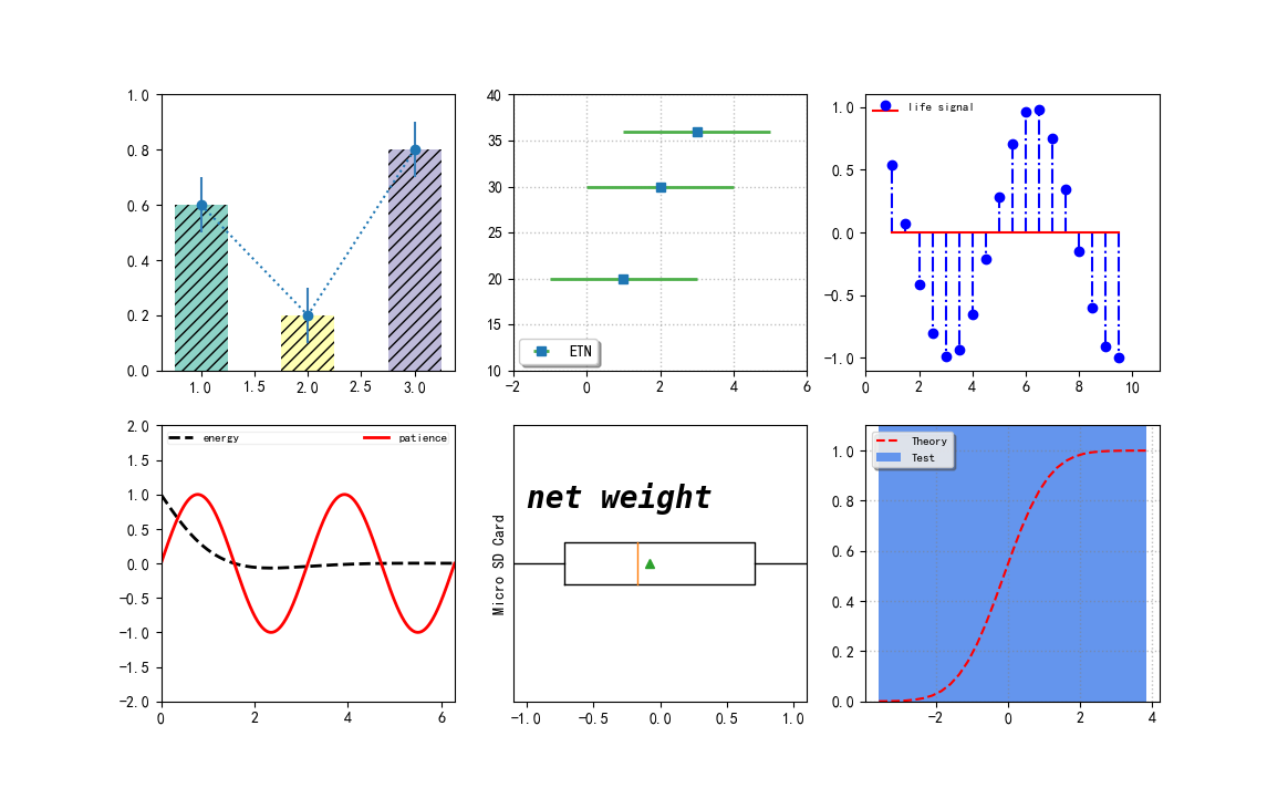
【综合示例】
import numpy as np
import matplotlib.pyplot as plt
import matplotlib as mpl

mpl.use('Qt5Agg')
mpl.rcParams['font.sans-serif'] = ['SimHei']
mpl.rcParams['font.serif'] = ['SimHei']
mpl.rcParams['axes.unicode_minus'] = False  # 解决保存图像是负号'-'显示为方块的问题,或者转换负号为字符串

fig, ax = plt.subplots(2, 3)

# subplot(231)
colors = ["#8dd3c7", "#ffffb3", "#bebada"]
ax[0, 0].bar([1, 2, 3], [0.6, 0.2, 0.8], color=colors, width=0.5, hatch="///", align="center")
ax[0, 0].errorbar([1, 2, 3], [0.6, 0.2, 0.8], yerr=0.1, capsize=0, ecolor="#377eb8", fmt="o:")
ax[0, 0].set_ylim(0, 1.0)

# subplot(232)
ax[0, 1].errorbar([1, 2, 3], [20, 30, 36], xerr=2, ecolor="#4daf4a", elinewidth=2, fmt="s", label="ETN")
ax[0, 1].legend(loc=3, fancybox=True, shadow=True, fontsize=10, borderaxespad=0.4)
ax[0, 1].set_ylim(10, 40)
ax[0, 1].set_xlim(-2, 6)
ax[0, 1].grid(ls=":", lw=1, color="grey", alpha=0.5)

# subplot(233)
x3 = np.arange(1, 10, 0.5)
y3 = np.cos(x3)
ax[0, 2].stem(x3, y3, basefmt="r-", linefmt="b-.", markerfmt="bo", label="life signal", use_line_collection=True)
ax[0, 2].legend(loc=2, fontsize=8, frameon=False, borderpad=0.0, borderaxespad=0.6)
ax[0, 2].set_xlim(0, 11)
ax[0, 2].set_ylim(-1.1, 1.1)

# subplot(234)
x4 = np.linspace(0, 2 * np.pi, 500)
x4_1 = np.linspace(0, 2 * np.pi, 1000)
y4 = np.cos(x4) * np.exp(-x4)
y4_1 = np.sin(2 * x4_1)
line1, line2, = ax[1, 0].plot(x4, y4, "k--", x4_1, y4_1, "r-", lw=2)
ax[1, 0].legend((line1, line2), ("energy", "patience"),
                loc="upper center", fontsize=8, ncol=2,
                framealpha=0.3, mode="expand",
                columnspacing=2, borderpad=0.1)
ax[1, 0].set_ylim(-2, 2)
ax[1, 0].set_xlim(0, 2 * np.pi)

# subplot(235)
x5 = np.random.randn(100)
ax[1, 1].boxplot(x5, vert=False, showmeans=True, meanprops=dict(color="g"))
ax[1, 1].set_yticks([])
ax[1, 1].set_xlim(-1.1, 1.1)
ax[1, 1].set_ylabel("Micro SD Card")
ax[1, 1].text(-1.0, 1.2, "net weight", fontsize=20, style="italic",
              weight="black", family="monospace")

# subplot(236)
mu = 0.0
sigma = 1.0

x6 = np.random.randn(10000)
n, bins, patches = ax[1, 2].hist(x6, bins=30,
                                 histtype="stepfilled", cumulative=True,
                                 color="cornflowerblue", label="Test")
y = ((1 / (np.sqrt(2 * np.pi) * sigma)) * np.exp(-0.5 * (1 / sigma * (bins - mu)) ** 2))
y = y.cumsum()
y /= y[-1]

ax[1, 2].plot(bins, y, "r--", linewidth=1.5, label="Theory")
ax[1, 2].set_ylim(0.0, 1.1)
ax[1, 2].grid(ls=":", lw=1, color="grey", alpha=0.5)
ax[1, 2].legend(loc="upper left", fontsize=8, shadow=True, fancybox=True, framealpha=0.8)

# adjust subplots() layout
plt.subplots_adjust()

plt.show()