CSS3入门
前言:
可以在网页上调试,再复制

1.CSS是什么
cascading style sheet -- 层叠级联样式表
2.CSS快速入门
方法一:在<head》里面定义,十分臃肿
内部样式
<head>
    <meta charset="UTF-8">
    <title>Title</title>
    <!--规范 <style>可以编写css的代码,每一个声明最好用分号结尾
    语法:选择器{
               声明1:--;
               声明2:--;
              }
    -->
    <style>
        h1{
            color: green;
        }
    </style>
</head>
<body>
    <h1>我的第一个标题</h1>
</body>
方法2:引入外部.css文件,达到分离的效果建议使用
外部样式
<!DOCTYPE html>
<html lang="en">
<head>
    <meta charset="UTF-8">
    <title>Title</title>
    <link rel="stylesheet" href="css/demo01.css">
</head>
<body>
    <h1>我的第一个标题</h1>
</body>
</html>
// 快捷方式,标签名加tab;such as (link + tab)
h1{
    color: yellow;
}
方法三:行内样式
<body>
    <!--行内样式-->
    <h1 style="color: red">我的第一个标题</h1>
</body>
优先级:行内样式与内部样式 与部样式作用与同一元素上(就近原则),自上而下代码被执行,与元素最近的修改就覆盖了前面所有的。
3.CSS选择器(重点加难点)
作用:选择页面上的某一个或者某一类元素
3.1三种基本选择器 标签,类,id选择器
<!DOCTYPE html>
<html lang="en">
<head>
    <meta charset="UTF-8">
    <title>Title</title>
    <style>
        /*标签选择器会选择到页面上的所有标签
        格式:标签{}
        */
        h1{
            color: red;
        }
        /*类选择器. 可以是一组,选择所有class属性一致的标签
        格式: .class{}
        */
        .huJes{
            color: beige;
        }
        /*id 选择器 全局唯一
        格式:#id{}
        */
        #only{
            color: blue;
        }

    </style>
</head>
<body>
    <h1 >我的第一个标题</h1>
    <h1 class="huJes">我的第二个</h1>
    <h2 class="huJes">我的第二个同一组的</h2>
    <h1 id="only" class="huJes">我的</h1>
</body>
</html>
id>类>标签
3.2 层次选择器
3.2.1 后代选择器
body p{
	background : red;
}
/*  body 中所有的p标签都会被渲染*/
3.2.2 子选择器
儿子选择器
body>p{
	background : red
	}
/* 只有下一代才会被渲染*/
3.2.3 兄弟选择器
.class + 兄弟的标签(只有一个)
弟弟选择器
/* 下面兄弟选择器*/
选择器 + p{
	background : red;
}
<body>
<p>0</p>
<p class="hujes">1</p>
<p>22</p>
<p>33</p>
</body>
// 只能选取22这个渲染
3.2.4 通用选择器
.class ~ 标签(同级的所有)
.选择器 ~ p{
       background: red;
}
<body>
<p>0</p>
<p class="hujes">1</p>
<p>22</p>
<p>33</p>
</body>
// 结果是22 和 33 都能显红
3.3 结构伪类选择器
标签:---
加了冒号,过滤了一些条件的
        /*ul的第一个子元素*/
        ul li:first-child{
            background: blue;
        }
        /*ul的最后一个元素*/
        ul li:last-child{
            background: red;
        }
还有:p : hover 这种,鼠标上去变色
a:hover{
	color:yellow;
}
div nth of type(1){
}
含义是div的父级标签的第一个子代
3.4 属性选择器
id+class使用
标签【属性名=属性值(正则)】
=绝对等于
*= 包含这个元素
^=以这个开头
$= 以这个结尾
a[id]  存在id属性的元素
a[id=first]  id=first 的元素
a[class*="links"] class 中有links的元素
a[href^=http] 选中href中以http开头的元素
<a href="http://www.baidu.com" class = links item first id="first"> 1 </a>
<a href="abc.doc"> docs</a>
4 美化网页元素
4.1 字体样式
<span 》标签把元素括起来
font-family,font-style,font-variant,font-weight,font-size,font
font-family(字体族): “Arial”、“Times New Roman”、“宋体”、“黑体”等;
font-style(字体样式): normal(正常)、italic(斜体)或oblique(倾斜);
font-variant (字体变化): normal(正常)或small-caps(小体大写字母);
font-weight (字体浓淡): 是normal(正常)或bold(加粗)。有些浏览器甚至支持采用100到900之间的数字(以百为单位);
font-size(字体大小): 可通过多种不同单位(比如像素或百分比等)来设置, 如:12px,12pt,120%,1em
如果用 font 属性的话,就可以把几个样式进行简化,减少书写的情况;font 属性的值应按以下次序书写(各个属性之间用空格隔开):
顺序:font-style | font-variant | font-weight | font-size | line-height | font-family
.font{
font-style:italic;
font-variant:small-caps;
font-weight:700;
font-size:12px;
line-height:1.5em;
font-family:arial,verdana;
}
上面的样式简写为:
.font{font:italic small-caps 700 12px/1.5em arial,verdana;}
4.2 文本样式
颜色:可用单词或16进制的rgb或rgba表示
文本位置:text-align 排版
首行缩进:text-indent:2em // 一个em一个字母
行高和块的高度一致就可以上下居中:line-height=heigth
text-decoration:none | [underline(下划线) || overline(上划线) || line-through(中划线)]
小
直接在网页调试,键盘上下即可

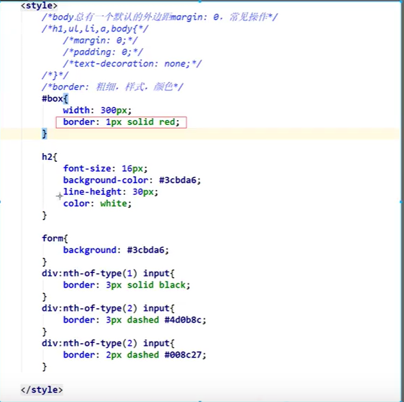
5.盒子模型
当 margin 是四个参数时:是 上 右 下 左 ,而不是上下左右哦!
是二个参数时,取对角,上下或者左右 such margin:0 auto ,说明上下为0,左右自动对齐
是一个参数时,上右下左都是一个值
border三个参数是粗细,样式,颜色;
padding是四个参数时,是 上 右 下 左 padding与margin一样
这是一个盒子模型,外面margin为外边距,盒子粗细为border,内边距为padding,内容是蓝色那一部分
对于body都有一个默认的外边距像body来说margin为8px

盒子计算方式
margin+border+padding+内容宽度
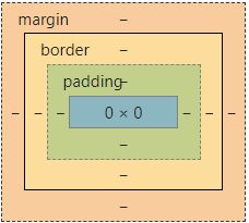
如果别人给你50px*50px 那么你想到的肯定是整个盒子的大小而不是内容的宽长
6圆角边框 阴影
4个角 分为四个值为顺时针方向,2个值为【(左上=右下),(右上=左下)】 一个值为4个角的都一样
border-radius  圆角边框
box-shadow  阴影
7.浮动float+展示display
块级元素:独占一行
h1~h6 p div 列表
行内元素:不独占一行
span a img strong
行内元素可以包裹在块级元素里面
display:block|inline|inline-block
分为块级,行内,块级行内
float分为左浮右浮
display:block 时候可以设置块的大小,也可以移动块元素
8.定位
8.1 相对定位
相对于自己原来的位置进行偏移
position:relative 相对定位(相对自己)
        .first{
            border: 1px solid red;
            position: relative;
            top: -30px;
          // 负的就向那方移
        }
是这个样子之后
<!DOCTYPE html>
<html lang="en">
<head>
    <meta charset="UTF-8">
    <title>Title</title>
    <style>
        #app{
             300px;
            height: 300px;
            border: 1px solid red;
            padding:10px;
        }
        a{
             100px;
            height: 100px;
            text-decoration: none;
            background: rebeccapurple;
            line-height: 100px;
            text-align: center;
            color: white;
            display: block;
        }
        a:hover{
            background: black;
        }
        .a2{
            position: relative;
            right: -200px;
            top:-100px
        }
        .a3{
            position: relative;
            right: -100px;
            top:-100px
        }
        .a4{
            position: relative;
            top: -100px;
        }
        .a5{
            position: relative;
            top: -200px;
            right: -200px;
        }
    </style>
</head>
<body>
<div id="app">
    <a href="#" class="a1">链接1</a>
    <a href="#" class="a2">链接2</a>
    <a href="#" class="a3">链接3</a>
    <a href="#" class="a4">链接4</a>
    <a href="#" class="a5">链接5</a>
</div>
</body>
</html>
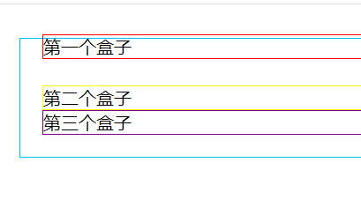
场景定位5个超连接块
8.2 绝对定位
定义:基于xxx定位,上下左右
1.没有父级元素定位(父级元素没有position:xxx)的前提下,相对于浏览器边框定位
2.如果有父元素定位,那我们就相对于父元素定位
在父级元素内移动
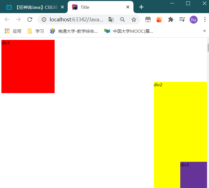
8.3 固定定位
position:fixed
一般用于固定住某一个网页的地方,例如无论我们怎样滑动网页,有小广告一直在右下角
三个定位的区别:
   <style>
        body{
            height: 10000px;
        }
        div:nth-of-type(1){
             200px;
            height: 200px;
            background: red;
            position: relative;
            right: 0;
            bottom: 0;
        }
        div:nth-of-type(2){
             200px;
            height: 400px;
            background: yellow;
            position: absolute;
            right: 0;
            bottom: 0;
        }
        div:nth-of-type(3){
             100px;
            height: 100px;
            background: rebeccapurple;
            position: fixed;
            right: 0;
            bottom: 0;
        }
    </style>

</head>
<body>
<div>div1</div>
<div>div2</div>
<div>div3</div>
</body>
9.网页动画(特性)
https://cybermap.kaspersky.com/cn
酷炫的卡巴斯基网络威胁