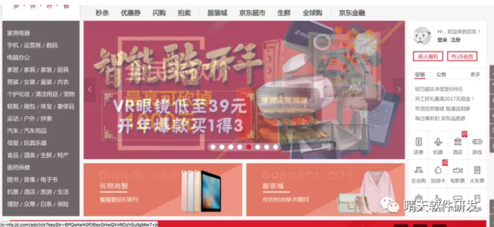
映入眼帘的就是一个常见的三栏布局:即左边商品导航和右边导航固定宽度,中间的主要内容随浏览器宽度自适应。
三栏布局,顾名思义就是两边固定,中间自适应。三栏布局在开发十分常见,那么什么是三栏布局?比如我打开某东的首页:
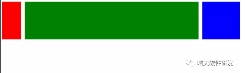
下面围绕的这样的目的,即左右模块固定宽度,中间模块随浏览器变化自适应,想要完成的最终效果如下图所示:
红色和蓝色宽度固定,绿色宽度自适应,下面七种方法实现的最终效果跟这个差不多,可能会稍有不同。
下面七种技巧各有千秋,在开发中可以根据实际需求选择适合自己的方法进行编码。
1. 流体布局
<!DOCTYPE html>
<html lang="en">
<head>
    <style>
	.left {
	    float: left;
	    height: 200px;
	    width: 100px;
	    background-color: red;
	}
	.right {
	    width: 200px;
	    height: 200px;
	    background-color: blue;
	    float: right;
	}
	.main {
	    margin-left: 120px;
	    margin-right: 220px;
	    height: 200px;
	    background-color: green;
	}
    </style>
</head>
<body>
    <div class="container">
        <div class="left"></div>
        <div class="right"></div>
        <div class="main"></div>
    </div>
</body>
</html>
左右模块各自向左右浮动,并设置中间模块的 margin 值使中间模块宽度自适应。
缺点就是主要内容无法最先加载,当页面内容较多时会影响用户体验。
2. BFC 三栏布局
BFC 规则有这样的描述:BFC 区域,不会与浮动元素重叠。因此我们可以利用这一点来实现 3 列布局。
<!DOCTYPE html>
<html lang="en">
<head>
    <style>
	.left {
	    float: left;
	    height: 200px;
	    width: 100px;
	    margin-right: 20px;
	    background-color: red;
	}
	.right {
	    width: 200px;
	    height: 200px;
	    float: right;
	    margin-left: 20px;
	    background-color: blue;
	}
	.main {
	    height: 200px;
	    overflow: hidden;
	    background-color: green;
	}
    </style>
</head>
<body>
    <div class="container">
        <div class="left"></div>
        <div class="right"></div>
        <div class="main"></div>
    </div>
</body>
</html>
缺点跟方法一类似,主要内容模块无法最先加载,当页面中内容较多时会影响用户体验。因此为了解决这个问题,有了下面要介绍的布局方案双飞翼布局。
3. 双飞翼布局
<!DOCTYPE html>
<html lang="en">
<head>
    <style>
        .content {
  	    float: left;
  	    width: 100%;
        }
        .main {
  	    height: 200px;
  	    margin-left: 110px;
  	    margin-right: 220px;
  	    background-color: green;
        }
	.left {
	    float: left;
	    height: 200px;
	    width: 100px;
	    margin-left: -100%;
	    background-color: red;
	}
	.right {
	    width: 200px;
	    height: 200px;
	    float: right;
	    margin-left: -200px;
	    background-color: blue;
	}
    </style>
</head>
<body>
    <div class="content">
        <div class="main"></div>
    </div>
    <div class="left"></div>
    <div class="right"></div>
</body>
</html>
利用的是浮动元素 margin 负值的应用,感兴趣的同学可以上网搜搜原理。
主体内容可以优先加载,HTML 代码结构稍微复杂点。
4. 圣杯布局
<!DOCTYPE html>
<html lang="en">
<head>
    <style>
	.container {
	    margin-left: 120px;
	    margin-right: 220px;
	}
	.main {
	    float: left;
	    width: 100%;
	    height: 300px;
	    background-color: red;
	}
	.left {
	    float: left;
	    width: 100px;
	    height: 300px;
	    margin-left: -100%;
	    position: relative;
	    left: -120px;
	    background-color: blue;
	}
	.right {
	    float: left;
	    width: 200px;
	    height: 300px;
	    margin-left: -200px;
	    position: relative;
	    right: -220px;
	    background-color: green;
	}
    </style>
</head>
<body>
    <div class="container">
	<div class="main"></div>
	<div class="left"></div>
	<div class="right"></div>
    </div>
</body>
</html>
跟双飞翼布局很像,有一些细节上的区别,相对于双飞翼布局来说,HTML 结构相对简单,但是样式定义就稍微复杂,也是优先加载内容主体。
5. Flex 布局
<!DOCTYPE html>
<html lang="en">
<head>
    <style>
	.container {
            display: flex;
	}
	.main {
            flex-grow: 1;
	    height: 300px;
	    background-color: red;
	}
	.left {
	    order: -1;
	    flex: 0 1 200px;
	    margin-right: 20px;
	    height: 300px;
	    background-color: blue;
	}
	.right {
	    flex: 0 1 100px;
            margin-left: 20px;
	    height: 300px;
	    background-color: green;
	}
    </style>
</head>
<body>
    <div class="container">
	<div class="main"></div>
	<div class="left"></div>
	<div class="right"></div>
    </div>
</body>
</html>
简单实用,未来的趋势,需要考虑浏览器的兼容性。
6. Table 布局
<!DOCTYPE html>
<html lang="en">
<head>
    <style>
        .container {
	    display: table;
	    width: 100%;
        }
        .left, .main, .right {
	    display: table-cell;
        }
        .left {
	    width: 200px;
	    height: 300px;
	    background-color: red;
        }
        .main {
	    background-color: blue;
        }
        .right {
	    width: 100px;
	    height: 300px;
	    background-color: green;
        }
    </style>
</head>
<body>
    <div class="container">
	<div class="left"></div>
	<div class="main"></div>
	<div class="right"></div>
    </div>
</body>
</html>
缺点:无法设置栏间距
7. 绝对定位布局
<!DOCTYPE html>
<html lang="en">
<head>
    <style>
	.container {
	    position: relative;
	}
	.main {
	    height: 400px;
	    margin: 0 120px;
	    background-color: green;
	}
	.left {
	    position: absolute;
	    width: 100px;
	    height: 300px;
	    left: 0;
	    top: 0;
	    background-color: red;
	}
	.right {
	    position: absolute;
	    width: 100px;
	    height: 300px;
	    background-color: blue;
            right: 0;
	    top: 0;
	}
    </style>
</head>
<body>
    <div class="container">
        <div class="main"></div>
	<div class="left"></div>
	<div class="right"></div>
    </div>
</body>
</html>
转自:https://mp.weixin.qq.com/s?src=11×tamp=1621489648&ver=3079&signature=wDGa5ND9KCZRS4yxRu6dvORejz*MaRShrCtHmbvFk9g8b3CAx2qD8yACXJNmiwIegQmVuWp3Sexw7ujzE-QiFsZDUkZzFA3hp7zbu*mC8tMBYzZFuFtihEU9UrJCXguT&new=1