js 可以做动画,但是需要写很多代码;其实css也是可以做动画的,而且比js写的代码还少,理解也相对简单。
这里用到css3 的animation 属性,它配合着 @keyframes 规则来使用,可以得到较好的效果
使用方法:
animation : name duration timing-function delay interation-count direction
@keyframes 规则用于创建动画。在 @keyframes 中规定某项 CSS 样式,就能创建由当前样式逐渐改为新样式的动画效果。
例如:
@keyframes mydonghua{
from{background:red;}
to{background:yellow;}
}
这表示动画 mydonghua 的初始值background的值为red,最终值是 background:yellow;
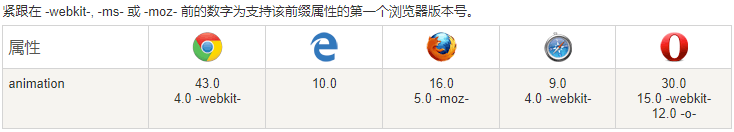
浏览器支持状况:
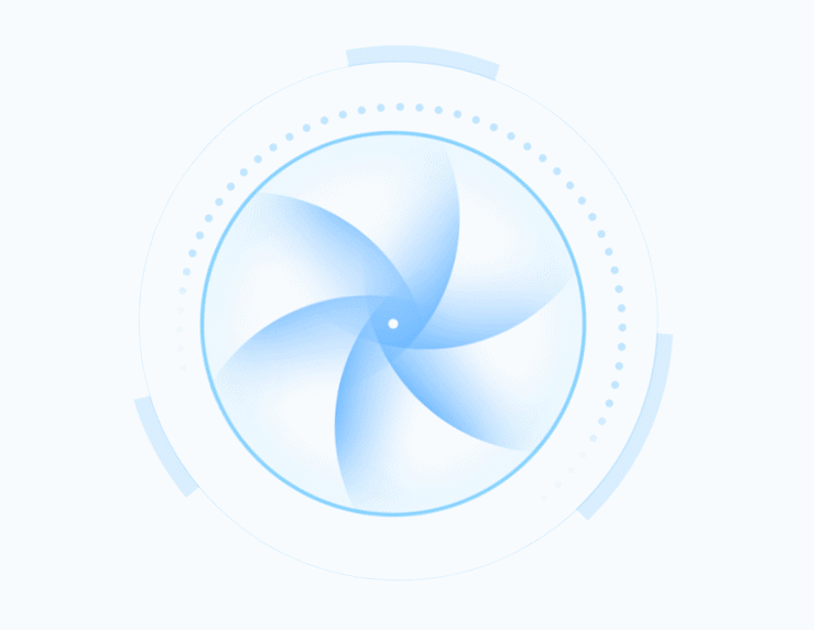
下面做一个动画效果:转动的风车
模式:三张图片围绕中心点(即Z轴)循环转动
html 代码:
 1 <!DOCTYPE html>
 2 <html lang="en">
 3 <head>
 4     <meta charset="UTF-8">
 5     <title>转动的风车</title>
 6     <link rel="stylesheet" href="css/fengche000.css">
 7 </head>
 8 <body>
 9     <ul>
10         <li><img src="img/fengche_1.png"></li>
11         <li><img src="img/fengche_2.png"></li>
12         <li><img src="img/fengche_3.png"></li>
13     </ul>
14 </body>
15 </html>
css 代码:
 1 * {
 2     margin: 0px;
 3     padding: 0px;
 4 }
 5 ul li {
 6     position: absolute;
 7     left: 20%;
 8     top: 10%;
 9     width: 500px;
10     height: 500px;
11     list-style-type: none;
12 }
13 ul li img{
14     position:relative;
15     display:inline-block;
16     width:100%;
17     height:100%;
18 }
19 /*nth-of-type(1):选中第一个li*/
20 ul li:nth-of-type(1) {
21     /*animation:动画*/
22     /*move1: 调用动画move1, 下面keyframes定义的move1*/
23     /*5s: 在5秒内完成动画move1 里面定义的动作*/
24     /*linear: 匀速运动*/
25     /*infinite: 运动重复无限次*/
26     animation: move1 5s linear infinite;
27 }
28 ul li:nth-of-type(2) {
29     animation: move2 10s linear infinite;
30 }
31 ul li:nth-of-type(3) {
32     animation: move1 10s linear infinite;
33 }
34
35 @keyframes move1 {
36     /*
37         from: 相当于%0 动画的第一个阶段
38         to: 相当于100% 动画的第二个阶段
39     */
40     from {
41         /*transform: 变形*/
42         /*rotateZ: 以y轴为圆心旋转 从0度开始*/
43         transform: rotateZ(0deg);
44     }
45     to {
46         /*rotateZ: 以y轴为圆心旋转 顺时针运动到360度*/
47         transform: rotateZ(360deg);
48     }
49 }
50
51 @keyframes move2 {
52     from {
53         transform: rotateZ(0deg);
54     }
55     to {
56         transform: rotateZ(-360deg);
57     }
58 }
运行效果: