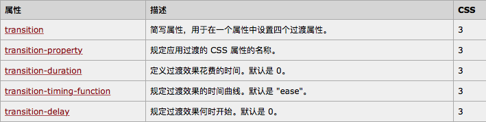
通过 CSS3,我们可以在不使用 Flash 动画或 JavaScript 的情况下,当元素从一种样式变换为另一种样式时为元素添加效果。
请把鼠标移动到下面的元素上:
先看一下这个代码 实现旋转放大的效果:
<html>
    <head>
        <meta charset="UTF-8">
        <title></title>
        <style type="text/css">
            .anim_transition {
                width: 100px;
                height: 70px;
                background-color: green;
                text-align: center;
                color: white;
                border-radius: 5px;
                transition: all 2s linear;
            }
            .anim_transition:hover {
                width: 150px;
                height: 105px;
                -webkit-transform: rotate(360deg);
            }
        </style>
        <script>

        </script>
    </head>
    <body>
        <div id="matrixBox" class="anim_transition">css3过度</div>

    </body>
</html>
先看一下 关于 transition的属性
如果简写的话 就可以这样写:
transition:property 时间 过度方式 延时时长
例如:
transition: width 2s, height 2s, transform 2s linear 2s;
表示同时过度宽度 高度 和 transform 过渡时间为2秒 过度方式为匀速 延时2秒开始过渡。
上面就是泛泛而谈 下面我们来具体介绍一下:
W3C标准中对CSS3的transition是这样描述的:css的transition允许css的属性值在一定的时间区域内平滑的过渡。这种效果可以在鼠标单击 获得焦点 被点击活着对元素的任何改变中触发,并圆滑的以动画效果改变CSS的属性值。
transition的语法
transition : [<'transition-property'> || <'transition-duration'> || <'transition-timing-function'> || <'transition-delay'> [, [<'transition-property'> || <'transition-duration'> || <'transition-timing-function'> || <'transition-delay'>]]*
transition主要包括四个属性值:执行变换的属性transition-property,变换延续的时间transition-duration,变换的速率变化transition-timing-function,变换延时的时间transition-delay。
一 transition-property
语法:
transition-property : none | all | [ <IDENT> ] [ ',' <IDENT> ]*
transition-property是用来指定当元素其中一个属性改变时执行transition效果,其主要有以下几个值:none(没有属性改变)all(所有属性改变) 这个也是默认值;indent(元素属性名)。当其值为none时,transition马上停止执行,当指定为all时,则元素产生任何属性值变化时都将执行transition效果。indent是可以指定元素的某一个属性值。其对应的类型如下:
1、color: 通过红、绿、蓝和透明度组件变换(每个数值处理)如:background-color,border-color,color,outline-color等css属性;
2.length: 真实的数字 如:word-spacing,width,vertical-align,top,right,bottom,left,padding,outline-width,margin,min-width,min-height,max-width,max-height,line-height,height,border-width,border-spacing,background-position等属性;
3、percentage:真实的数字 如:word-spacing,width,vertical-align,top,right,bottom,left,min-width,min-height,max-width,max-height,line-height,height,background-position等属性;
4、integer离散步骤(整个数字),在真实的数字空间,以及使用floor()转换为整数时发生 如:outline-offset,z-index等属性;
5、number真实的(浮点型)数值,如:zoom,opacity,font-weight,等属性;
6、transform list:
7、rectangle:通过x, y, width 和 height(转为数值)变换,如:crop
8、visibility: 离散步骤,在0到1数字范围之内,0表示“隐藏”,1表示完全“显示”,如:visibility
9、shadow: 作用于color, x, y 和 blur(模糊)属性,如:text-shadow
10、gradient: 通过每次停止时的位置和颜色进行变化。它们必须有相同的类型(放射状的或是线性的)和相同的停止数值以便执行动画,如:background-image
11、paint server (SVG): 只支持下面的情况:从gradient到gradient以及color到color,然后工作与上面类似
12、space-separated list of above:如果列表有相同的项目数值,则列表每一项按照上面的规则进行变化,否则无变化
13、a shorthand property: 如果缩写的所有部分都可以实现动画,则会像所有单个属性变化一样变化
具体什么css属性可以实现transition效果,在W3C官网中列出了所有可以实现transition效果的CSS属性值以及值的类型。这里需要提醒一点是,并不是什么属性改变都为触发transition动作效果,比如页面的自适应宽度,当浏览器改变宽度时,并不会触发transition的效果。但上述表格所示的属性类型改变都会触发一个transition动作效果。
二、transition-duration:
语法:
transition-duration : <time> [, <time>]*
transition-duration是用来指定元素 转换过程的持续时间,取值:<time>为数值,单位为s(秒)或者ms(毫秒),可以作用于所有元素,包括:before和:after伪元素。其默认值是0,也就是变换时是即时的
三、transition-timing-function:
语法:
transition-timing-function : ease | linear | ease-in | ease-out | ease-in-out | cubic-bezier(<number>, <number>, <number>, <number>) [, ease | linear | ease-in | ease-out | ease-in-out | cubic-bezier(<number>, <number>, <number>, <number>)]*
取值:
transition-timing-function的值允许你根据时间的推进去改变属性值的变换速率,有六个可能的值。
1.ease (逐渐变慢) 默认值 ease函数等同于贝塞尔曲线()
1、ease:(逐渐变慢)默认值,ease函数等同于贝塞尔曲线(0.25, 0.1, 0.25, 1.0).
2、linear:(匀速),linear 函数等同于贝塞尔曲线(0.0, 0.0, 1.0, 1.0).
3、ease-in:(加速),ease-in 函数等同于贝塞尔曲线(0.42, 0, 1.0, 1.0).
4、ease-out:(减速),ease-out 函数等同于贝塞尔曲线(0, 0, 0.58, 1.0).
5、ease-in-out:(加速然后减速),ease-in-out 函数等同于贝塞尔曲线(0.42, 0, 0.58, 1.0)
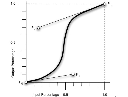
6.cubic-bezier:(该值允许你自定义一个时间曲线) 特定的cubic-bezier曲线 (x1, y1, x2, y2)四个值特定于曲线上点P1和点P2。所有值需在[0, 1]区域内,否则无效。
其是cubic-bezier为通过贝赛尔曲线来计算“转换”过程中的属性值,如下曲线所示,通过改变P1(x1, y1)和P2(x2, y2)的坐标可以改变整个过程的Output Percentage。初始默认值为default.
其他几个属性的示意图:

四、transition-delay:
语法:
transition-delay : <time> [, <time>]*
transition-delay是用来指定一个动画开始执行的时间,也就是说当改变元素属性值后多长时间开始执行transition效果,其取值:<time>为数值,单位为s(秒)或者ms(毫秒),其使用和transition-duration极其相似,也可以作用于所有元素,包括:before和:after伪元素。 默认大小是"0",也就是变换立即执行,没有延迟。
有时我们不只改变一个css效果的属性,而是想改变两个或者多个css属性的transition效果,那么我们只要把几个transition的声明串在一起,用逗号(“,”)隔开,然后各自可以有各自不同的延续时间和其时间的速率变换方式。但需要值得注意的一点:transition-delay与transition-duration的值都是时间,所以要区分它们在连写中的位置,一般浏览器会根据先后顺序决定,第一个可以解析为时间的怭值为transition-duration第二个为transition-delay。如:
  a {
    -moz-transition: background 0.5s ease-in,color 0.3s ease-out;
    -webkit-transition: background 0.5s ease-in,color 0.3s ease-out;
    -o-transition: background 0.5s ease-in,color 0.3s ease-out;
    transition: background 0.5s ease-in,color 0.3s ease-out;
  }
如果你想给元素执行所有transition效果的属性,那么我们还可以利用all属性值来操作,此时他们共享同样的延续时间以及速率变换方式,如:
  a {
    -moz-transition: all 0.5s ease-in;
    -webkit-transition: all 0.5s ease-in;
    -o-transition: all 0.5s ease-in;
    transition: all 0.5s ease-in;
  }
综合上述我们可以给transition一个速记法:transition: <property> <duration> <animation type> <delay>如下图所示

相对应的一个示例代码:
p {
  -webkit-transition: all .5s ease-in-out 1s;
  -o-transition: all .5s ease-in-out 1s;
  -moz-transition: all .5s ease-in-out 1s;
  transition: all .5s ease-in-out 1s;
}
浏览器的兼容性:

先这样 以后学习到更高深的知识,会回来补充的。原博地址:http://www.w3cplus.com/content/css3-transition