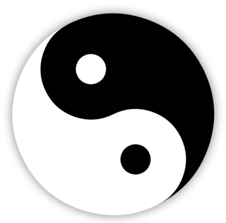
效果预览:
PS:
1、昨天用3个DIV实现了太极图(点击查看),,今天试着用1个Div来做。
2、公司刚忙过双10周年庆,最近空闲下来,闲着也是闲着,总得写点东西吧。
3、高手莫喷,小弟仅仅是没事折腾一下,做个的记录。
4、有网友反应旋转的时候会卡。
5、IE浏览器,出门左拐、走好不送 ~~~
实现步骤:
HTML:
<div class="box-taiji"></div>
步骤一:
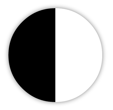
.box-taiji {0;height:400px;position:relative;margin:50px auto;border-left:200px solid #000;border-right:200px solid #fff;box-shadow:0 0 30px rgba(0,0,0,.5);border-radius:400px;}
结合border实现左黑右白的正方形,加上圆角、阴影。 PS:刚开始的时候用background-image:linear-gradient(left, #000 50%, #fff 50%);来实现黑边圆形。IE10下测试不行。所以用了border。
步骤二:
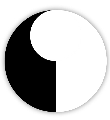
.box-taiji {0;height:400px;position:relative;margin:50px auto;border-left:200px solid #000;border-right:200px solid #fff;box-shadow:0 0 30px rgba(0,0,0,.5);border-radius:400px;}
.box-taiji:after {200px;height:200px;position:absolute;content:"";display:block;top:0;left:-100px;z-index:1;background-color:#fff;border-radius:50%;}
加上伪类,实现一个一个白色的圆形,定位好位置。
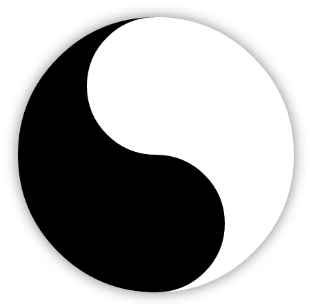
.box-taiji {0;height:400px;position:relative;margin:50px auto;border-left:200px solid #000;border-right:200px solid #fff;box-shadow:0 0 30px rgba(0,0,0,.5);border-radius:400px;}
.box-taiji:after {200px;height:200px;position:absolute;content:"";display:block;top:0;left:-100px;z-index:1;background-color:#fff;border-radius:50%;box-shadow:0 200px 0 #000;}
利用box-shadow:0 200px 0 #000;实现同样大小的圆,放好。
步骤三:
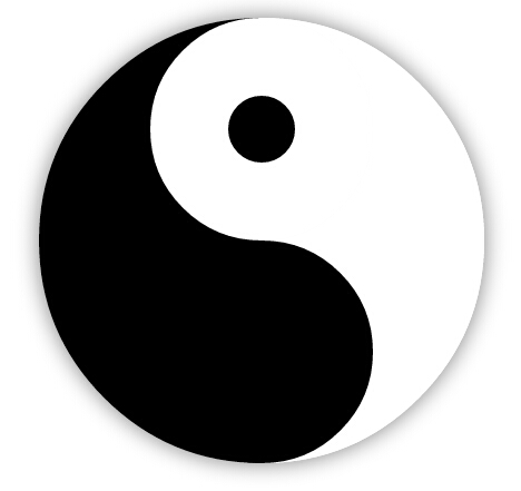
.box-taiji {0;height:400px;position:relative;margin:50px auto;border-left:200px solid #000;border-right:200px solid #fff;box-shadow:0 0 30px rgba(0,0,0,.5);border-radius:400px;}
.box-taiji:before,
.box-taiji:after {position:absolute;content:"";display:block;}
.box-taiji:before {200px;height:200px;top:0;left:-100px;z-index:1;background-color:#fff;border-radius:50%;box-shadow:0 200px 0 #000;}
.box-taiji:after {60px;height:60px;top:70px;left:-30px;z-index:2;background-color:#000;border-radius:50%;box-shadow:0 200px 0 #fff;}
同样步骤二一样的原理,再实现黑白两个圆,放到相关的位置。我们的太极图就画好了,下面的任务就是动起来~~
步骤四:
.box-taiji {0;height:400px;position:relative;margin:50px auto;border-left:200px solid #000;border-right:200px solid #fff;box-shadow:0 0 30px rgba(0,0,0,.5);border-radius:400px;animation:rotation 2.5s linear infinite;-webkit-animation:rotation 2.5s linear infinite;-moz-animation:rotation 2.5s linear infinite;}
.box-taiji:before,
.box-taiji:after {position:absolute;content:"";display:block;}
.box-taiji:before {200px;height:200px;top:0;left:-100px;z-index:1;background-color:#fff;border-radius:50%;box-shadow:0 200px 0 #000;}
.box-taiji:after {60px;height:60px;top:70px;left:-30px;z-index:2;background-color:#000;border-radius:50%;box-shadow:0 200px 0 #fff;}

@keyframes rotation {
    0% {transform:rotate(0deg);}
    100% {transform:rotate(-360deg);}
}
@-webkit-keyframes rotation {
    0% {-webkit-transform:rotate(0deg);}
    100% {-webkit-transform:rotate(-360deg);}
}
@-moz-keyframes rotation {
    0% {-moz-transform:rotate(0deg);}
    100% {-moz-transform:rotate(-360deg);}
}
加上@keyframes、animation等CSS3动画效果,OK,搞定。。
原理解析:
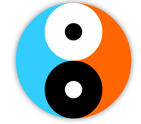
我们先把背景颜色调一下,原理一下子就清晰了。。其实就是:两个半圆在最下面,四个小圆利用定位叠加上去。
完整代码:
<!doctype html>
<html>
<head>
<meta charset="utf-8">
<title>CSS3实现旋转的太极图(二):只用1个DIV</title>
<style>
/* 利用background-image实现左黑右白的圆,IE下测试不太理想 */
/* .box-taiji {400px;height:400px;position:relative;margin:30px auto;border-radius:400px;box-shadow:0 0 30px rgba(0,0,0,.5);background-image:linear-gradient(left, #000 50%, #fff 50%);background-image:-webkit-linear-gradient(left, #000 50%, #fff 50%);background-image:-moz-linear-gradient(left, #000 50%, #fff 50%);}
.box-taiji:before,
.box-taiji:after {position:absolute;content:"";display:block;}
.box-taiji:before {200px;height:200px;top:0;left:100px;z-index:1;background-color:#fff;border-radius:50%;box-shadow:0 200px 0 #000;}
.box-taiji:after {60px;height:60px;top:70px;left:170px;z-index:2;background-color:#000;border-radius:50%;box-shadow:0 200px 0 #fff;}
 */


.box-taiji {0;height:400px;position:relative;margin:50px auto;border-left:200px solid #000;border-right:200px solid #fff;box-shadow:0 0 30px rgba(0,0,0,.5);border-radius:400px;animation:rotation 2.5s linear infinite;-webkit-animation:rotation 2.5s linear infinite;-moz-animation:rotation 2.5s linear infinite;}
.box-taiji:before,
.box-taiji:after {position:absolute;content:"";display:block;}
.box-taiji:before {200px;height:200px;top:0;left:-100px;z-index:1;background-color:#fff;border-radius:50%;box-shadow:0 200px 0 #000;}
.box-taiji:after {60px;height:60px;top:70px;left:-30px;z-index:2;background-color:#000;border-radius:50%;box-shadow:0 200px 0 #fff;}

@keyframes rotation {
    0% {transform:rotate(0deg);}
    100% {transform:rotate(-360deg);}
}
@-webkit-keyframes rotation {
    0% {-webkit-transform:rotate(0deg);}
    100% {-webkit-transform:rotate(-360deg);}
}
@-moz-keyframes rotation {
    0% {-moz-transform:rotate(0deg);}
    100% {-moz-transform:rotate(-360deg);}
}
</style>
</head>

<body>

<div class="box-taiji"></div>

</body>
</html>