<!DOCTYPE html>
<html lang="en">

<head>
    <meta charset="UTF-8">
    <title>Document</title>
    <style type="text/css">
    * {
        margin: 0;
        padding: 0
    }

    .words {
        font-size: 25px;
        font-weight: 700;
        text-align: center;
        margin: 20px 0
    }

    div {
        width: 300px;
        height: 150px;
        margin: 0 auto 10px;
        border: 1px solid #ddd;
    }

    .box1 {
        background: -webkit-linear-gradient(left, transparent, #000 55%);
        background: -o-linear-gradient(right, transparent, #000 55%);
        background: -moz-linear-gradient(right, transparent, #000 55%);
        background: linear-gradient(to right, transparent, #000 55%);
    }

    .box2 {
        background: linear-gradient(to bottom, rgb(255, 255, 255), #fff0d5);
        background: -o-linear-gradient(to bottom, rgb(255, 255, 255), #fff0d5);
        background: -ms-linear-gradient(to bottom, rgb(255, 255, 255), #fff0d5);
        background: -moz-linear-gradient(to bottom, rgb(255, 255, 255), #fff0d5);
        background: -webkit-linear-gradient(to bottom, rgb(255, 255, 255), #fff0d5);
    }

    .box3 {
        background: -webkit-linear-gradient(top, rgb(106, 106, 106) 0%, rgb(80, 80, 80) 50%, #393939 50%, #7e7e7e);
        background: -moz-linear-gradient(top, rgb(106, 106, 106) 0%, rgb(80, 80, 80) 50%, #393939 50%, #7e7e7e);
        background: -o-linear-gradient(top, rgb(106, 106, 106) 0%, rgb(80, 80, 80) 50%, #393939 50%, #7e7e7e);
        background: -ms-linear-gradient(top, rgb(106, 106, 106) 0%, rgb(80, 80, 80) 50%, #393939 50%, #7e7e7e);
        background: linear-gradient(top, rgb(106, 106, 106) 0%, rgb(80, 80, 80) 50%, #393939 50%, #7e7e7e);
    }

    .box4 {
        background: -webkit-linear-gradient(top, rgba(200, 200, 200, 0.5) 0%, rgba(200, 200, 200, 0.5) 50%, #222 50%, #222);
        background: -moz-linear-gradient(top, rgba(200, 200, 200, 0.5) 0%, rgba(200, 200, 200, 0.5) 50%, #222 50%, #222);
        background: -o-linear-gradient(top, rgba(200, 200, 200, 0.5) 0%, rgba(200, 200, 200, 0.5) 50%, #222 50%, #222);
        background: -ms-linear-gradient(top, rgba(200, 200, 200, 0.5) 0%, rgba(200, 200, 200, 0.5) 50%, #222 50%, #222);
        background: linear-gradient(top, rgba(200, 200, 200, 0.5) 0%, rgba(200, 200, 200, 0.5) 50%, #222 50%, #222);
    }
.box5 {
200px;
height: 35px;
margin: 50px auto;
background: -webkit-linear-gradient(#fac9f0, #fff, #f5a5e5);/* Safari 5.1 - 6.0 */
background: -o-linear-gradient(#fac9f0, #fff, #f5a5e5);/* Opera 11.1 - 12.0 */
background: -moz-linear-gradient(#fac9f0, #fff, #f5a5e5);/* Firefox 3.6 - 15 */
background: linear-gradient(#fac9f0, #fff, #f5a5e5);/* 标准的语法(必须放在最后) */
}
    </style>
</head>

<body>
    <p class="words">渐变类型</p>
    <div class="box1"></div>
    <div class="box2"></div>
    <div class="box3"></div>
    <div class="box4"></div>
    <div class="box5"></div>
</body>

</html>
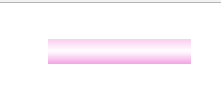
效果图:

box5效果:
<!DOCTYPE html>
<html lang="zh-CN">
<head>
    <meta charset="UTF-8">
    <title>Document</title>
    <meta name="viewport" content="width=device-width,initial-scale=1.0, minimum-scale=1.0, maximum-scale=1.0, user-scalable=no" />
    <meta content="yes" name="apple-mobile-web-app-capable" />
    <meta content="black" name="apple-mobile-web-app-status-bar-style" />
    <meta content="telephone=no" name="format-detection" />
    <style type="text/css">
        *{margin: 0; padding: 0}
        body{ max-width: 640px; margin:0 auto; }
        .scroll{ width: 60%; height: 10px; background-color: #f5d9d9; border-radius: 5px; float: left; position: relative; margin: 7px 10px 0 10px;}
        .scroll span{ position: absolute; left: 0; top:0; display: block; height: 10px; background-image: -webkit-linear-gradient(0deg, #f87a75, #6ddafa);  border-radius: 5px;}

    </style>
    <!-- 0deg 代表旋转角度-->
    <div class="scroll"><span style=" 60%"></span></div>
</head>
<body>

</body>
</html>
效果图:

<!DOCTYPE html>
<html lang="en">
<head>
    <meta charset="UTF-8">
    <meta name="viewport" content="width=device-width, initial-scale=1.0">
    <title>高亮渐变</title>
    <style>
        *{margin: 0; padding: 0;}
        .box6{ width: 200px; height: 40px; line-height: 40px; margin: 20px auto; color: #fff; font-size: 18px; text-align: center;
            background: radial-gradient(ellipse at 50% 0%,#d76b50,#bc1615,#bc1615);
            background: -webkit-radial-gradient(ellipse at 50% 0%,#bc1615,#bc1615);}
    </style>
</head>
<body>
    <div class="box6">按钮渐变</div>
</body>
</html>
效果图:

无意中发现,可以直接生产代码:
http://tools.jb51.net/code/css_generator
