发现了之前忽略的小问题,做个笔记。
需求如图 :
非ui,见谅
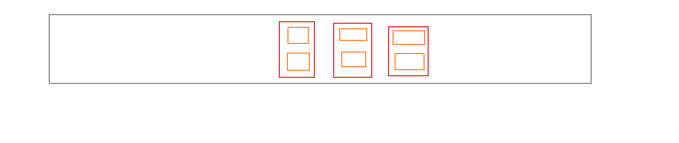
如图: 灰盒A是一个width100%box,红盒需要中间靠拢并留有固定间距,橙盒需上下居中(红盒子高度一致,橙盒高度一致)
这个是一个经典的flex布局,代码如下 :
    <div class="conBox">
      <div class="item" v-for="(item,index) in list" :key="index">
        <div>{{item.name}}</div>
        <div>{{item.n2}}</div>
      </div>
    </div>
.conBox {
   100%;
  height: 170px;
  margin-top: 88px;
  border: 1px solid red;
  display: flex;
  justify-content: center;
  //------------------------------//
  .item {
    border: 1px solid blue;
     170px;
    height: 170px;
    display: flex;
    flex-wrap: wrap;
    flex-direction: column;
    align-items: center;
    justify-content: center;
//less-后代选择器
    &:nth-child(1),
    &:nth-child(2) { // less后代选择器应该这样写,&表示自身
      background: red;
      margin-right: 20px;
    }

  }
}
ui的需求是红盒左右间距是10pt,所以后来我写的是第一个,第二个红盒子的右边距是20px(1:2换算),但是后来再仔细看时发现不对,会导致红盒整体向右偏移,应当是每个红盒的左右间距是10px,这样才是20px。因而修改后的代码:
.conBox {
   100%;
  height: 170px;
  margin-top: 88px;
  border: 1px solid red;
  display: flex;
  justify-content: center;
  //------------------------------//
  .item {
    border: 1px solid blue;
     170px;
    height: 170px;
    display: flex;
    flex-wrap: wrap;
    flex-direction: column;
    align-items: center;
    justify-content: center;
    margin:0 1.33vw; //换算后的单位
  }
}
做个笔记