CSS3动画 添加某种效果可以从一种样式转变到另一个
-
@keyframes 创建动画 @keyframes move { 0% { transform: rotate(0deg); } 100% { transform: rotate(360deg); } }
-
animation 所有动画属性的简写属性,除了 animation-play-state 属性。
-
animation-name 规定 @keyframes 动画的名称。
-
animation-duration 规定动画完成一个周期所花费的秒或毫秒。默认是 0。
-
animation-timing-function 规定动画的速度曲线。默认是 "ease"。
-
animation-fill-mode 定当动画不播放时(当动画完成时,或当动画有一个延迟未开始播放时),要应用到元素的样式。
-
animation-delay 规定动画何时开始。默认是 0。
-
animation-iteration-count 规定动画被播放的次数。默认是 1。
-
animation-direction 规定动画是否在下一周期逆向地播放。默认是 "normal"。
-
animation-play-state 规定动画是否正在运行或暂停。默认是 "running"。
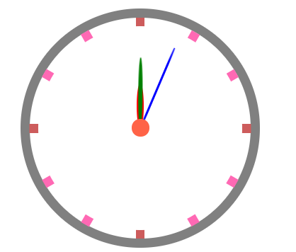
简单小时钟
  1 <!DOCTYPE html>
  2 <html lang="en">
  3
  4 <head>
  5     <meta charset="UTF-8">
  6     <meta name="viewport" content="width=device-width, initial-scale=1.0">
  7     <title>钟表</title>
  8     <style>
  9         /* 最外层表盘 */
 10         .outer {
 11              250px;
 12             height: 250px;
 13             border: 10px solid gray;
 14             margin: 100px auto;
 15             border-radius: 50%;
 16             position: relative;
 17             text-align: center;
 18             line-height: 250px;
 19             z-index: 1;
 20         }
 21
 22         /* 内部时间刻度 */
 23         .bar {
 24              10px;
 25             height: 250px;
 26             background-color: gray;
 27             position: absolute;
 28             left: 120px;
 29             background-color: hotpink;
 30         }
 31
 32         .outer div:nth-child(1) {
 33             background-color: indianred;
 34         }
 35
 36         .outer div:nth-child(2) {
 37             transform: rotate(30deg);
 38         }
 39
 40         .outer div:nth-child(3) {
 41             transform: rotate(60deg);
 42         }
 43
 44         .outer div:nth-child(4) {
 45             transform: rotate(90deg);
 46             background-color: indianred;
 47         }
 48
 49         .outer div:nth-child(5) {
 50             transform: rotate(120deg);
 51         }
 52
 53         .outer div:nth-child(6) {
 54             transform: rotate(150deg);
 55         }
 56
 57         /* 中间表盘,主要用来遮盖多余的时间刻度 */
 58         .inner {
 59              230px;
 60             height: 230px;
 61             background-color: white;
 62             border-radius: 50%;
 63             position: absolute;
 64             z-index: 2;
 65             top: 10px;
 66             left: 10px;
 67         }
 68
 69         /* 中心的小点,旋转中心 */
 70         .center {
 71              20px;
 72             height: 20px;
 73             background-color: tomato;
 74             border-radius: 50px;
 75             /* 定位在最上边 */
 76             position: absolute;
 77             z-index: 10;
 78             top: 115px;
 79             left: 115px;
 80         }
 81
 82         /* 时针 */
 83         .hours {
 84              8px;
 85             height: 50px;
 86             background-color: red;
 87             border-radius: 50%;
 88             /* 定位 */
 89             position: absolute;
 90             z-index: 3;
 91             top: 75px;
 92             left: 121px;
 93             /* 旋转 */
 94             transform-origin: bottom;
 95             animation: move 216000s;
 96             animation-timing-function: steps(60, end);
 97             animation-iteration-count: infinite;
 98         }
 99
100         /* 分针 */
101         .minutes {
102              5px;
103             height: 80px;
104             background-color: green;
105             border-radius: 50%;
106             /* 定位 */
107             position: absolute;
108             z-index: 4;
109             top: 45px;
110             left: 122.5px;
111             /* 旋转 */
112             transform-origin: bottom;
113             animation: move 3600s;
114             animation-timing-function: steps(60, end);
115             animation-iteration-count: infinite;
116         }
117
118         /* 秒针 */
119         .seconds {
120              3px;
121             height: 100px;
122             background-color: blue;
123             border-radius: 50%;
124             /* 定位 */
125             position: absolute;
126             z-index: 5;
127             top: 27px;
128             left: 123px;
129             /* 旋转 */
130             transform-origin: bottom;
131             animation: move 60s;
132             animation-timing-function: steps(60, end);
133             animation-iteration-count: infinite;
134         }
135
136         /* 旋转360°动画 */
137         @keyframes move {
138             0% {
139                 transform: rotate(0deg);
140             }
141
142             100% {
143                 transform: rotate(360deg);
144             }
145         }
146     </style>
147 </head>
148
149 <body>
150     <!-- 容器 -->
151     <div class="outer">
152         <!-- 时间刻度 -->
153         <div class="bar"></div>
154         <div class="bar"></div>
155         <div class="bar"></div>
156         <div class="bar"></div>
157         <div class="bar"></div>
158         <div class="bar"></div>
159         <!-- 中间表盘,遮盖多余刻度 -->
160         <div class="inner"></div>
161         <!-- 中间旋转中心 -->
162         <div class="center"></div>
163         <!-- 时针 -->
164         <div class="hours"></div>
165         <!-- 分针 -->
166         <div class="minutes"></div>
167         <!-- 秒针 -->
168         <div class="seconds"></div>
169     </div>
170 </body>
171
172 </html>
运行截图