echarts3使用总结2

接着上一篇文章补充一点项目中遇到的问题及解决方法

1、y轴正负轴调换

 yAxis: {
    inverse: false //y轴正负轴调换
},
2、去掉图表背景线
yAxis: [
          {
              type: 'value',
              name: '占比',
              splitLine:{
                  show:false  //背景横线不显示
                  },
             }
]
3、y轴以百分比显示
yAxis: [
          {
              type: 'value',
              name: '占比',
              axisLabel: {
                 formatter: '{value} %'
              },
]
4、y轴刻度设置最小/最大值
  yAxis : [
                {
                    type : 'value',
                    minInterval: 1,
            maxInterval:100
                }
            ],
5、设置y轴刻度显示保留几位小数
 yAxis: {
        type: 'value',
        axisLabel: {
            formatter: '{value} ',
            formatter: function (value, index) {           
                  return value.toFixed(2);  //保留两位小数
            }
 
        }
    },
6、饼图文字在扇形内部显示
  series : [
       label: {
          normal: {
                position: 'inner'
              }
        }
]
下面贴几个最近做的echart的demo希望可以帮助到一些朋友
1、在图表中添加平行于y轴和x轴的线以及趋势线(如下图)
 代码:
<!DOCTYPE html>
<html lang="en">
<head>
    <meta charset="UTF-8">
    <title>Document</title>
</head>
<body>
    <input type="text">
    <div id="pic0" style=" 600px;height:400px;"></div>
    <script src="js/echarts.js"></script>
    <script>
        var myChart14 = echarts.init(document.getElementById('pic0'));
        option14 = {
            title: {
                text: '未来一周气温变化',
                subtext: '纯属虚构'
            },
            tooltip: {
                trigger: 'axis'
            },
            
            xAxis:  {
                type: 'category',
                boundaryGap: false,
                data: ['100','200','300','400','500','600','700']
            },
            yAxis: {
                type: 'value',
                axisLabel: {
                    formatter: '{value} '
                }
            },
            series: [
                {
                    name:'最高气温',
                    type:'line',
                    data:[100, 200, 300, 400, 500, 600, 700]
                },
                {            //平行于y轴
                    name:'',
                    type:'line',
                    markLine: {
                        name:'盈亏临界点',
                        symbol:'circle',
                        lable:{
                            normal:{
                                show:true,
                                position:'end',
                                formatter:'盈亏临界点'
                            }
                        },
                        data: [[
                            {coord:['400',0],value:1},  //{coord:[4,0],value:1},//此处的4不加引号表示横坐标第几个从0开始
                            {coord:['400',350],value:400}//如何获取grid上侧最大值,目前是写死的
                        ]]
                    }
                },
                {        //平行于x轴
                        name: '线',
                        type: 'scatter',
                        symbolSize: 20,
                        markLine: {
                            lable:{
                                normal:{
                                    show:true,
                                    position:'end',
                                    formatter:'线'
                                }
                            },
                            data: [{
                                yAxis: 350,
                            }]
                        },
                        data: [],
                },
               {
                    name:'趋势线',
                    type:'line',
                    //data:[0],
                    markLine: {
                        name:'aa1',
                        data: [[
                                {name: '标线1起点', value: 0, coord:['100',700]},
                                {name: '标线1终点',value: 0, coord:['700',20]}
                            ]]
                    }
                }
            ]
        }; 
        myChart14.setOption(option14);
    </script>
</body>
</html>

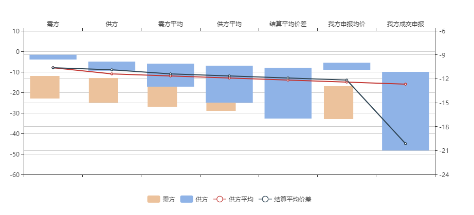
 2、双y坐标带增量的柱状图+折线图(如下图)

代码:

<!DOCTYPE html>
<html lang="en">
<head>
    <meta charset="UTF-8">
    <title>Document</title>
</head>
<body>
    <div id="pic4" style=" 1000px;height:400px;"></div>
    <script src="js/echarts.js"></script>
    <script>
        var myChart = echarts.init(document.getElementById('pic4'));
        option = {
                title: {                    
                },
                tooltip: {
                    trigger: 'axis'
                },
                legend: {
                    data:['需方','供方','需方平均','供方平均','结算平均价差','我方申报均价','我方成交申报'],
                    bottom:'bottom'
                },
                toolbox: {
                    show: true,
                    feature: {
                        dataView: {readOnly: false},
                        restore: {},
                        saveAsImage: {}
                    }
                },
                dataZoom: {
                    show: false,
                    start: 0,
                    end: 100
                },
                toolbox:{
                    show:false,
                },
                xAxis: [
                    {
                        type: 'category',
                        boundaryGap: true,
                        data: []
                    },
                    {
                        type: 'category',
                        boundaryGap: true,
                        data:['需方','供方','需方平均','供方平均','结算平均价差','我方申报均价','我方成交申报'],
                    }
                ],
                yAxis: [
                    {
                        type: 'value',
                        scale: true,
                        boundaryGap: [0.2, 0.2]
                    },
                    {
                        type: 'value',
                        scale: true,
                        boundaryGap: [0.2, 0.2]
                    }
                ],
                series: [
                     {
                        name: '辅助',
                        type: 'bar',
                        stack:  '总量',
                        barWidth: '50%',
                        itemStyle: {
                            normal: {
                                barBorderColor: 'rgba(0,0,0,0)',
                                color: 'rgba(0,0,0,0)'
                            },
                            emphasis: {
                                barBorderColor: 'rgba(0,0,0,0)',
                                color: 'rgba(0,0,0,0)'
                            }
                        },
                        data: [-12,-13,-14,-15,-16,-17,-18]
                    },
                    {
                        name: '需方',
                        type: 'bar',
                        stack: '总量',
                        color:['#ecc29c'],
                        barWidth: '50%',
                        data:[-11,-12,-13,-14,-15,-16,-17]
                    },
                    {
                            name: '供方辅助',
                            type: 'bar',
                            stack:  '总量1',
                            clickable : true,
                            itemStyle: {
                                normal: {
                                    barBorderColor: 'rgba(0,0,0,0)',
                                    color: 'rgba(0,0,0,0)'
                                },
                                emphasis: {
                                    barBorderColor: 'rgba(0,0,0,0)',
                                    color: 'rgba(0,0,0,0)'
                                }
                            },
                            data: [-4,-5,-6,-7,-8,-9,-10]
                    },
                    {
                        name:'供方',
                        type:'bar',
                        color:["#8fb3e7"],
                        stack:  '总量1',
                        xAxisIndex: 1,
                        yAxisIndex: 1,
                        data:[-5,-6,-7,-8,-9,-1,-11]
                    },
                    {
                        name:'供方平均',
                        type:'line',
                        data:[-8,-11,-12,-13,-14,-15,-16]
                    },
                     {
                        name:'结算平均价差',
                        type:'line',
                        data:[-8,-9,-11,-12,-13,-14,-45]
                    }
                ]
            };
        myChart.setOption(option);
    </script>
</body>
</html>
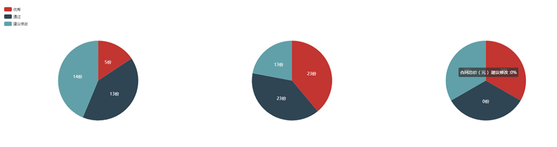
3、一个div中放多个饼图

代码:

<!DOCTYPE html>
<html lang="en">
<head>
    <meta charset="UTF-8">
    <title>Document</title>
    <style>
        #pic{
            width:100%;
            height:800px;
        }
    </style>
</head>
<body>
    <div id="pic"></div>
    <script src="js/echarts.js"></script>
    <script>
        var mychart = echarts.init(document.getElementById('pic'))
        option = {
            title : {
                text: '',
                subtext: '',
                x:'center'
            },
            tooltip : {
                trigger: 'item',
                formatter: "{a} {b} :{d}%",
                 textStyle: {
                            fontSize:14
                        }
            },
            legend: {
                orient: 'vertical',
                left: 'left',
                data: ['优秀','通过','建议修改']
            },
            toolbox: {
                show: true,
                orient: 'vertical',
                left: 'right',
                top: 'center',
                feature: {
                    dataView: {readOnly: false},
                    restore: {},
                    saveAsImage: {}
                }
            },
            grid: [
                {x: '0%',y: '25%',  '100%', height: '40%'},
            ],
            xAxis: [
                {    
                    type: 'category',
                    axisTick: {
                        alignWithLabel: true
                    },
                    axisLabel:{
                        interval:0   //设置间隔,0的时候全部显示
                    },

                    data: ['合同数量(个)','合同电量(万千瓦时)','合同总价(元)']
                },
            ],
            yAxis: [
                {gridIndex: 0,name:'年级',show:false},
            ],
            series : [
                {
                    title:'aaa',
                    name: '合同数量(个)',
                    type: 'pie',
                    //roseType:'radius',
                    radius : '33%',
                    center: ['16.5%', '31%'],
                    data:[
                        {value:5, name:'优秀'},
                        {value:32-5-14, name:'通过'},
                        {value:14, name:'建议修改'}
                    ],
                    label: {
                    normal: {
                        position: 'inner',
                        formatter: '{c}份',
                         textStyle: {
                            color: '#ffffff',
                            fontSize: 14
                        }
                    }
                },
                    itemStyle: {
                        emphasis: {
                            shadowBlur: 10,
                            shadowOffsetX: 0,
                            shadowColor: 'rgba(0, 0, 0, 0.5)'
                        }
                    }
                },
                {
                    name: '合同电量(万千瓦时)',
                    type: 'pie',
                    radius : '33%',
                    center: ['50%', '31%'],
                    data:[
                        {value:23, name:'优秀'},
                        {value:46-23, name:'通过'},
                        {value:13, name:'建议修改'},
                        /*{value:335, name:'3'},
                        {value:1548, name:'4'}*/
                    ],
                    label: {
                    normal: {
                        position: 'inner',
                        formatter: '{c}份',
                         offset: [,100],
                         textStyle: {
                            color: '#ffffff',
                            fontSize: 14
                            }
                        }
                    },
                    itemStyle: {
                        emphasis: {
                            shadowBlur: 10,
                            shadowOffsetX: 0,
                            shadowColor: 'rgba(0, 0, 0, 0.5)'
                        }
                    }
                },
                {
                    name: '合同总价(元)',
                    type: 'pie',
                    //roseType:'radius',
                    radius : '33%',
                    center: ['83.5%', '31%'],
                    data:[
                        {value:0, name:'优秀'},
                        {value:0, name:'通过'},
                        {value:0, name:'建议修改'},
                    ],
                    label: {
                    normal: {
                        position: 'inner',
                        formatter: '{c}份',
                         textStyle: {
                            color: '#ffffff',
                            fontSize: 14
                            }
                        }
                    },
                    itemStyle: {
                        emphasis: {
                            shadowBlur: 10,
                            shadowOffsetX: 0,
                            shadowColor: 'rgba(0, 0, 0, 0.5)'
                        }
                    }
                }
                
            ]
        };
        mychart.setOption(option);
    </script>
</body>
</html>

 若有错误欢迎大家批评指正

 上述内容是参照echarts官网http://echarts.baidu.com/,若有侵权请联系,谢谢!

 作者:BlancheWang 
出处:http://www.cnblogs.com/hhw3
本文版权归作者和博客园共有,欢迎转载,但未经作者同意必须保留此段声明,且在文章页面明显位置给出原文连接。

原文地址:https://www.cnblogs.com/hhw3/p/7365117.html