一 figure使用
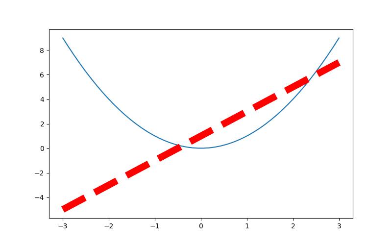
 1 import numpy as np
 2 import matplotlib.pyplot as plt
 3
 4 # 从-3到中取50个数
 5 x = np.linspace(-3, 3, 50)
 6 print(x)
 7 y1 = 2*x+1
 8 y2 = x**2
 9 plt.figure()
10 plt.plot(x, y1)
11 plt.figure(num=3, figsize=(8, 5))   # figsize的设置长和宽
12 plt.plot(x, y2)
13 plt.plot(x, y1, color='red', linewidth=10.0, linestyle='--')   # linewidth 设置线的宽度, linesyyle设置线的形状
14 # savefig  保存图片
15 plt.savefig("./image_dir/xianxing.png")
16 plt.show()
二: 设置坐标轴
# 从-3到中取50个数
    x = np.linspace(-3, 3, 50)

    y1 = 2 * x + 1
    y2 = x ** 2
    plt.figure(num=3, figsize=(8, 5))  # figsize的设置长和宽
    plt.plot(x, y2)
    plt.plot(x, y1, color='red', linewidth=10.0, linestyle='--')
    plt.xlim((-1, 2))   # 设置x轴的范围
    plt.ylim((-2, 3))   # 设置y轴的范围
    plt.xlabel('I am x')  # 设置x轴的名称
    plt.ylabel('I am y')   # 设置y轴额名称
    new_ticks = np.linspace(-1, 2, 5)
    print(new_ticks)
    plt.xticks(new_ticks)   # 设置x轴的范围的刻度值
    # 设置y轴的范围的刻度值
    plt.yticks([-2, -1, 0, 1, 2, 3],
               [r'$really bad$', r'$bad$', r'$normal$', r'$good$', r'$really good$'])
    plt.savefig('./image_dir/xlim.png')
    plt.show()
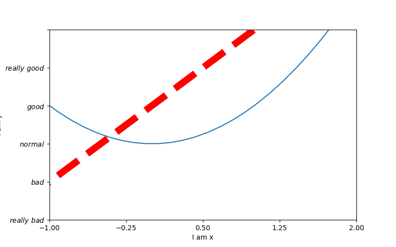
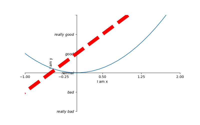
 1  # 从-3到中取50个数
 2     x = np.linspace(-3, 3, 50)
 3
 4     y1 = 2 * x + 1
 5     y2 = x ** 2
 6     plt.figure(num=3, figsize=(8, 5))  # figsize的设置长和宽
 7     plt.plot(x, y2)
 8     plt.plot(x, y1, color='red', linewidth=10.0, linestyle='--')
 9     plt.xlim((-1, 2))   # 设置x轴的范围
10     plt.ylim((-2, 3))   # 设置y轴的范围
11     plt.xlabel('I am x')  # 设置x轴的名称
12     plt.ylabel('I am y')   # 设置y轴额名称
13     new_ticks = np.linspace(-1, 2, 5)
14     print(new_ticks)
15     plt.xticks(new_ticks)   # 设置x轴的范围的刻度值
16     # 设置y轴的范围的刻度值
17     plt.yticks([-2, -1, 0, 1, 2, 3],
18                [r'$really bad$', r'$bad$', r'$normal$', r'$good$', r'$really good$'])
19     # gca = 'get current axis'
20     ax = plt.gca()
21     #  将轴的右边去掉
22     ax.spines['right'].set_color('none')
23     #  将轴的上边去掉
24     ax.spines['top'].set_color('none')
25     #  将下轴设置为x
26     ax.xaxis.set_ticks_position('bottom')
27     # 将左轴设置为y
28     ax.yaxis.set_ticks_position('left')
29     # 设置下轴的位置  set_position(outward, axes)
30     ax.spines['bottom'].set_position(('data', 0))
31     # 设置左轴位置
32     ax.spines['left'].set_position(('data', '0'))
33     plt.savefig('./image_dir/xlim2.png')
34     plt.show()
三: legend 图例
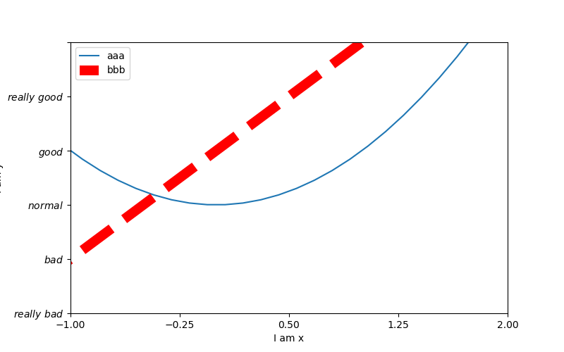
 1  # 从-3到中取50个数
 2     x = np.linspace(-3, 3, 50)
 3
 4     y1 = 2 * x + 1
 5     y2 = x ** 2
 6     plt.figure(num=3, figsize=(8, 5))  # figsize的设置长和宽
 7
 8     plt.xlim((-1, 2))   # 设置x轴的范围
 9     plt.ylim((-2, 3))   # 设置y轴的范围
10     plt.xlabel('I am x')  # 设置x轴的名称
11     plt.ylabel('I am y')   # 设置y轴额名称
12     new_ticks = np.linspace(-1, 2, 5)
13     print(new_ticks)
14     plt.xticks(new_ticks)   # 设置x轴的范围的刻度值
15     # 设置y轴的范围的刻度值
16     plt.yticks([-2, -1, 0, 1, 2, 3],
17                [r'$really bad$', r'$bad$', r'$normal$', r'$good$', r'$really good$'])
18
19     # plt.plot是有返回值的
20     l1, =  plt.plot(x, y2, label='up')
21     l2, = plt.plot(x, y1, color='red', linewidth=10.0, linestyle='--', label='down')
22     # handles,   labels是设置名称, loc是设置位置
23     plt.legend(handles=[l1, l2], labels=['aaa', 'bbb'], loc='best')
24     plt.savefig('./image_dir/xlim3.png')
25     plt.show()
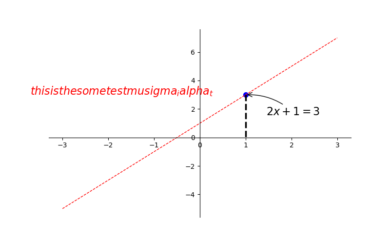
四: annotation标注
 1  # 从-3到中取50个数
 2     x = np.linspace(-3, 3, 50)
 3     y1 = 2 * x + 1
 4     # y2 = x ** 2
 5     plt.figure(num=3, figsize=(8, 5))  # figsize的设置长和宽
 6     # plt.plot(x, y2)
 7     plt.plot(x, y1, color='red', linewidth=1.0, linestyle='--')
 8     # gca = 'get current axis'
 9     ax = plt.gca()
10     #  将轴的右边去掉
11     ax.spines['right'].set_color('none')
12     #  将轴的上边去掉
13     ax.spines['top'].set_color('none')
14     #  将下轴设置为x
15     ax.xaxis.set_ticks_position('bottom')
16     # 将左轴设置为y
17     ax.yaxis.set_ticks_position('left')
18     # 设置下轴的位置  set_position(outward, axes)
19     ax.spines['bottom'].set_position(('data', 0))
20     # 设置左轴位置
21     ax.spines['left'].set_position(('data', '0'))
22     x0 = 1
23     y0 = 2 * x0 + 1
24     plt.scatter(x0, y0, s=50, color='b')
25     plt.plot([x0, x0], [y0, 0], 'k--', lw=2.5)
26
27     # method1   xycoords依赖的数据集
28     plt.annotate(r'$2x+1=%s$' % y0, xy=(x0, y0), xycoords='data', xytext=(+30, -30), textcoords='offset points',
29                  fontsize=16, arrowprops=dict(arrowstyle='->', connectionstyle='arc3, rad=.2'))
30
31     # method2
32     plt.text(-3.7, 3, r'$ this is the some test mu sigma_i alpha_t$', fontdict={'size':16, 'color':'r'})
33     plt.savefig('./image_dir/xlim4.png')
34     plt.show()
五:tick能见度
 1  # 从-3到中取50个数
 2     x = np.linspace(-3, 3, 50)
 3     y1 = 0.1*x
 4     # y2 = x ** 2
 5     plt.figure(num=3, figsize=(8, 5))  # figsize的设置长和宽
 6     # plt.plot(x, y2)
 7     plt.plot(x, y1, linewidth=10)
 8     plt.ylim(-2, 2)
 9     # gca = 'get current axis'
10     ax = plt.gca()
11     #  将轴的右边去掉
12     ax.spines['right'].set_color('none')
13     #  将轴的上边去掉
14     ax.spines['top'].set_color('none')
15     #  将下轴设置为x
16     ax.xaxis.set_ticks_position('bottom')
17     # 将左轴设置为y
18     ax.yaxis.set_ticks_position('left')
19     # 设置下轴的位置  set_position(outward, axes)
20     ax.spines['bottom'].set_position(('data', 0))
21     # 设置左轴位置
22     ax.spines['left'].set_position(('data', '0'))
23     for label in ax.get_xticklabels() + ax.get_yticklabels():
24         label.set_fontsize(12)
25         label.set_bbox(dict(facecolor='blue', edgecolor='None', alpha=0.9))
26     plt.savefig('./image_dir/xlim5.png')
27     plt.show()
