一、 一个页面上两个div左右铺满整个浏览器,要保证左边的div一直为100px,右边的div跟随浏览器大小变化(比如浏览器为500,右边div为400,浏览器为900,右边div为800),请写出大概的css代码。
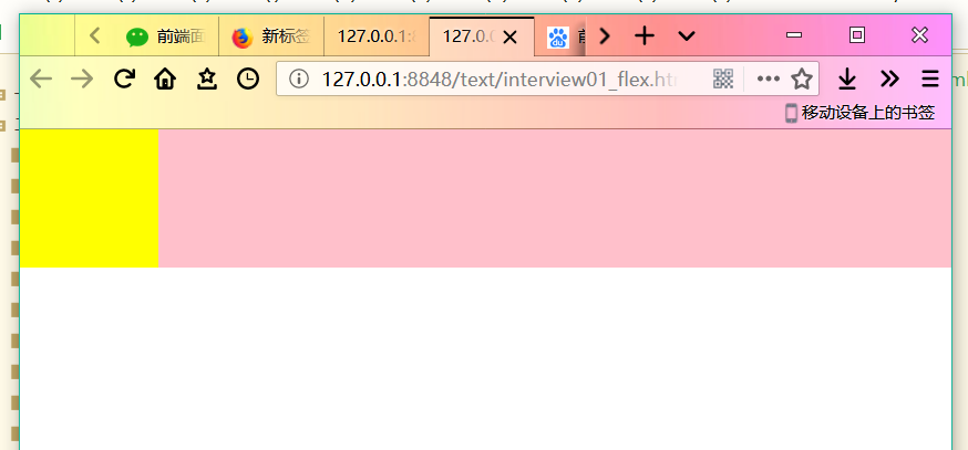
1. 使用flex
<!DOCTYPE html>
<html>
	<head>
		<meta charset="utf-8">
		<title></title>
		<style>
			* {
			    margin: 0;
			    padding: 0;
			}
			.box{
				100%;
				height: 100px;
				display: flex;
				flex-direction: row;
				align-items: center;
			}
			.left{
				flex-basis:100px;
				-webkit-flex-basis: 100px;
				background-color: yellow;
				height: 100%;
			}
			.right{
				background-color: pink;
				height: 100%;
				flex-grow: 1;
			}
		</style>
	</head>
	<body>
		<div class='box'>
			<div class='left'></div>
			<div class='right'></div>
		</div>
	</body>
</html>
## 2. 浮动布局
```html
left1 {
float: left;
height: 100px;
 100px;
background-color: gold;
}
right1 {
background-color: greenyellow;
height: 100px;
margin-left: 100px;/*==距离左边栏的宽度==*/
}
<div align = center>
</div>
### 总结
## flex父容器属性:
| 属性 | 作用 | 特性 |
| --------------- | ------------------------------------ | ---- |
| flex-direction | 定义子项在容器内的排列方向 | 排列 |
| flex-wrap | 定义子项在容器内的换行效果 | 排列 |
| flex-flow | flex-direction和flex-wrap的复合属性 | 排列 |
| justify-content | 定义子项在容器内水平对齐方式 | 对齐 |
| align-items | 定义子项在容器内垂直对齐方式 | 对齐 |
| align-content | 定义多行子项在容器内整体垂直对齐方式 | 对齐 |
## flex子容器属性:
| 属性 | 作用 | 特性 |
| ----------- | -------------------------------------------------------- | -------- |
| order | 定义子项们的排列顺序 | 排列 |
| flex-grow | 定义子项宽度之和不足父元素宽度时,子项拉伸的比例 | 占地面积 |
| flex-shrink | 定义子项宽度之和超过父元素宽度时,子项缩放的比例 | 占地面积 |
| flex-basis | 定义子项的初始宽度,flex-grow和flex-shrink以此为基础缩放 | 占地面积 |
| align-self | 定义单个子项与其他项目不一样的对齐方式 | 对齐 |
## float属性总结
| 属性 | 作用 |
| ------------ | ------ |
| float: left | 左浮动 |
| float: right | 右浮动 |