1.基于CSS3的文字斑马行效果
body{
font-size:1em;
line-height:2em;
}
div.content{
background: linear-gradient(#ccf2fa 50%, #ffffff 50%);
background-size: 100% 4em;
}
<html>
<body>
<div class="content">
<p>Lorem ipsum dolor sit amet, consectetur adipiscing elit. Et hercule mihi vir optimus nostrique amantissimus, Aulus Torquatus, versatur ante oculos, cuius quantum studium et quam insigne fuerit erga me temporibus illis, quae nota sunt omnibus, scire necesse est utrumque vestrum. Is enim percontando atque interrogando elicere solebat eorum opiniones, quibuscum disserebat, ut ad ea, quae ii respondissent, si quid videretur, diceret. Itaque Epicurus semper hoc utitur, ut probet voluptatem natura expeti, quod ea voluptas, quae in motu sit, et parvos ad se alliciat et bestias, non illa stabilis, in qua tantum inest nihil dolere. At vero Epicurus una in domo, et ea quidem angusta, quam magnos quantaque amoris conspiratione consentientis tenuit amicorum greges! quod fit etiam nunc ab Epicureis.</p>
<p>Eiuro, inquit adridens, iniquum, hac quidem de re; Quoniam, inquiunt, omne peccatum inbecillitatis et inconstantiae est, haec autem vitia in omnibus stultis aeque magna sunt, necesse est paria esse peccata. . </p>
</div>
</body>
</html>
效果图

2.不同颜色版本的按钮
只要把半透明的黑色或白色叠加在主色调上,即可产生主色调的亮色和暗色变体,这样就能简单地实现不同颜色版本的按钮了。
.btn{margin: 50px; text-align: center;font-size: 16px;}
.btn a{
    padding: .3em .8em;
    border: 1px solid rgba(0,0,0,.1);
    background: #58a linear-gradient(hsla(0,0%,100%,.2),transparent);
    border-radius: .2em;
    box-shadow: 0 .05em .25em rgba(0,0,0,.5);
    color: white;
    text-shadow: 0 -.05em .05em rgba(0,0,0,.5);
    font-size: 125%;line-height: 1.5;
    }
    .btn a.cancel{background-color: #c00;}
    .btn a.ok{background-color: #6b0;margin-right: 20px;}
<p class="btn">
      <a href="#" class="ok">OK</a>
      <a href="#" class="cancel">cancel</a>
  </p>

3.隔行换色的另一种方法
<ul class="linear">
      <li>1</li>
      <li>2</li>
      <li>3</li>
      <li>4</li>
      <li>5</li>
      <li>6</li>
      <li>7</li>
      <li>8</li>
  </ul>
.linear{background: linear-gradient(#fb3 50%,#58a 0);background-size: 100% 80px;}
.linear li{height: 40px;line-height: 40px; color: #FFFFFF;text-align: center;}
利用css背景图来实现隔行换色,百分比代表所占区域的大小,如果把第二个色标的位置值设为0,那它的位置就总是会被浏览器调整为前一个色标的位置值。
效果图

如果要创建超过两种颜色的条纹,也是很容易的。举例来说,下面的代码可以生成三种颜色的水平条纹。
.linear{background: linear-gradient(#fb3 33.3%,#58a 0,#58a 66.6%,yellowgreen 0);background-size: 100% 80px;}
.linear li{height: 40px;line-height: 40px; color: #FFFFFF;text-align: center;}
效果图:

垂直条纹
垂直条纹的代码跟水平代码几乎是一样的,差别主要在于:我们需要在开头加上一个额外的参数来指定渐变的方向。在水平条纹的代码中我们其实也可以加上这个参数,只不过它的默认值to bottom本来就跟我们的意图一致,于是就省略了。最后,我们还需要把background-size的值颠倒一下。
.linear{background: linear-gradient(to right/*或90deg*/,#fb3 33.3%,#58a 0,#58a 66.6%,yellowgreen 0);background-size: 80px 100%;}
效果图:

斜向条纹
在完成水平和垂直条纹之后,我们可能会顺着往下想:如果我们再次改变background-size的值和渐变的方向,是不是就可以得到斜向(比如45deg)的条纹图案呢?比如这样
.linear{background: linear-gradient(45deg,#fb3 33.3%,#58a 0,#58a 66.6%,yellowgreen 0);background-size: 80px 80px;}

可以发现,这个办法行不通。原因在于我们只是把每个“贴片”内部渐变旋转了45度,而不是把整个重复的背景都旋转了。解决方案,在增加一些色标
4.文字颜色渐变
<!DOCTYPE html>
<html>
    <head>
        <meta charset="utf-8" />
        <title></title>
        <style>
            .text{
                font-size: 30px;
                color:#f35626;
                animation: hue 10s infinite linear;
            }
            @keyframes hue{
                from{-webkit-filter: hue-rotate(0deg);}
                to{-webkit-filter: hue-rotate(360deg);}
            }
        </style>
    </head>
    <body>
    <h3 class="text">颜色渐变动画</h3>
    </body>
</html>
hue-rotate翻译就是色相旋转 色相旋转??懂了好像又没懂?作为前端工程师,基本的色彩原理还是要知道的:

这就是色相环,这里是24种代表颜色,实际在屏幕上可以显示的RGB颜色有16万种。就是说,上面的颜色变化,在一分钟内有16万种变化……
上面可以很明显的知道这是一个圆环,hue-rotate()就定义了当前颜色在这个圆环上的偏转角度。
最终的效果图
CSS3 pointer-events:none应用举例及扩展 (转载至张鑫旭 更多介绍及案例请查看原文链接原文链接)
CSS新属性pointer-events:字面理解是点击鼠标事件,其支持的值牛毛般多,不过大多都与SVG相关,我们可以不用理会。
pointer-events:none“幻影”特性的实际应用
下图所示的这种效果目前很多地方都有见到,水平或是垂直列表的两端(可能会有平滑滚动效果)有个白色的半透明渐变覆盖:

您可以狠狠地点击这里:pointer-events:none“幻影”应用demo
在IE浏览器下,filter滤镜实现的半透明渐变背景元素本身就是镂空的穿透的,即我们可以使用鼠标选择或点击半透明背景后面的元素,如下截图:

但是对于FireFox或是Chrome等现代浏览器,则半透明覆盖下面的元素会被遮住,无法选择或点击:
此时,我们可以利用pointer-events:none的“幻影”特性,对半透明覆盖元素应用pointer-events:none声明使其可以鼠标穿透,于是,半透明覆盖后面的文字可以选择了,链接也可以点击了:

聚光灯效果
<!DOCTYPE html>
<html lang="en">
<head>
    <meta charset="UTF-8">
    <meta name="viewport" content="width=device-width, initial-scale=1.0">
    <meta http-equiv="X-UA-Compatible" content="ie=edge">
    <title>Document</title>
    <style>
        svg {
            position: absolute;
            top: 0;
            right: 0;
            bottom: 0;
            left: 0;
            margin: auto;
        }

        body {
            background: #555;
        }

        circle {
            transform: translateX(100px);
            animation: 3s move alternate infinite;
        }

        @keyframes move {
            from {
                transform: translateX(0);
            }
            to {
                transform: translateX(500px);
            }
        }
    </style>
</head>
<body>
    <svg xmlns="http://www.w3.org/2000/svg" width="600" height="100" viewBox="0 0 600 100">
        <defs>
            <mask id="experiment">
                <circle fill="#fff" cx="66.836" cy="50.356" r="34" />
            </mask>
        </defs>
        <path mask="url(#experiment)" class="experiment" fill="yellow" d="M150.142 73.467v-46.61h34.56v7.884h-25.15v10.335h23.402v7.854h-23.4v12.685h26.04v7.854H150.14v-.003zM188.835 73.467l15.93-24.323-14.436-22.288h11l9.348 14.976 9.157-14.976h10.905l-14.498 22.638 15.93 23.974H220.82l-10.333-16.12-10.365 16.12h-11.287zM237.004 73.467v-46.61h15.103c5.723 0 9.453.233 11.19.698 2.672.7 4.908 2.22 6.71 4.562 1.8 2.343 2.702 5.37 2.702 9.078 0 2.86-.52 5.268-1.56 7.217-1.038 1.95-2.357 3.482-3.957 4.595-1.6 1.112-3.227 1.85-4.88 2.21-2.247.445-5.5.667-9.76.667h-6.137v17.583h-9.412zm9.41-38.727v13.227h5.152c3.71 0 6.19-.243 7.44-.73 1.25-.488 2.23-1.25 2.94-2.29.71-1.038 1.066-2.246 1.066-3.624 0-1.695-.498-3.095-1.494-4.197-.997-1.102-2.257-1.79-3.784-2.066-1.124-.21-3.38-.318-6.772-.318h-4.547v-.002zM280.435 73.467v-46.61h34.56v7.884h-25.148v10.335h23.4v7.854h-23.4v12.685h26.04v7.854h-35.452v-.003zM323.898 73.467v-46.61h19.81c4.98 0 8.6.418 10.856 1.255 2.258.838 4.063 2.326 5.42 4.467 1.356 2.14 2.035 4.59 2.035 7.345 0 3.496-1.028 6.385-3.085 8.664-2.058 2.276-5.13 3.715-9.222 4.307 2.035 1.188 3.716 2.492 5.04 3.912 1.325 1.42 3.11 3.94 5.357 7.564l5.69 9.094h-11.255l-6.805-10.143c-2.416-3.625-4.07-5.908-4.96-6.853-.89-.943-1.833-1.59-2.83-1.938-.996-.35-2.575-.525-4.737-.525h-1.906v19.458h-9.41zm9.413-26.9h6.964c4.515 0 7.332-.19 8.457-.57 1.124-.383 2.003-1.04 2.64-1.972.636-.934.954-2.1.954-3.498 0-1.568-.42-2.834-1.257-3.8s-2.018-1.573-3.545-1.827c-.764-.106-3.053-.16-6.867-.16h-7.344v11.828zM370.604 73.467v-46.61h9.412v46.61h-9.412zM388.855 73.467v-46.61h14.084l8.456 31.793 8.362-31.794h14.115v46.61h-8.742v-36.69l-9.25 36.69h-9.063l-9.22-36.69v36.69h-8.742zM443.223 73.467v-46.61h34.562v7.884h-25.148v10.335h23.4v7.854h-23.4v12.685h26.04v7.854h-35.453v-.003zM486.75 73.467v-46.61h9.156l19.076 31.125V26.856h8.743v46.61h-9.442l-18.79-30.395v30.397h-8.743zM544.17 73.467V34.74h-13.83v-7.885h37.04v7.885h-13.8v38.727h-9.41z"
        />
        <path mask="url(#experiment)" class="tube" fill="yellow" d="M136.07 27.246h-22.185v5.547h2.31V67.92c0 3.05 2.497 5.547 5.547 5.547h6.47c3.052 0 5.547-2.496 5.547-5.547V32.793h2.31v-5.547zm-4.62 33.74h-11.094v-1.848h11.093v1.848zm0-6.93h-6.472v-1.85h6.47v1.85zm0-6.935h-11.094v-1.848h11.093v1.85zm0-6.932h-6.472V38.34h6.47v1.848z"
        />
    </svg>
</body>
</html>
根据兄弟元素的数量范围来匹配元素
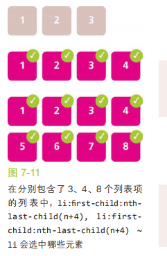
:nth-child()选择符用来命中一个范围,它的参数不仅可以是简单的数字,也可以是像 an+b 这样的表达式(比如 :nth-child(2n+1))。这里的 n 表示一个变量,理论上的范围是 0 到 + ∞。如果使用 n+b 这种形式的表达式(此时相当于 a 的取值为 1),那么不论 n 如何取值,这个表达式都无法产生一个小于 b 的值。因此,n+b 这种形式的表达式可以选中从第 b 个开始的所有子元素。举例来说,:nth-child(n+4) 将会选中除了第一、二、三个子元素之外的所有子元素。如下图:

利用这个技巧,我们可以在列表项的总数是 4 或更多时选中所有列表项。在这种情况下,我们可以把表达式 n+4 传给 :nth-last-child():
li:first-child:nth-last-child(n+4),
li:first-child:nth-last-child(n+4) ~ li {
 /* 当列表至少包含四项时,命中所有列表项 */
}
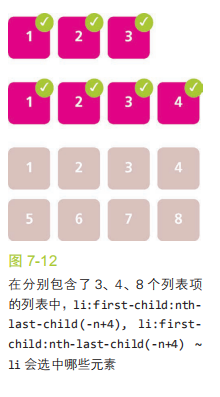
同理,-n+b 这种形式的表达式可以选中开头的 b 个元素。因此,仅当列表中有 4 个或更少的列表项时,要选中所有列表项可以这样写:
li:first-child:nth-last-child(-n+4),
li:first-child:nth-last-child(-n+4) ~ li {
 /* 当列表最多包含四项时,命中所有列表项 */
}
当然,我们还可以把这两种技巧组合起来使用,不过代码也会变得更加复杂。假设我们希望在列表包含 2 ~ 6 个列表项时命中所有的列表项,可以这样写:
li:first-child:nth-last-child(n+2):nth-last-child(-n+6),
li:first-child:nth-last-child(n+2):nth-last-child(-n+6) ~ li {
 /* 当列表包含2~6项时,命中所有列表项 */
}