1.介绍
CSS中的:befor、:after都会创建一个伪元素,其中:befor创建的伪元素是所选元素的第一个子元素,:after创建的伪元素是所选元素的最后一个子元素。
:befor、:after创建的伪元素默认样式为内联样式。
2.语法
/* CSS3 */
selector::before

/* CSS2 */
selector:before
CSS3引入了 ::(两个冒号)是用来区分伪类(:一个冒号)和伪元素(::两个冒号)。
伪类:操作元素本身,如 :hover、:first-child、:focus等等。
伪元素:操作元素的子元素,如 ::before、::after、::content等等。
在IE8中只支持:(一个冒号),所以为了兼容这些浏览器也可以使用 :befor、:after。
3.content属性
content 属性表示伪元素填充的内容。
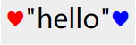
示例:
html:
<div class="test-div">"hello"</div>
css:
.test-div {
    width: 100px;
    height: 100px;
    margin-left: 20px;
    background-color: #eee;
}

.test-div::before {
    content: "♥";
    color: red;
}

.test-div::after {
    content: "♥";
    color: blue;
}
效果:
4.可替换元素
可替换元素(replaced element):其展现不由CSS来控制的。这些元素是一类外观渲染独立于CSS的对象。
典型的可替换元素有<iframe>、<img>、 <object>、 <video> 以及 表单元素,如<textarea>、 <input> 。
某些元素只在一些特殊情况下表现为可替换元素,例如 <audio> 和 <canvas> 。
:befor :after 在此类元素内是不生效的。
5.浏览器支持情况
IE9版本才开始完全支持 :befor :after ,Chrome、Firefox现都已全线支持。
| IE | Edge | Firefox | Chrome | Android Chrome | Ios Safari |
| 9 | all | 2 | all | all | all |
6.应用场景
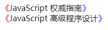
1)支持文本字符
html:
<span class="book">JavaScript 权威指南</span>
<br>
<span class="book">JavaScript 高级程序设计</span>
css:
.book::before {
    content: "《";
    color: red;
}

.book::after {
    content: "》";
    color: blue;
}
效果:
2)支持iconfont
说明:content属性也支持iconfont字体图表的展示。这也是使用最多的场景。
示例:此示例已引用了阿里iconfont图标库
html:
<link rel="stylesheet" href="//at.alicdn.com/t/font_535317_4pkadolrurdrhpvi.css">
<span class="wechat">微信</span>
css:
.wechat::before {
    content: "e85b";
    font-family: "iconfont";
    font-size: 15px;
    font-style: normal;
    color: #44b549;
}
效果:

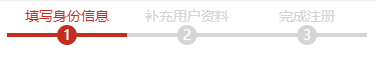
3.1)进度线
说明::befor :after创建的伪元素可以以线条方式定位在元素周边的指定位置上,如进度线和时间线。
html:
<div class="progress-line-wrapper">
    <div class="item active">
        <span class="title">填写身份信息</span>
        <span class="step">1</span>
    </div>
    <div class="item">
        <span class="title">补充用户资料</span>
        <span class="step">2</span>
    </div>
    <div class="item">
        <span class="title">完成注册</span>
        <span class="step">3</span>
    </div>
</div>
css:
.progress-line-wrapper .item {
     120px;
    float: left;
    text-align: center;
    font-size: 14px;
}

.progress-line-wrapper .item .title {
    display: block;
    color: #d5d5d5;
}

.progress-line-wrapper .item .step {
     20px;
    height: 20px;
    display: inline-block;
    position: relative;
    background-color: #d5d5d5;
    color: #fff;
    border-radius: 50%;
    text-align: center;
}

.progress-line-wrapper .item .step::before,
.progress-line-wrapper .item .step::after {
    content: '';
     50px;
    height: 4px;
    background-color: #d5d5d5;
    position: absolute;
    top: 8px;
}

.progress-line-wrapper .item .step::before {
    right: 20px;
}

.progress-line-wrapper .item .step::after {
    left: 20px;
}

/* 激活时样式 */
.progress-line-wrapper .item.active .title {
    color: #c12d1e;
}

.progress-line-wrapper .item.active .step {
    background-color: #c12d1e;
    color: #fff;
}

.progress-line-wrapper .item.active .step::before,
.progress-line-wrapper .item.active .step::after {
    background-color: #c12d1e;
}
效果:
3.2)时间线
html:
<!-- 时间线 -->
<div class="time-line-wrapper">
    <div class="item avtive">
        <span class="title">配送完成</span>
        <span class="time">2018/02/02 18:10</span>
    </div>
    <div class="item">
        <span class="title">开始配送</span>
        <span class="time">2018/02/02 17:40</span>
    </div>
    <div class="item">
        <span class="title">接收订单</span>
        <span class="time">2018/02/02 17:31</span>
    </div>
    <div class="item">
        <span class="title">提交订单</span>
        <span class="time">2018/02/02 17:30</span>
    </div>
</div>
css:
/* 时间线 */

.time-line-wrapper .item {
    position: relative;
    padding-top: 50px;
    margin-left: 20px;
}

.time-line-wrapper .item::before {
    width: 15px;
    height: 15px;
    content: '';
    background-color: #d5d5d5;
    border-radius: 50%;
    position: absolute;
    bottom: 5px;
    left: -20px;
    z-index: 1001;
}

.time-line-wrapper .item::after {
    width: 5px;
    height: 90%;
    content: '';
    background-color: #d5d5d5;
    position: absolute;
    bottom: 15px;
    left: -15px;
    z-index: 1000;
}

/* 时间线的第一个节点,表示目前的状态 */
.time-line-wrapper .item:first-child {
    padding-top: 0px;
}

.time-line-wrapper .item:first-child::before {
    background-color: #3fa6c5;
}

.time-line-wrapper .item:first-child:after {
    display: none;
}
效果:

4)几何图形
说明:通过设置 :befor :after 伪元素的border相关属性,可创建非常多的几何图形;如三角形、多边形、五角星等等。
4.1)矩形
说明:默认情况下,:befor :after 伪元素的border边框属性与其他HTML元素一样。
css:
div::before {
    width: 0px;
    height: 0px;
    content: '';
    position: absolute;
    border-top: 50px solid #f50000;
    border-right: 50px solid #6cc361;
    border-bottom: 50px solid #6167c3;
    border-left: 50px solid #fa00d9;
}
效果:

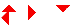
4.2)三角形
说明:显示某一方位的border,并隐藏左右2边的border(背景设置为透明),可让伪元素显示三角形的形状。
html:
<!-- 三角形 -->
<div class="triangle top"></div>
<div class="triangle right"></div>
<div class="triangle bottom"></div>
<div class="triangle left"></div>
css:
.triangle {
    width: 0px;
    height: 0px;
    display: inline-block;
    margin-right: 100px;
    position: relative;
}

.triangle::before {
    width: 0px;
    height: 0px;
    content: '';
    position: absolute;
}

.triangle.top::before {
    border-top: 0px;
    border-right: 30px solid transparent;
    border-bottom: 30px solid #f50000;
    border-left: 30px solid transparent;
}

.triangle.right::before {
    border-top: 30px solid transparent;
    border-right: 0px;
    border-bottom: 30px solid transparent;
    border-left: 30px solid #f50000;
}

.triangle.bottom::before {
    border-top: 30px solid #f50000;
    border-right: 30px solid transparent;
    border-bottom: 0px;
    border-left: 30px solid transparent;
}

.triangle.left::before {
    border-top: 30px solid transparent;
    border-right: 30px solid #f50000;
    border-bottom: 30px solid transparent;
    border-left: 0px;
}
效果:
7.扩展阅读
MDN ::before:https://developer.mozilla.org/en-US/docs/Web/CSS/::before
MDN ::after:https://developer.mozilla.org/en-US/docs/Web/CSS/::after
::before、::after介绍:https://css-tricks.com/pseudo-element-roundup/