通过设置div的border属性,来实现!
将div的height和width属性分别设置为0px,将4边的border值设置为一样的宽度,通过调节边框的颜色课看到效果。
<style>
    div{height: 0px;width: 0px;
        border-top: 20px solid red;
        border-left: 20px solid blue;
        border-right: 20px solid gray;
        border-bottom: 20px solid pink;
    }
    </style>
</head>
<body>
    <div></div>
</body>
即可得到一个由4个三角形组成的正方形。如下图:

接下去,只要设置将另外3边的颜色去掉就可以得到三角形,此时设置border-color为transparent,此时就能得到三角形。
div{height: 0px; 0px;
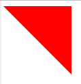
border-top: 20px solid red;
border-left: 20px solid transparent;
border-right: 20px solid transparent;
border-bottom: 20px solid transparent;
}
得到如下图:

另外,transparent为颜色值,等同于rgba(0,0,0,0),透明度为0。然而在IE6中不支持,会默认显示如下图:

==================后续添加=====================
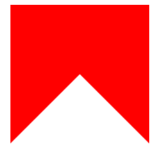
div{
        height: 0;
        width: 0;
        border-top: 100px solid red;
        border-left: 100px solid transparent;
    }
偶尔百度的时候看到,这样的设置会形成2个三角形,是之前没想到的,所以记录下来,嘿嘿,效果如下图:
==================后续添加(伪类)=====================
伪类(::before和::after)做三角形和对话框三角border
    div{margin: 20px auto;height: 200px;width: 200px;position: relative;background: red}
    div::after{
        content: '';
        position: absolute;
        border: 100px solid transparent;
        border-bottom-color: #fff;
        top: 0px;
        left: 0px;
    }
首先设置将伪类元素全部不可见,border的大小取决于height和width的大小,若是top和bottom的边框,则是height的一半。并且通过定位控制位置。效果如下图:
此处情况 after和before均可。
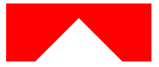
div{margin: 20px auto 0;height: 200px;width: 500px;position: relative;background: red}
    div::after{
        content: '';
        position: absolute;
        border: 250px solid transparent;
        border-bottom-color: #fff;
        top: -200px;
        left: 0px;
    }
当父元素的height和width大小不同时,以bottom部分为例,将border大小设置为父级元素width的一半,此时,三角形的顶部尖角会刚好处于父元素的中央,再通过调节top,让三角上移,注意此时top应设为负值。效果如下:
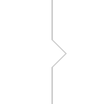
还有经常看到的微信对话框内的三角图形 ,佩服大神的思维,利用重叠两个元素来实现,类似于下图
代码如下:
div{height: 100px;width: 100px;border: 1px solid #ccc;margin: 10px auto;position: relative;}
    div:before{
        content: '';
        height: 0;
        width: 0;
        position: absolute;
        border: 10px solid transparent;
        border-left-color: #ccc;
        top: 40px;
        left: 100px;
    }
    div:after{
        content: '';
        height: 0;
        width: 0;
        position: absolute;
        border: 9px solid transparent;
        border-left-color: #fff;
        top: 41px;
        left: 100px;
    }
此处可以合并很多代码,为了更直观就先这样先放着。
原理:通过设置两个伪元素,通过分别定位,相互重叠,留出1px的非重叠区域,从而达到效果。当然,可以调节top、left、right、bottom来控制三角的方向。