一、单行文本垂直居中:
设置其文本的行高line-height与其父容器高度相等即可。如
<style>
    .test{
            background-color: grey;
            line-height:90px;
        }
</style>
<body>
    <div class="test">文本垂直居中</div>
</body>
效果图如下

二、已定位的盒子实现垂直居中
法一:子盒子绝对定位后设置其高度,margin:auto,且top、right、left、bottom均为0.
<style>
        .container{
            width: 500px;
            height: 500px;
            position: relative;
            background-color: red;
        }
        .absolute-center{
            width: 50%;
            height: 50%;
            overflow: auto;
            margin:auto;
            position: absolute;
            top:0;
            left:0;
            bottom:0;
            right:0;
            background-color: green;
        }
    </style>

<body>
<div class="container">
    <div class="absolute-center">垂直居中</div>
</div>
</body>
效果图如下:

法二:让其子盒子绝对定位后的top:50%,margin-top:-自身高度的一半px;水平居然则设其left与margin-left
<!DOCTYPE html>
<html>
<head lang="en">
    <meta charset="UTF-8">
    <title></title>
    <style>
        .container{
            width: 500px;
            height: 500px;
            position: relative;
            background-color: red;
        }
        .absolute-center{
            width:100px;
            height: 100px;
            position: absolute;
            top:50%;
            margin-top:-50px;
            left:50%;
            margin-left:-50px;
            background-color: green;
        }
    </style>
</head>
<body>
<div class="container">
    <div class="absolute-center">垂直居中</div>
</div>
</body>
</html>
效果图如下:

如果想让其在可视区内永远居中,则需要设置其定位为position:fixed;z-index:999;
法三:当元素的高度不确定时,可配合translate来实现,不过IE9不支持,代码如下:
<!DOCTYPE html>
<html>
<head lang="en">
    <meta charset="UTF-8">
    <title></title>
    <style>
        .parent{
            position: relative;
            height: 300px;
            background-color: grey;
        }
        .child{
            position: absolute;
            top:50%;
            transform:translateY(-50%);
            background-color: green;
        }
    </style>
</head>
<body>
<div class="parent">
    <div class="child">adfadf</div>
</div>
</body>
</html>
三、未定位、未浮动的盒子实现垂直居中
法一:设置其父元素为table-cell布局,配合vertical-align: middle;来实现,如下代码:
<!DOCTYPE html>
<html>
<head lang="en">
    <meta charset="UTF-8">
    <title></title>
    <style>
        .parent{
            display: table-cell;
            vertical-align: middle;
            background-color: grey;
            height: 100px;

        }
        .child{
            background-color: blue;
        }
    </style>
</head>
<body>
<div class="parent">
    <div class="child">table-cell实现的居中</div>
</div>
</body>
</html>
如果已经定位或浮动的元素仍然想用此方法来实现垂直居中,需要在其外面再加一个父盒子包起来便可实现。若要IE7支持,则需要改为<table>表格布局。
法二:若子元素是图片,通过设置父元素的行高来代替高度,且设置父元素的font-size为0
vertical-align:middle的解释是元素的中垂点与父元素的基线加1/2父元素中字母X的高度对齐。由于字符X在em框中并不是垂直居中的,且各个字体的字符X的高低位置不一致。所以,当字体大小较大时,这种差异就更明显。当font-size为0时,相当于把字符X的字体大小设置为0,于是可以实现完全的垂直居中。如下代码:
<!DOCTYPE html>
<html>
<head lang="en">
    <meta charset="UTF-8">
    <title></title>
    <style>
        .parent{
            line-height: 500px;
            fon-size:0;
            background-color: grey;
            width: 500px;

        }
        .child{
            vertical-align: middle;
        }
    </style>
</head>
<body>
<div class="parent">
    <img src="img/shop.png" alt="" class="child"/>
</div>
</body>
</html>
效果图如下:

法三:通过新增元素来实现垂直居中的效果
新增元素设置高度为父级高度,宽度为0,且同样设置垂直居中vertical-align:middle的inline-block元素。由于两个元素之间空白被解析,所以需要在父级设置font-size:0,在子级再将font-size设置为所需值;若结构要求不严格,则可以将两个元素一行显示,则不需要设置font-size:0。代码如下:
<!DOCTYPE html>
<html>
<head lang="en">
    <meta charset="UTF-8">
    <title></title>
    <style>
        .parent{
            height: 100px;
            font-size:0;
            background-color: grey;
            width: 200px;
        }
        .child{
            display: inline-block;
            font-size:20px;
            vertical-align: middle;
            background-color: blue;
        }
        .childSbling{
            display: inline-block;
            height: 100%;
            vertical-align: middle;
        }
    </style>
</head>
<body>
<div class="parent">
    <div class="child">adfadf</div>
    <i class="childSbling"></i>
</div>
</body>
</html>
效果图如下:

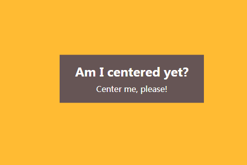
法四:利用VW单位。VW是与视口宽度相关的,1VW表示视口宽度的1%
<!DOCTYPE html>
<html lang="en">

<head>
    <meta charset="UTF-8">
    <meta name="viewport" content="width=device-width, initial-scale=1.0">
    <meta http-equiv="X-UA-Compatible" content="ie=edge">
    <title>Document</title>
    <style>
        * {
            padding: 0;
            margin: 0;
        }
        .main {
            width: 18em;
            padding: 1em 1.5em;
            margin: 50vh auto 0;
            transform: translateY(-50%);
            box-sizing: border-box;
            background: #655;
            color: white;
            text-align: center;
        }
        h1 {
            margin: 0 0 .2em;
            font-size: 150%;
        }
        p {
            margin: 0;
        }
        body {
            background: #fb3;
            font: 100%/1.5 sans-serif;
        }
    </style>
</head>

<body>
    <div class="main">
        <h1>I am a title</h1>
        <p>asdfasdfasdf</p>
    </div>
</body>

</html>
效果如下:
四、使用弹性盒子来实现垂直居中,不过IE9以下不支持。
法一:在父盒子上加display:flex;align-items: center;如下代码:
<!DOCTYPE html>
<html>
<head lang="en">
    <meta charset="UTF-8">
    <title></title>
    <style>
        .parent{
            display: flex;
            align-items: center;
            background-color: grey;
            height: 200px;
        }

    </style>
</head>
<body>
<div class="parent">
    <div class="child">adfadf</div>
</div>
</body>
</html>
效果如下:

法二:在子盒子上加margin:auto 0;代码如下:
<!DOCTYPE html>
<html>
<head lang="en">
    <meta charset="UTF-8">
    <title></title>
    <style>
        .parent{
            display: flex;
            background-color: grey;
            height: 200px;
        }
        .child{
            margin:auto 0;
        }
    </style>
</head>
<body>
<div class="parent">
    <div class="child">子</div>
</div>
</body>
</html>
效果如下:
