安装px2rem-loader
yarn add px2rem-loader --dev
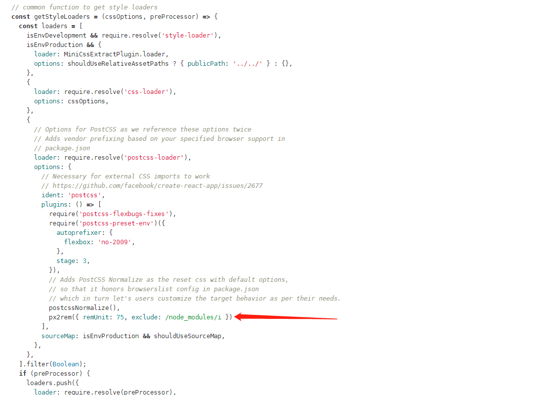
修改build/utils.js
const px2remLoader = {
    loader: 'px2rem-loader',
    options: {
      remUnit: 192//这是设计稿的尺寸1920/10
    }
}

// generateLoaders函数

const loaders = options.usePostCSS ? [cssLoader, px2remLoader, postcssLoader] : [cssLoader, px2remLoader]
引入lib-flexible.js 或者 手动设置根标签fontSize
- main.js中引入lib-flexible
// refreshRem函数修改(修改lib-flexible原文件)
if (width / dpr > 540) {//这里有个插件设置的参数,当它大于540的时候最大用540适配,pc肯定大于540了,它就会以540去自适应,指定不行啊/所以怎么办,搞它
          //width = 540 * dpr;
          //修改为以宽度设置,我管你多大啊,你有多大我就有多兼容
          width = width * dpr;
}
- main.js中加入下边代码
window.onresize = setHtmlFontSize;
function setHtmlFontSize(){
    const htmlWidth = document.documentElement.clientWidth || document.body.clientWidth;
    const htmlDom = document.getElementsByTagName('html')[0];
    htmlDom.style.fontSize = htmlWidth / 10 + 'px';
};
setHtmlFontSize();
注:
- 最后一步一定要在Vue实例之前操作
-
px2rem-loader 引用了 px2rem ,配置同 px2rem(比如/*no*/会忽略px转为rem等等)
- 在scss中/*no*/不生效,可以将px写为PX
- px2rem-loader会将项目中所有文件中的px(符合转换条件)转为rem,包括node_modules中引用的第三方库,
解决方法:postcss-px2rem-exclude插件(之前写react的时候遇到过,还请自测是否有效)
// webpack.config.js
const px2rem = require('postcss-px2rem-exclude')

// 新增下边配置 (所有第三方库中的px均不会被转为rem)
px2rem({ remUnit: 75, exclude: /node_modules/i })