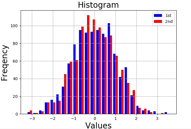
1.绘制频率图
import numpy as np
import matplotlib.pyplot as plt

y = np.random.standard_normal((1000,2))

# 画图
plt.figure(figsize=(7,5))
plt.hist(y,label=['1st','2nd'],color=['b','r'],bins=25)   # 绘制频率图的命令
plt.grid(True)
plt.legend(loc=0)
plt.xlabel('Values',size=20)
plt.ylabel('Freqency',size=20)
plt.title('Histogram',size=20)
plt.show()
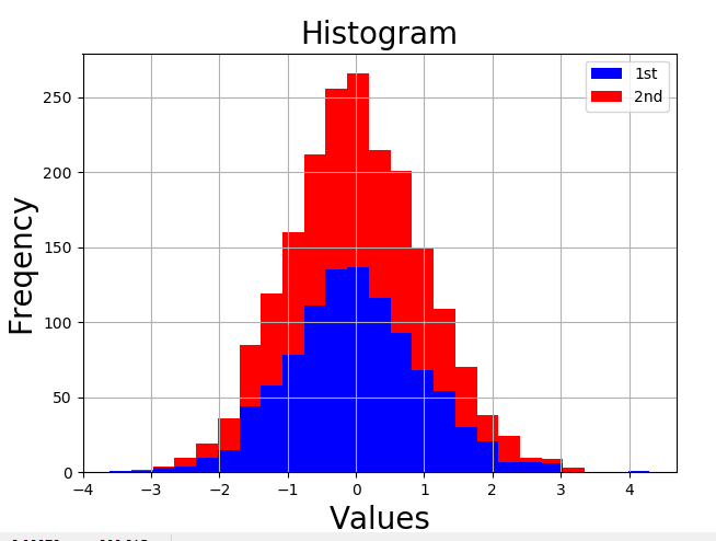
2.累计图
import numpy as np
import matplotlib.pyplot as plt

y = np.random.standard_normal((1000,2))

# 画图
plt.figure(figsize=(7,5))
plt.hist(y,label=['1st','2nd'],color=['b','r'],stacked=True,bins=25)   # 绘制频率图的命令
plt.grid(True)
plt.legend(loc=0)
plt.xlabel('Values',size=20)
plt.ylabel('Freqency',size=20)
plt.title('Histogram',size=20)
plt.show()
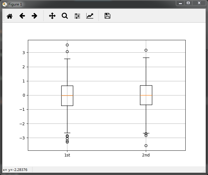
3.箱体图
import numpy as np
import matplotlib.pyplot as plt

y = np.random.standard_normal((1000,2))

# 画图
fig,ax=plt.subplots(figsize=(7,5))     # 绘制图形 坐标轴为ax
plt.boxplot(y)
plt.grid(True)
plt.setp(ax,xticklabels=['1st','2nd']) # 将x轴的坐标改为。。
plt.show()