目录:
盒子阴影
轮廓线
清除浮动带来的影响的方法
两种标签的边距问题
变态盒模型
练习之拼接图
相对定位
绝对定位
练习之船图
盒子阴影
<!DOCTYPE html>
<html lang="en">
<head>
    <meta charset="UTF-8">
    <style>
        #div1{
            width: 300px;
            height: 300px;
            margin: 0 auto;
            background-color: #878787;
            box-shadow: 10px 5px 0px 0px green;
            /*x轴偏移  y轴偏移    模糊范围    阴影扩展范围  阴影颜色*/
        }
    </style>
    <title>Title</title>
</head>
<body>
<div id="div1">
</div>
</body>
</html>
运行图

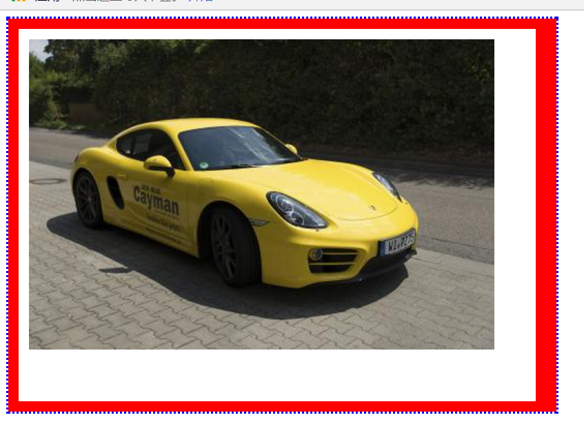
轮廓线
案例一
<!DOCTYPE html>
<html lang="en">
<head>
    <meta charset="UTF-8">
    <style>
        #div1 {
            width: 475px;
            height: 330px;
            border: 10px solid red;
            border-right: 20px solid red;
            padding: 10px 15px 20px 10px;
            outline: 2px dotted blue;/*轮廓线*/
        }
    </style>
    <title>保时捷+轮廓线</title>
</head>
<body>
<div id="div1">
    <img src="../../img/baoshijie.jpg" alt="" width="450" height="300">
</div>
</body>
</html>
运行图
案例2
<!DOCTYPE html>
<html lang="en">
<head>
    <meta charset="UTF-8">
    <style>
        input:focus{
            outline: none;/*指针选取时,没有轮廓线*/
        }
    </style>
    <title>轮廓线</title>
</head>
<body>
姓名:<input type="text"> <br>
姓名:<input type="text">
</body>
</html>
运行图
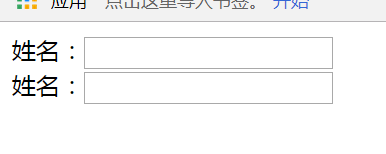
如果没有
input:focus{
            outline: none;/*指针选取时,没有轮廓线*/
        }
这段,鼠标指针点击输入框,输入框边框会变蓝色,有了这段,变化只是输入框里出现光标。
浮动:怎么清除浮动带来的影响
有两种方法,全在代码里标注起来了
<!DOCTYPE html>
<html lang="en">
<head>
    <meta charset="UTF-8">
    <style>
        #div1{
            height: 100px;
            background-color: red;
        }
        #div2{
            /*height: 400px;*/
            background-color: yellow;
            overflow: hidden;
        }
        #div3{
            height: 100px;
            background-color: green;
            clear: both;
        }
        #div21{
            width: 20%;
            height: 750px;
            background-color: aqua;
            float: left;
        }
        #div22{
            width: 60%;
            height: 750px;
            background-color: aquamarine;
            float: left;
        }
        #div23{
            width: 10%;
            height: 750px;
            background-color: bisque;
            float: left;
        }
        /*#div26{!*方法一:清除浮动野路子*!
            clear: both;
        }*/
        /*.clearfix{
            zoom: 1;!*兼容模式:给ie低版本*!
        }
        .clearfix:after{ !*方法二:清除浮动best方法*!
            content: "";
            display: block;
            clear: both;
        }*/
    </style>
    <title>浮动:怎么清除浮动带来的影响</title>
</head>
<body>
<div>
    <div id="div1"></div>
    <div id="div2" class="clearfix">
        <div id="div21">左</div>
        <div id="div22">中</div>
        <div id="div23">右</div>
        <!--<div id="div26"></div>-->
    </div>
    <div id="div3"></div>
</div>
</body>
</html>
行级标签和块级标签 两种盒子模型的外边距问题
<!DOCTYPE html>
<html lang="en">
<head>
    <meta charset="UTF-8">
    <style>
        span {
            height: 20px;
            background-color: #878787;
        }

        #s1 {
            margin-right: 20px;
        }

        #s2 {
            margin-left: 30px;
        }
        /*距离相加*/
        div {
            height: 30px;
            background-color: red;
        }

        #div1 {
            margin-bottom: 20px;
        }

        #div2 {
            margin-top: 30px;
        }
        /*距离选最大的展示*/
    </style>
    <title>Margin</title>
</head>
<body>
<span id="s1">asdfasf</span>
<span id="s2">asfdasfa</span>
<div id="div1"></div>
<div id="div2"></div>
</body>
</html>
运行图
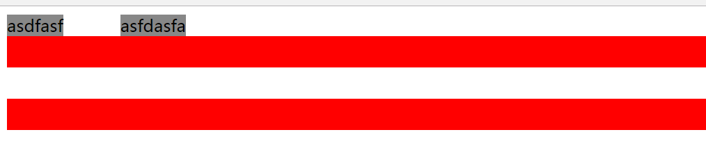
结果:span两个盒子左右相距50px div两个盒子上下相距30px
知识点:span标签是行级,所以看她的margin左右边距,会发现 两个span盒子模型的最终距离是margin边距相加的
div标签是块级,看他的margin上下边距,会发现 两个div盒子的最终距离 展现的是其中margin边距最大的
变态盒模型
<!DOCTYPE html>
<html lang="en">
<head>
    <meta charset="UTF-8">
    <style>
        * {
            padding: 0;
            margin: 0;
        }

        #left {
            height: 100px;
            width: 20%;
            background-color: #F2AD0A;
            float: left;
            border: 1px solid green;
        }

        #center {
            height: 100px;
            width: 60%;
            background-color: #FF0000;
            float: left;
        }

        #right {
            height: 100px;
            width: 20%;
            background-color: #FFFF00;
            float: left;
        }
    </style>
    <title>怪异盒子模型</title>
</head>
<body>

<div>
    <div id="left"></div>
    <div id="center"></div>
    <div id="right"></div>
</div>

</body>
</html>
运行图

<!DOCTYPE html>
<html lang="en">
<head>
    <meta charset="UTF-8">
    <style>
        * {
            padding: 0;
            margin: 0;
        }

        #left {
            height: 100px;
            width: 20%;
            background-color: #F2AD0A;
            float: left;
            border: 1px solid green;
            /*变态盒模型*/
            box-sizing: border-box; /*内容区变少了*/
        }

        #center {
            height: 100px;
            width: 60%;
            background-color: #FF0000;
            float: left;
        }

        #right {
            height: 100px;
            width: 20%;
            background-color: #FFFF00;
            float: left;
        }
    </style>
    <title>怪异盒子模型</title>
</head>
<body>

<div>
    <div id="left"></div>
    <div id="center"></div>
    <div id="right"></div>
</div>

</body>
</html>
运行图

上边两个运行图的差别就是有无
box-sizing: border-box;这段的区别。
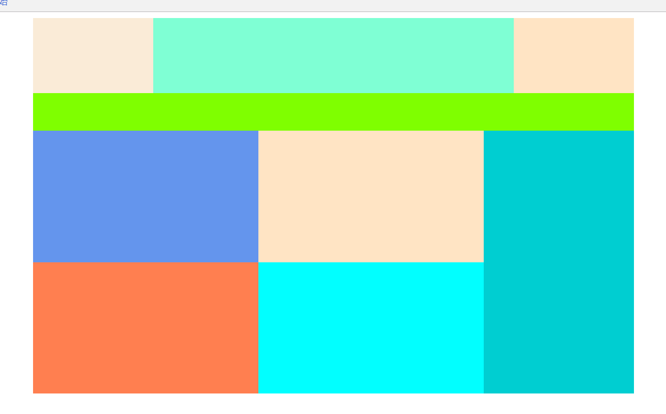
练习之拼接图:
<!DOCTYPE html>
<html lang="en">
<head>
    <meta charset="UTF-8">
    <style>
        #container {
            height: 500px;
            width: 800px;
            margin: 0 auto;
        }

        #top {
            height: 100px;
        }

        #tleft {
            height: 100px;
            width: 20%;
            background-color: antiquewhite;
            float: left;
        }

        #tcenter {
            height: 100px;
            width: 60%;
            background-color: aquamarine;
            float: left;
        }

        #tright {
            height: 100px;
            width: 20%;
            background-color: bisque;
            float: left;
        }

        #center {
            height: 50px;
            background-color: chartreuse;
        }

        #bottom {
            height: 350px;
        }

        #bleft {
            height: 350px;
            width: 75%;
            float: left;
        }

        #bright {
            height: 350px;
            width: 25%;
            background-color: darkturquoise;
            float: left;
        }

        #btop {
            height: 50%;
        }

        #btleft {
            height: 100%;
            width: 50%;
            background-color: cornflowerblue;
            float: left;
        }

        #btright {
            height: 100%;
            width: 50%;
            background-color: bisque;
            float: left;
        }

        #bbottom {
            height: 50%;
        }

        #bbleft {
            height: 100%;
            width: 50%;
            background-color: coral;
            float: left;
        }

        #bbright {
            height: 100%;
            width: 50%;
            background-color: cyan;
            float: left;
        }
    </style>
    <title>色彩图拼接</title>
</head>
<body>
<div id="container">
    <div id="top">
        <div id="tleft"></div>
        <div id="tcenter"></div>
        <div id="tright"></div>
    </div>
    <div id="center"></div>
    <div id="bottom">
        <div id="bleft">
            <div id="btop">
                <div id="btleft"></div>
                <div id="btright"></div>
            </div>
            <div id="bbottom">
                <div id="bbleft"></div>
                <div id="bbright"></div>
            </div>
        </div>
        <div id="bright"></div>
    </div>
</div>
</body>
</html>
运行图:
相对定位:
<!DOCTYPE html>
<html lang="en">
<head>
    <meta charset="UTF-8">
    <style>
        /*相对定位:
            1:相对与自己原来的位置进行定位
            2:移动以后,自己原来的位置不会被其他元素占用*/
        #left {
            height: 50px;
            width: 200px;
            background-color: aqua;
            float: left;
        }

        #center {
            height: 50px;
            width: 200px;
            background-color: antiquewhite;
            float: left;
            position: relative;
            top: 20px;
            left: 50px;
            z-index: -1; /*有这条代码就会让right盖住center*/
        }

        #right {
            height: 50px;
            width: 200px;
            background-color: aquamarine;
            float: left;
        }
    </style>
    <title>相对定位</title>
</head>
<body>
<div id="left"></div>
<div id="center"></div>
<div id="right"></div>
</body>
</html>
运行图

绝对定位:
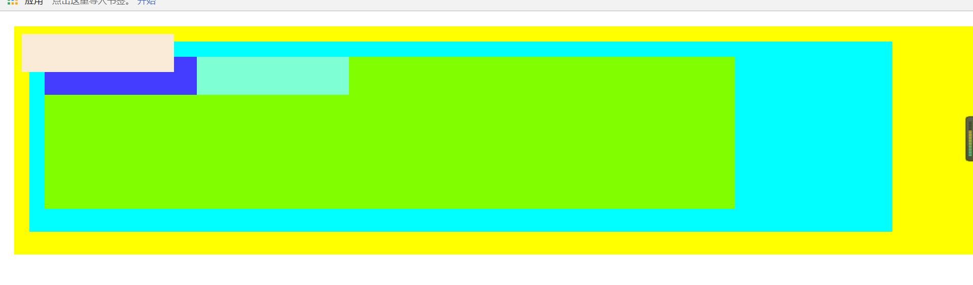
<!DOCTYPE html>
<html lang="en">
<head>
    <meta charset="UTF-8">
    <style>
        * {
            padding: 0px;
            margin: 0px;
        }

        #div1 {
            height: 300px;
            background-color: #FFFF00;
            margin: 20px 0 0 20px;
            overflow: hidden;
            position: relative;
        }

        #div2 {
            height: 250px;
            width: 90%;
            background-color: aqua;
            margin: 20px 0 0 20px;
            overflow: hidden;
        }

        #div3 {
            height: 200px;
            width: 80%;
            background-color: chartreuse;
            margin: 20px 0 0 20px;
            overflow: hidden;
        }

        #left {
            height: 50px;
            width: 200px;
            background-color: #433eff;
            float: left;
        }

        #center {
            height: 50px;
            width: 200px;
            background-color: antiquewhite;
            float: left;
            position: absolute;
            top: 10px;
            left: 10px;
        }

        #right {
            height: 50px;
            width: 200px;
            background-color: aquamarine;
            float: left;
        }
    </style>
    <title>绝对定位</title>
</head>
<body>
<!--绝对定位:
        1:相对于,离他最近的,bingqie使用了定位的父元素
                    如果没有符合的,最后以body为基准。
        2:元素原来的空间会被其他元素占用。-->
<div id="div1">
    <div id="div2">
        <div id="div3">
            <div id="left"></div>
            <div id="center"></div>
            <div id="right"></div>
        </div>
    </div>
</div>
</body>
</html>
运行图
案例之船图:
<!DOCTYPE html>
<html lang="en">
<head>
    <meta charset="UTF-8">
    <style>
        #container {
            width: 306px;
            height: 142px;
            background-image: url("../../img/duo.png");
            margin: 0 auto;
            margin-top: 50px;
        }

        #img1 {
            position: relative;
            top: 25px;
            left: 0px;
            opacity: 0;
        }

        #img1:hover {
            opacity: 1;
        }

        #img2 {
            position: relative;
            top: -33px;
            left: -64px;
            opacity: 0;
        }

        #img2:hover {
            opacity: 1;
        }

        #img3 {
            position: relative;
            top: -148px;
            left: 160px;
            opacity: 0;
        }

        #img3:hover {
            opacity: 1;
        }

        #img4 {
            position: relative;
            top: -90px;
            left: 99px;
            opacity: 0;
        }

        #img4:hover {
            opacity: 1;
        }
    </style>
    <title>船图</title>
</head>
<body>
<div id="container">
    <img src="../../img/duo1.png" alt="1" id="img1">
    <img src="../../img/duo2.png" alt="2" id="img2">
    <img src="../../img/duo3.png" alt="3" id="img3">
    <img src="../../img/duo4.png" alt="4" id="img4">

</div>
</body>
</html>
运行图

运行效果是鼠标指针点在哪个图标上,那个图标就会展现成放大外凸