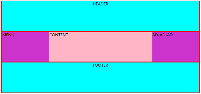
Flex:Holy Grail
<html>
<head>

<style type="text/css">
body,div,header,main,nav,aside,
footer{
  border: solid 1px red;
}
.HolyGrail {
  display: flex;
  min-height: 90vh;
  flex-direction: column;
}

header,
footer {
  flex: 1;
  background-color:#00ffff;
  text-align:center;

}

.HolyGrail-body {
  display: flex;
  flex: 1;
}

.HolyGrail-content {
  flex: 1;
}

.HolyGrail-nav, .HolyGrail-ads {
  /* 两个边栏的宽度设为12em */
  flex: 0 0 12em;
}

.HolyGrail-nav {
  /* 导航放到最左边 */
  order: -1;
}
如果是小屏幕,躯干的三栏自动变为垂直叠加。

@media (max- 768px) {
  .HolyGrail-body {
    flex-direction: column;
    flex: 1;
  }
  .HolyGrail-nav,
  .HolyGrail-ads,
  .HolyGrail-content {
    flex: auto;
  }
}
.HolyGrail-nav,.HolyGrail-ads{
   background-color:#cc33cc;
}
.HolyGrail-content{
    background-color:#FFB5C5;
}
</style>
</head>


<body class="HolyGrail">
  <header>HEADER</header>
  <div class="HolyGrail-body">
    <main class="HolyGrail-content">CONTENT</main>
    <nav class="HolyGrail-nav">MENU</nav>
    <aside class="HolyGrail-ads">AD-AD-AD</aside>
  </div>
  <footer>FOOTER</footer>
</body>

</html>