修改折线图大小
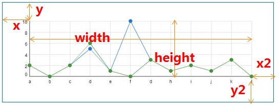
myChart.setOption({
title:{ text:"价格指数" }, grid:{ x:25, y:45, x2:5, y2:20, borderWidth:1 }, ....饼图修改颜色
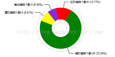
- option = {
- title : {
- text: '全局指标状态分布图',
- x:'left',
- y:'top'
- },
- tooltip : {
- show: true,
- formatter: "{a} <br/>{b} : {c} ({d}%)"
- },
- color:['red', 'green','yellow','blueviolet']
- }
tooltip 提示换行
itemStyle: {
normal:{
label:{
show:true,
formatter: '{b} : {c}
({d}%)'
},
labelLine:{
show:true
}
},
修改 X 轴,Y 轴 颜色,粗细
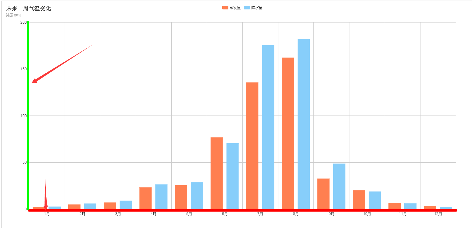
xAxis : [
                {
                    type : 'category',
                    data : ['1月','2月','3月','4月','5月','6月','7月','8月','9月','10月','11月','12月'],
                    //设置轴线的属性
                    axisLine:{
                        lineStyle:{
                            color:'#FF0000',
                            8,//这里是为了突出显示加上的
                        }
                    }
                }
            ],
            yAxis : [
                {
                    type : 'value',
                    //设置轴线的属性
                    axisLine:{
                        lineStyle:{
                            color:'#00FF00',
                            8,//这里是为了突出显示加上的
                        }
                    }
                }