Responsive Web Design is regarded as being the approach which suggests that web design and development should respond to the end-user’s behavior and environment based on their screen size, platform and orientation.
Responsiveness consists of a mix of flexible grids and layouts, images and an intelligent use of CSS media queries. When the end-user switches from their laptop over to their iPad, the website being viewed should automatically switch to accommodate that particular resolution, image size and scripting abilities.
In other words, the website should have the technology to automatically respond to the end-user’s preferences. This would eliminate the need for a different design and development phase every time a new gadget device is introduced on the market.
Along with all of the newest devices – also come varying screen resolutions, definitions and orientations. New devices with different screen resolutions are being developed every day, and each of these devices are able to handle variations in size, functionality as well as color.
With Responsiveness aimed at crafting sites to provide an optimal viewing experience, modern built web sites must now be able to support basic mobile devices that lack JavaScript. There are now many ways of validating and testing Responsive Web Designed websites, ranging from mobile site validators and mobile emulators to simultaneous testing tools.
In this article we would like to introduce our readers to several such tools by which to detect the Responsiveness of a website. Enjoy !
1. ProtoFluid 4
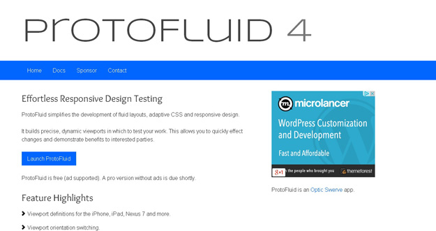
ProtoFluid simplifies the development of fluid layouts, adaptive CSS and responsive design. It builds precise, dynamic viewports in which to test your work. This allows you to quickly effect changes and demonstrate benefits to interested parties. It is free and lets you use other extensions like FireBug.
2. Viewport Resizer
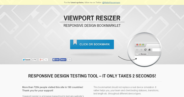
Viewport resizer is a browser-based tool to test any website’s responsiveness. Just save the bookmarklet, go to the page you want to test, click on your created bookmarklet and check all kinds of screen resolutions of the page. The smartest way to share your defined environment of devices and breakpoints directly with your team and client. However, this bookmarklet should not replace a real device simulation. It rather helps you, your team and client testing statuses, transitions, text length etc. throughout different device types.
3. Responsive.IS
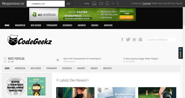
Responsive.Is is developed by TypeCast another impressive responsive design testing tool, which you can use to test your responsive design. Just type in a URL, and it will automatically change its size depending on the device you choose.
4. Respondr
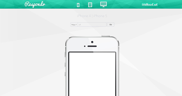
Respondr is a lightweight, pretty useful and handy tool that lets you test your websites on different devices. You need to enter the URL of the site/page that you want to test, and then select the device of your choice. You can select an iPhone, iPad, or desktop.
5. Froont
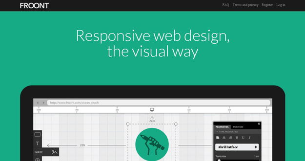
FROONT is a web-based design tool that runs in the browser and makes responsive web design accessible to all kinds of visual designers, even those without any coding skills.
FROONT makes responsive web design visual. Design can be done in-browser with intuitive drag-and-drop tools. After all, humans judge design with their eyes therefore it seems just normal to see right away how designs will look across all different screen sizes. Each project has its own URL,that makes it easy to test the designs on real devices right away.
6. Responsivepx
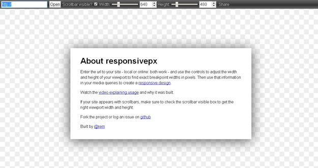
With responsivepx you need to Enter the url to your site – local or online: both work – and use the controls to adjust the width and height of your viewport to find exact breakpoint widths in pixels. Then use that information in your media queries to create a responsive design.
7. Responsive Web Design Testing Tool
Responsive Web Design Testing tool has been built to help with testing your responsive websites while you design and build them.
8. Screenfly
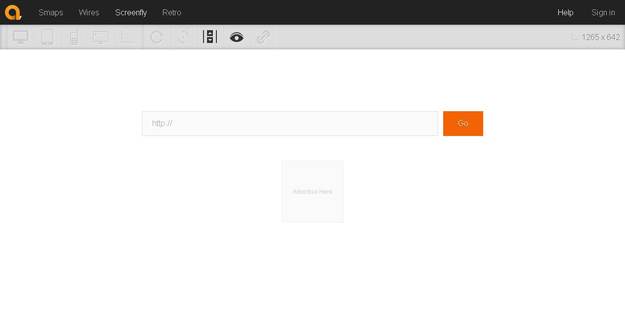
Screenfly lets you enter a URL to test, and then you choose phone, tablet, desktop, or TV. You can also enter a custom screensize, rotate the screen, and generate a URL to share with others for testing.
9. Review.js
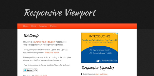
ReView is a dynamic viewport system that provides efficient responsive web design viewing choice. Developed in pure JavaScript according to the principles of core (mobile) first progressive enhancement. The system provides both initial ‘Opt-In’ and ‘Opt-Out’ responsive design states.
10. Responsinator
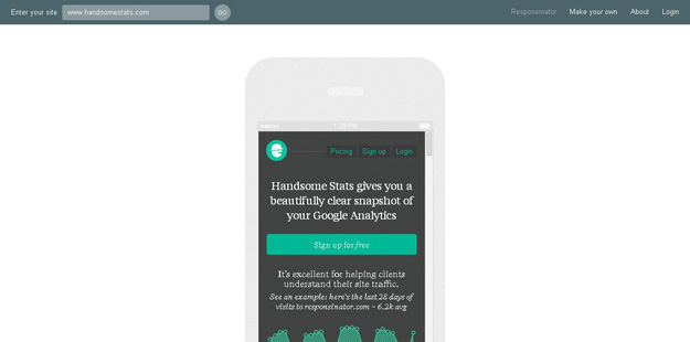
Responsinator helps website makers quickly get an indication of how their responsive site will look on the most popular devices Responsivator lets you test your web applications iphone and ipad, kindle and Android platform. It also shows your site both in portrait and landscape mode.
11. Resizemybrowser
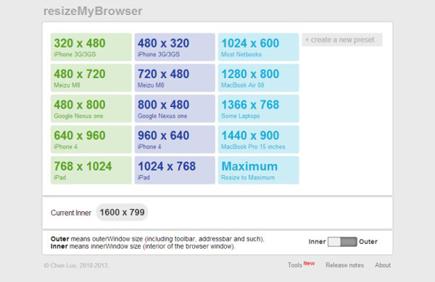
resizeMyBrowser allows you to choose the dimensions of your browser for testing. You can choose between 15 different presets, or you can enter your own custom screen sizes.
12. Responsive Design Bookmarklet
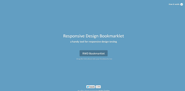
It’s a simple responsive design testing tool, you need to drag the bookmarklet above your bookmarks bar and it will be applied in your browser. You can then choose to preview the current page on screen widths the size of tablets and smartphones.
13. Adobe Edge Inspect CC
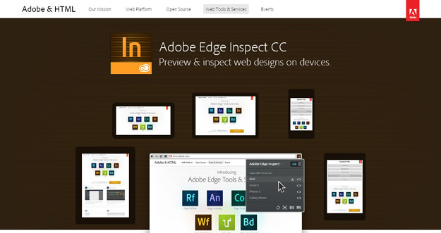
Adobe Edge lets you preview and inspect web designs on devices.
14. I am mobile
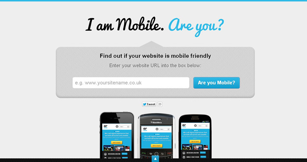
I am mobile is another good responsive design testing tool that test your web sites on various viewports and also gives you some tips to make your websites more mobile friendly.
15. Retina Images
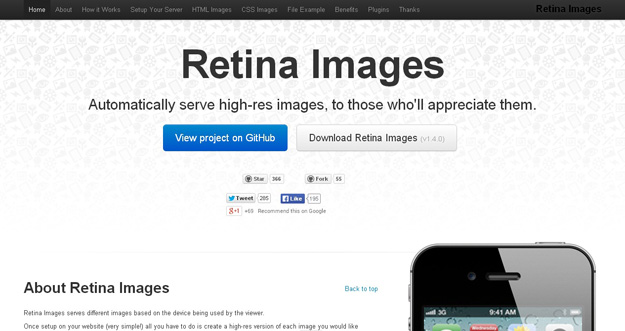
Retina Images serves different images based on the device being used by the viewer.
Once setup on your website (very simple!) all you have to do is create a high-res version of each image you would like optimized for retina screens and all the work is done for you. You don’t even need to change any img tags (providing they have a height or width).
原文来自于:http://codegeekz.com/responsive-web-design-testing-tools/