语法:
@media mediatype and|not|only (media feature) {
    CSS-Code;
}
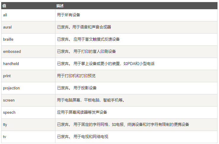
mediatype媒体类型:


实现方式:
@media screen and (min- **px) and (max- **px){
CSS-Code;
}
CSS-Code:
.row{
    &:after{
        content:"";
        height:0;
        display:block;
        clear:both;
    }
    zoom:1;
}
[class*="col-"]{
    float:left;
    box-sizing: border-box;
}
@media screen and (min- 0px) and (max- 768px){
    .col-xs-0{
         0%;
        overflow: hidden;
    }
    .col-xs-1{
         4.16666667%;
    }
    .col-xs-2{
         8.333333333%;
    }
    .col-xs-3{
         12.5%;
    }
    .col-xs-4{
         16.66666667%;
    }
    .col-xs-5{
         20.83333333%;
    }
    .col-xs-6{
         25%;
    }
    .col-xs-7{
         29.16666667%;
    }
    .col-xs-8{
         33.33333333%;
    }
    .col-xs-9{
         37.5%;
    }
    .col-xs-10{
         41.66666667%;
    }
    .col-xs-11{
         45.83333333%;
    }
    .col-xs-12{
         50%;
    }
    .col-xs-13{
         54.16666667%;
    }
    .col-xs-14{
         58.33333333%;
    }
    .col-xs-15{
         62.5%;
    }
    .col-xs-16{
         66.66666667%;
    }
    .col-xs-17{
         70.83333333%;
    }
    .col-xs-18{
        75%;
    }
    .col-xs-19{
         71.16666667%;
    }
    .col-xs-20{
        83.33333333%;
    }
    .col-xs-21{
         87.5%;
    }
    .col-xs-22{
        91.66666667%;
    }
    .col-xs-23{
         95.83333333%;
    }
    .col-xs-24{
        100%;
    }
}
@media screen and (min- 769px) and (max- 1024px){
    .col-sm-0{
         0%;
        overflow: hidden;
    }
    .col-sm-1{
         4.16666667%;
    }
    .col-sm-2{
         8.333333333%;
    }
    .col-sm-3{
         12.5%;
    }
    .col-sm-4{
         16.66666667%;
    }
    .col-sm-5{
         20.83333333%;
    }
    .col-sm-6{
         25%;
    }
    .col-sm-7{
         29.16666667%;
    }
    .col-sm-8{
         33.33333333%;
    }
    .col-sm-9{
         37.5%;
    }
    .col-sm-10{
         41.66666667%;
    }
    .col-sm-11{
         45.83333333%;
    }
    .col-sm-12{
         50%;
    }
    .col-sm-13{
         54.16666667%;
    }
    .col-sm-14{
         58.33333333%;
    }
    .col-sm-15{
         62.5%;
    }
    .col-sm-16{
         66.66666667%;
    }
    .col-sm-17{
         70.83333333%;
    }
    .col-sm-18{
        75%;
    }
    .col-sm-19{
         71.16666667%;
    }
    .col-sm-20{
        83.33333333%;
    }
    .col-sm-21{
         87.5%;
    }
    .col-sm-22{
        91.66666667%;
    }
    .col-sm-23{
         95.83333333%;
    }
    .col-sm-24{
        100%;
    }
}
@media screen and (min- 1025px) and (max- 1200px){
    .col-md-0{
         0%;
        overflow: hidden;
    }
    .col-md-1{
         4.16666667%;
    }
    .col-md-2{
         8.333333333%;
    }
    .col-md-3{
         12.5%;
    }
    .col-md-4{
         16.66666667%;
    }
    .col-md-5{
         20.83333333%;
    }
    .col-md-6{
         25%;
    }
    .col-md-7{
         29.16666667%;
    }
    .col-md-8{
         33.33333333%;
    }
    .col-md-9{
         37.5%;
    }
    .col-md-10{
         41.66666667%;
    }
    .col-md-11{
         45.83333333%;
    }
    .col-md-12{
         50%;
    }
    .col-md-13{
         54.16666667%;
    }
    .col-md-14{
         58.33333333%;
    }
    .col-md-15{
         62.5%;
    }
    .col-md-16{
         66.66666667%;
    }
    .col-md-17{
         70.83333333%;
    }
    .col-md-18{
        75%;
    }
    .col-md-19{
         71.16666667%;
    }
    .col-md-20{
        83.33333333%;
    }
    .col-md-21{
         87.5%;
    }
    .col-md-22{
        91.66666667%;
    }
    .col-md-23{
         95.83333333%;
    }
    .col-md-24{
        100%;
    }
}
@media screen and (min- 1201px){
    .col-lg-0{
         0%;
        overflow: hidden;
    }
    .col-lg-1{
         4.16666667%;
    }
    .col-lg-2{
         8.333333333%;
    }
    .col-lg-3{
         12.5%;
    }
    .col-lg-4{
         16.66666667%;
    }
    .col-lg-5{
         20.83333333%;
    }
    .col-lg-6{
         25%;
    }
    .col-lg-7{
         29.16666667%;
    }
    .col-lg-8{
         33.33333333%;
    }
    .col-lg-9{
         37.5%;
    }
    .col-lg-10{
         41.66666667%;
    }
    .col-lg-11{
         45.83333333%;
    }
    .col-lg-12{
         50%;
    }
    .col-lg-13{
         54.16666667%;
    }
    .col-lg-14{
         58.33333333%;
    }
    .col-lg-15{
         62.5%;
    }
    .col-lg-16{
         66.66666667%;
    }
    .col-lg-17{
         70.83333333%;
    }
    .col-lg-18{
        75%;
    }
    .col-lg-19{
         71.16666667%;
    }
    .col-lg-20{
        83.33333333%;
    }
    .col-lg-21{
         87.5%;
    }
    .col-lg-22{
        91.66666667%;
    }
    .col-lg-23{
         95.83333333%;
    }
    .col-lg-24{
        100%;
    }
}
说明:
1、父元素设置class.row清除它的子元素col-**的浮动,避免浮动造成的父元素高度的塌陷;
2、.col-**-0使该元素在对应条件下隐藏;
3、.col-**设置:box-sizing:border-box是我自己习惯用传统的盒子模型。