移动translate


<!doctype html>

<html>
<head>
    <meta charset="utf-8">
    <title>boxshadow</title>
    <style>
        .wrapper {
             200px;
            height: 200px;
            border: 2px dotted red;
            margin: 20px auto;
        }
        .wrapper div {
             200px;
            height: 200px;
            line-height: 200px;
            text-align: center;
            background:rosybrown;
            color:blueviolet;
            -webkit-transform: translate(50px,100px);
            -moz-transform:translate(50px,100px);
            transform: translate(50px,100px);
        }
    </style>
</head>

<body>
<div class="wrapper">
    <div>我向右向下移动</div>
</div>
</body>
</html

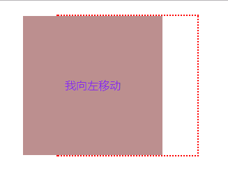
<!doctype html>
<html>
<head>
    <meta charset="utf-8">
    <title>boxshadow</title>
    <style>
        .wrapper {
             200px;
            height: 200px;
            border: 2px dotted red;
            margin: 20px auto;
        }
        .wrapper div {
             200px;
            height: 200px;
            line-height: 200px;
            text-align: center;
            background:rosybrown;
            color:blueviolet;
            -webkit-transform: translate(-50px);
            -moz-transform:translate(-50px);
            transform: translate(-50px);
        }
    </style>
</head>

<body>
<div class="wrapper">
    <div>我向左移动</div>
</div>
</body>
</html>
效果:
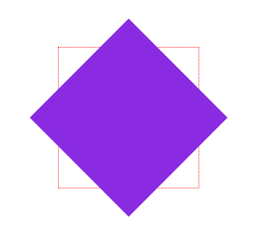
CSS3变形--旋转 rotate()
<!doctype html>
<html>
<head>
    <meta charset="utf-8">
    <title></title>
    <style>
        .wrapper {
             200px;
            height: 200px;
            border: 1px dotted red;
            margin: 100px auto;
        }
        .wrapper div {
             200px;
            height: 200px;
            background: blueviolet;
            -webkit-transform: rotate(45deg);
            transform: rotate(45deg);
        }
    </style>
</head>

<body>
<div class="wrapper">
    <div></div>
</div>
</body>
</html>
<!doctype html>
<html>
<head>
    <meta charset="utf-8">
    <title></title>
    <style>
        .wrapper {
             200px;
            height: 200px;
            border: 1px dotted red;
            margin: 100px auto;
        }
        .wrapper div {
             200px;
            height: 200px;
            background: orange;
            -webkit-transform: rotate(-20deg);
            transform: rotate(-20deg);

        }
    </style>
</head>

<body>
<div class="wrapper">
    <div></div>
</div>
</body>
</html>
演示结果 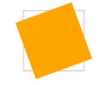
CSS3中的变形--缩放 scale()
<!doctype html>
<html>
<head>
    <meta charset="utf-8">
    <title></title>
    <style>

        .wrapper {
             200px;
            height: 200px;
            border:2px dashed red;
            margin: 100px auto;
        }
        .wrapper div {
             200px;
            height: 200px;
            line-height: 200px;
            background: orange;
            text-align: center;
            color: #fff;
        }
        .wrapper div:hover {
            opacity: .5;
            -webkit-transform: scale(1.5);
            -moz-transform:scale(1.5)
            transform: scale(1.5);
        }
    </style>
</head>

<body>
<div class="wrapper">
    <div>我将放大1.5倍</div>
</div>
</body>
</html>
演示结果

CSS3中的变形--矩阵 matrix()
<!doctype html>
<html>
<head>
    <meta charset="utf-8">
    <title></title>
    <style>

        .wrapper {
             200px;
            height: 200px;
            border: 2px dotted red;
            margin: 40px auto;
        }
        .wrapper div {
            200px;
            height: 200px;
            background: blueviolet;
            -webkit-transform: matrix(1,0,0,1,50,50);
            -moz-transform:matrix(1,0,0,1,50,50);
            transform: matrix(1,0,0,1,50,50);
        }
    </style>
</head>

<body>
<div class="wrapper">
    <div></div>
</div>
</body>
</html>
演示结果:

matrix(scaleX(),skewX(),skewY(),scaleY(),translateX(),translateY()); 扭曲缩放加位移
X轴缩放,X轴扭曲,Y轴扭曲,Y轴缩放,X轴位移,Y轴位移
a为元素的水平伸缩量,1为原始大小;
b为纵向扭曲,0为不变;
c为横向扭曲,0不变;
d为垂直伸缩量,1为原始大小;
e为水平偏移量,0是初始位置;
f为垂直偏移量,0是初始位置
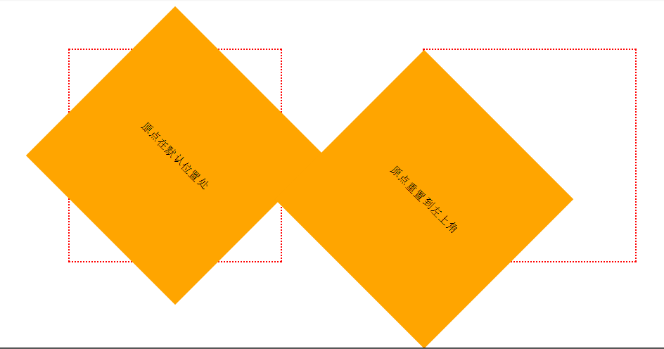
CSS3中的变形--原点 transform-origin
<!doctype html>
<html>
<head>
    <meta charset="utf-8">
    <title></title>
    <style>
        .wrapper {
             300px;
            height: 300px;
            float: left;
            margin: 100px;
            border: 2px dotted red;
            line-height: 300px;
            text-align: center;
        }
        .wrapper div {
            background: orange;
            -webkit-transform: rotate(45deg);
            transform: rotate(45deg);
        }
        .transform-origin div {
            -webkit-transform-origin: left top;
            transform-origin: left top;
        }
    </style>
</head>

<body>
<div class="wrapper">
    <div>原点在默认位置处</div>
</div>
<div class="wrapper transform-origin">
    <div>原点重置到左上角</div>
</div>
</body>
</html>
演示结果:
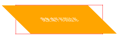
CSS3中的变形--扭曲 skew()
HTML代码:
<div class="wrapper">
  <div>我变成平形四边形</div>
</div>
CSS代码:
.wrapper {
   300px;
  height: 100px;
  border: 2px dotted red;
  margin: 30px auto;
}
.wrapper div {
   300px;
  height: 100px;
  line-height: 100px;
  text-align: center;
  color: #fff;
  background: orange;
  -webkit-transform: skew(45deg);
  -moz-transform:skew(45deg)
  transform:skew(45deg);
}
演示结果