一、使用 animation 和 @keyframes
二、使用 transition 属性
/**
 * css3 动画
 * 使用 @keyframes规则与 animation
 * @keyframes规则用于创建动画,在 @keyframes中规定某项 css样式,就能创建由当前样式逐渐改为新样式的动画
 * 若在某个时间点有多个动画指定同一属性行为,则在最后出现并应用的动画将覆盖其他动画。
 * Internet Explorer 9,以及更早的版本,不支持 @keyframe 规则或 animation 属性。
 */

// 属性                           描述
// @keyframes                    用于规定动画。
// 如: @keyframes myAnimationName { code... }

// animation                    所有动画属性的简写属性,除了 animation-play-state 属性。
// 如: animation: name duration timing-function delay iteration-count direction;

// animation-name                规定 @keyframes 动画的名称。
// 如: animation-name: myAnimationName

// animation-duration            规定动画完成一个周期所花费的秒或毫秒。默认是 0。
// 如: animation-duration: 2s/2000ms

// animation-timing-function    规定动画的速度曲线。默认是 "ease"。
// 如: animation-timing-function: cubic-bezier(a,b,c,d); 其中 p0(0,0),p1(a,b),p2(c,d),p3(1,1) cubic-bezier 函数详情: https://www.w3.org/TR/css-easing-1/#typedef-timing-function

// animation-delay              规定动画何时开始。默认是 0。
// 如: animation-delay: 2s/2000ms/-2s/-2000ms 使用负值动画会马上开始,但会跳过对应的 s/ms 数

// animation-iteration-count    规定动画被播放的次数。默认是 1。
// 如: animation-iteration-count: n/infinite(无数次播放)

// animation-direction          规定动画是否在下一周期逆向地播放。默认是 "normal"。
// 如: animation-direction: alternate(动画在奇数次数正常播放,如 1、3、5...,在偶数次数反向播放,如 2、4、6...)

// animation-play-state          规定动画是否正在运行或暂停。默认是 "running"。
// 如: animation-play-state: paused(如利用该属性通过 js代码在动画播放过程中暂停动画)

// animation-fill-mode          规定对象动画时间之外的状态。默认 none
// 如: animation-fill-mode: forwards(动画完成是,保持最后一个属性,即停在最后一个关键帧)/backwards(定义在 animation-delay时间内要用到的属性,即第一个关键帧)/both(应用 forwards和 backwards)
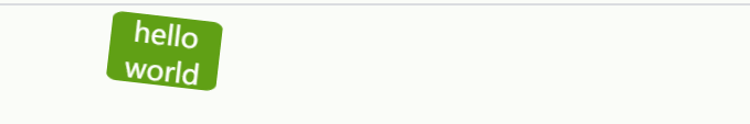
文章开头动画的代码示例:
<!DOCTYPE html>
<html lang="en">
<head>
  <meta charset="UTF-8">
  <meta name="viewport" content="width=device-width, initial-scale=1.0">
  <meta http-equiv="X-UA-Compatible" content="ie=edge">
  <title>css animation</title>
  <style>
    html,body{
      width: 100%;
      height: 100%;
    }
    .block{
      position: relative;
      width: 80px;
      height: 50px;
      background-color: #328403;
      border-radius: 10%;
      animation-name: myAnimation;
      animation-duration: 3s;
      animation-timing-function: ease-in-out;
      animation-iteration-count: infinite;

      text-align: center;
      font-size: 20px;
      color: white;
    }
    @keyframes myAnimation{
      0%{
        left: 0;
      }
      25%{
        left: 15%;
        transform: rotate(20deg);
        background-color: #beda3a;
      }
      50%{
        transform: rotate(0deg);
        left: 30%;
        background-color: #f29904;
      }
      90%{
        transform: rotate(360deg);
        left: 6%;
        background-color: #ff0000;
      }
      95%{
        transform: scale(1.5);
        left: 3%;
      }
      100%{
        transform: scale(1);
        left: 0px;
      }
    }
  </style>
</head>
<body>
  <div class="block">hello world</div>
</body>
</html>
/**
 * 使用 transition 属性
 */

// 值                            描述
// transition-property          规定设置过渡效果的 CSS 属性的名称。默认 all(所有属性获得过渡效果)
// 如: transition-property: width,property2,...propertyN|none(没有属性会获得过渡效果)

// transition-duration          规定完成过渡效果需要多少秒或毫秒。默认 0s(意味着不会有任何效果)
// 如: transition-duration: 2s/2000ms

// transition-timing-function    规定速度效果的速度曲线。默认 ease
// 如: transition-timing-function: linear|ease|ease-in|ease-out|ease-in-out|cubic-bezier(a,b,c,d); 其中 p0(0,0),p1(a,b),p2(c,d),p3(1,1)

// transition-delay              定义过渡效果何时开始。默认 0s
// 如: transition-delay: 2s/2000ms
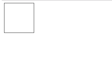
代码示例:
<!DOCTYPE html>
<html lang="en">
<head>
  <meta charset="UTF-8">
  <meta name="viewport" content="width=device-width, initial-scale=1.0">
  <meta http-equiv="X-UA-Compatible" content="ie=edge">
  <title>css transition</title>
  <style>
    html,
    body {
      width: 100%;
      height: 100%;
    }
    .test {
      width: 100px;
      height: 100px;
      border: 1px solid black;
      transition-property: width, background-color;
      transition-duration: 2s;
      transition-timing-function: ease-in-out;
    }

    .test:hover {
      width: 300px;
      background-color: red;
    }
  </style>
</head>
<body>
  <div class="test"></div>
</body>
</html>
示例结果: