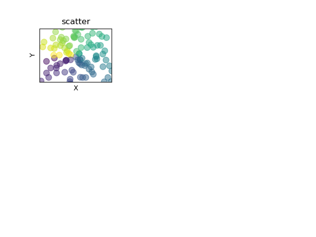
fig=plt.figure()
fig.add_subplot(3,3,1)#3行3列 第一个图
n=128
X=np.random.normal(0,1,n)
Y=np.random.normal(0,1,n)
T=np.arctan2(Y,X)#T用来上色的
plt.axes([0.025,0.025,0.95,0.95])#显示的范围
plt.scatter(X,Y,s=75,c=T,alpha=.5)#s表示点的大小,c表示颜色,用T的值来给c上色
plt.xlim(-1.5,1.5)
plt.xticks([])
plt.ylim(-1.5,1.5)
plt.yticks([])
plt.xlabel("X")
plt.ylabel("Y")
plt.title("scatter")
plt.show()#显示图
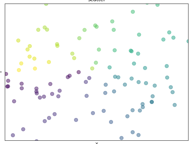
fig=plt.figure()
ax=fig.add_subplot(3,3,1)#3行3列 第一个图
n=128
X=np.random.normal(0,1,n)
Y=np.random.normal(0,1,n)
T=np.arctan2(Y,X)#T用来上色的
#plt.axes([0.025,0.025,0.95,0.95])#显示的范围
ax.scatter(X,Y,s=75,c=T,alpha=.5)#s表示点的大小,c表示颜色,用T的值来给c上色
plt.xlim(-1.5,1.5)
plt.xticks([])
plt.ylim(-1.5,1.5)
plt.yticks([])
plt.xlabel("X")
plt.ylabel("Y")
plt.title("scatter")
plt.show()#显示图
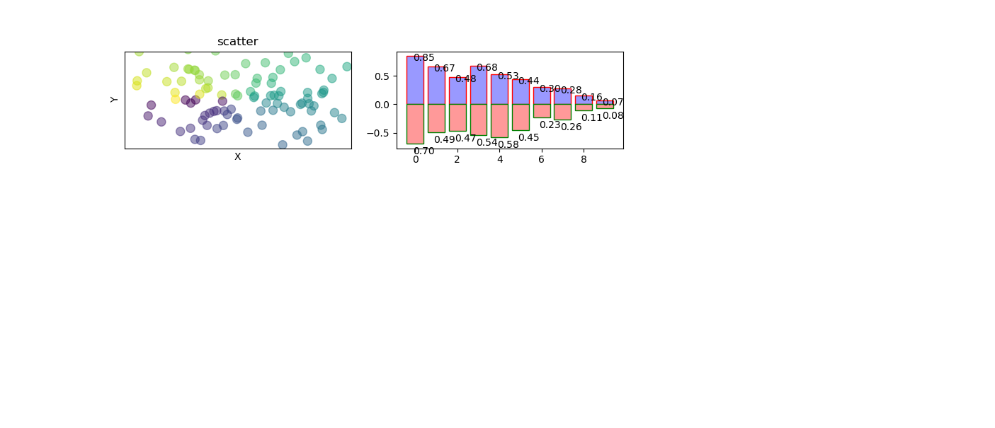
#scatter
fig=plt.figure()
fig.add_subplot(3,3,1)#3行3列 第一个图
n=128
X=np.random.normal(0,1,n)
Y=np.random.normal(0,1,n)
T=np.arctan2(Y,X)#T用来上色的
#plt.axes([0.025,0.025,0.95,0.95])#显示的范围
plt.scatter(X,Y,s=75,c=T,alpha=.5)#s表示点的大小,c表示颜色,用T的值来给c上色
plt.xlim(-1.5,1.5)
plt.xticks([])
plt.ylim(-1.5,1.5)
plt.yticks([])
plt.xlabel("X")
plt.ylabel("Y")
plt.title("scatter")
#bar
fig.add_subplot(332)
n=10
X=np.arange(n)
Y1=(1-X/float(n))*np.random.uniform(0.5,1.0,n)
Y2=(1-X/float(n))*np.random.uniform(0.5,1.0,n)
plt.bar(X,+Y1,facecolor='#9999ff',edgecolor='red')
#+Y1表示把柱状图画在横轴上面;facecolor配置柱子颜色;edgecolor配置柱子边缘颜色
plt.bar(X,-Y2,facecolor='#ff9999',edgecolor='green')
#-Y2表示把柱状图画在横轴下面;
for x,y in zip(X,Y1):
    plt.text(x+0.4, y+0.05, '%.2f'%y, ha='center', va='top')
    #添加注释;x+0.4, y+0.05表示注释的位置;'%.2f'%y表示注释的格式;
    #ha='center'注释的水平位置;va='bottom'注释在条的位置,top表示在条的里面,bottom表示在条的上面(外面)
for x,y in zip(X,Y2):
    plt.text(x+0.4, -y-0.05, '%.2f'%y, ha='center', va='top')
plt.show()#显示图
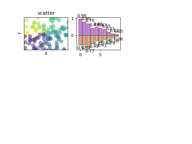
#scatter
fig=plt.figure()
ax=fig.add_subplot(3,3,1)#3行3列 第一个图
n=128
X=np.random.normal(0,1,n)
Y=np.random.normal(0,1,n)
T=np.arctan2(Y,X)#T用来上色的
#plt.axes([0.025,0.025,0.95,0.95])#显示的范围
ax.scatter(X,Y,s=75,c=T,alpha=.5)#s表示点的大小,c表示颜色,用T的值来给c上色
plt.xlim(-1.5,1.5)
plt.xticks([])
plt.ylim(-1.5,1.5)
plt.yticks([])
plt.xlabel("X")
plt.ylabel("Y")
plt.title("scatter")
#bar
ax=fig.add_subplot(332)####################################这里改了一下ax 和上面是一样的
n=10
X=np.arange(n)
Y1=(1-X/float(n))*np.random.uniform(0.5,1.0,n)
Y2=(1-X/float(n))*np.random.uniform(0.5,1.0,n)
ax.bar(X,+Y1,facecolor='#9999ff',edgecolor='red')
#+Y1表示把柱状图画在横轴上面;facecolor配置柱子颜色;edgecolor配置柱子边缘颜色
ax.bar(X,-Y2,facecolor='#ff9999',edgecolor='green')
#-Y2表示把柱状图画在横轴下面;
for x,y in zip(X,Y1):
    plt.text(x+0.4, y+0.05, '%.2f'%y, ha='center', va='top')
    #添加注释;x+0.4, y+0.05表示注释的位置;'%.2f'%y表示注释的格式;
    #ha='center'注释的水平位置;va='bottom'注释在条的位置,top表示在条的里面,bottom表示在条的上面(外面)
for x,y in zip(X,Y2):
    plt.text(x+0.4, -y-0.05, '%.2f'%y, ha='center', va='top')
plt.show()#显示图