vscode vue文件下,多个style的顺序会相互影响css的智能提示
svg的path属性在ie任何情况下,额外添加的transform/margin之类的css都会挂掉,暂时无解,很是郁闷。
神奇的替换图片方式
移动端1px问题比较喜欢的两种解决方案:
1.使用css3 linear-gradient
2.使用before或者after结合scale(0.5)
//缺点:占用了伪元素,代码量较多,优点:可以圆角,然后会有点毛边
border-radius + overflow 在某些情况失效,在父级加上transform: rotate(0)即可;
在html以后前面不要直接敲空格了,一定要用 ;ios把第一段文字的最后解析出了一个回车,导致显示的时候显示成了2行(white-space: normal;)
如果使用gkb编码的话,不要用node服务,会乱码。
清除:ie input icon
block元素内有inline-block时,会有间隙,行高对不齐等问题。间隙用font-size:0,margin负值等方法解决,行高是因为基线问题找vertical-align。
两者顺序不能反过来,某些系统会有不可预料的错乱
display: -webkit-flex;
display: flex;
背景,background-size 必须单独拆出来,理由同上
background: url(../img.jpg) no-repeat center/cover;
两端对齐
- text-align: justify;
- text-align-last: center;
弹窗居中
不固定宽高时transform: translate(-50%,-50%)是个好东西。但是配合jq。#obj.hide();时,会生成一条样式 transform: scale(0, 0); 这时导致两条样式冲突,弹窗不能居中.
负缩进
text-indent: -2em;
主动引发怪异模式
box-sizing: border-box;
查询api:
http://www.css88.com/book/css/
查询兼容性:
https://caniuse.com/#search=flex
好用:
li+li 相邻选择器
first-child 第一个子代选择器 (兼容性好,last-child不行)
ps:
ctrl+alt+c 生成透明背景,使图片居中. 适用于多个小图片排版.
在编辑器忽略node_modules,加载速度。

删除node_modules
npm install rimraf -g
rimraf node_modules
移动端svg线段进度条
html:
<svg version="1.1" id="path" width="1000px" height="1000px" >
<path d="" stroke="" stroke-width="1px" fill="none"/>
</svg>
css:
#path{animation:dash 2s 0s linear forwards;stroke-dasharray: 1000;stroke-dashoffset: 1000;}
@keyframes dash {
to {stroke-dashoffset: 0;}
}
stroke-dasharray 表示虚线描边。可选值为:none, <dasharray>, inherit. 其中,none表示不是虚线;<dasharray>为一个逗号或空格分隔的数值列表。表示各个虚线端的长度。可以是固定的长度值,也可以是百分比值;inherit表继承。
stroke-dashoffset 表示虚线的起始偏移。可选值为:<percentage>, <length>, inherit. 百分比值,长度值,继承。
stroke-linecap="butt" 描边端点表现形式
stroke-linejoin="miter" 描边转角的表现方式
var path = document.querySelector('.path');
var length = path.getTotalLength();
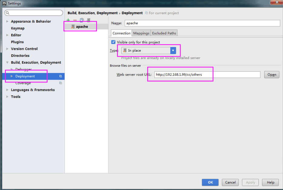
移动端调试(即以ip为链接地址,不是localhost,能在手机查看):
1 http-server
2
3.利用谷歌工具,详情查看另外篇文章。
4.storm 激活破解方法
4.1、修改hosts文件,把 0.0.0.0 account.jetbrains.com 在文件中另起一行添加进去。hosts文件一般存放在 C:WindowsSystem32driversetc 目录下。
4.2、打开 获取 IntelliJ IDEA 注册码 网站: http://idea.lanyus.com/ ,点击获取注册码输入到Activation code
----------
开心你就来打赏呀