I、画布
1、pyplot.figure()函数
matplotlib.pyplot.figure(num=None, figsize=None, dpi=None, facecolor=None, edgecolor=None, frameon=True, FigureClass=<class 'matplotlib.figure.Figure'>, clear=False, **kwargs)
matplotlib.pyplot.subplot(*args, **kwargs)
2、主要参数说明
3、官方文档直达链接
4、相关代码测试
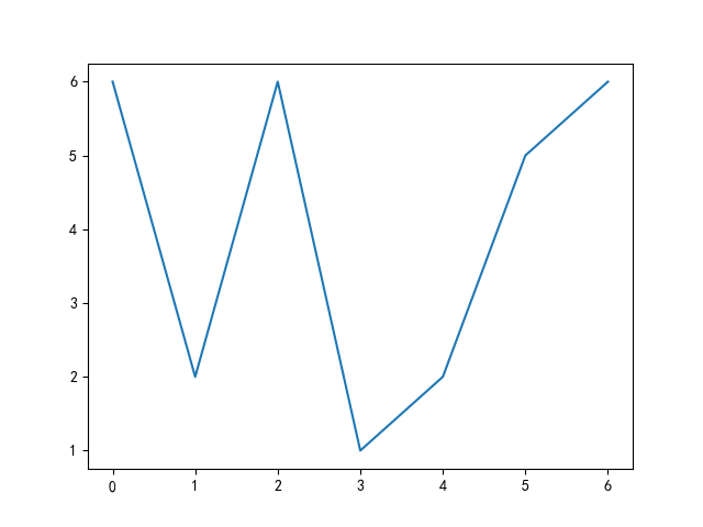
1、图形1
import matplotlib.pyplot as plt
import matplotlib.mlab as mlab
import seaborn as sns
import numpy as np
import pandas as pd

'''
matplotlib.pyplot.figure(num=None, figsize=None, dpi=None, facecolor=None, edgecolor=None, frameon=True, FigureClass=<class 'matplotlib.figure.Figure'>, clear=False, **kwargs)[source]
'''

# 解决中文不能在图片中显示的问题
plt.rcParams['font.sans-serif'] = ['SimHei']
# 用来正常显示负号
plt.rcParams['axes.unicode_minus'] = False

#
plt.figure()
x_range = np.arange(7)
y_range = np.random.randint(1, 7, size=7)
plt.plot(y_range)
plt.show()
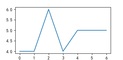
2、图形2
#修改参数
plt.figure(figsize=(2, 2), dpi=100)
x_range = np.arange(7)
y_range = np.random.randint(1, 7, size=7)
plt.plot(x_range, y_range)
plt.show()
II、子图切割
1、subplot函数方法
matplotlib.pyplot.subplot(*args, **kwargs)
2、主要参数

3、官方文档链接
4、简单测试
①图形1
plt.figure(figsize=(8, 8))
x_range = np.arange(7)
y_range = np.random.randint(1, 7, size=7)
plt.subplot(221)
plt.plot(x_range, y_range)
plt.subplot(222)
plt.plot(x_range, np.random.randint(1, 7, size=7))
plt.subplot(223)
plt.plot(x_range, np.random.randint(1, 7, size=7))
plt.show()

②、图形2
# 指定多个画布,并创建多个子图,并修改指定子图
plt.figure(1, figsize=(8, 8))
x_range = np.arange(7)
y_range = np.random.randint(1, 7, size=7)
plt.subplot(221)
plt.plot(x_range, y_range)
plt.subplot(222)
plt.plot(x_range, np.random.randint(1, 7, size=7))
plt.subplot(223)
plt.plot(x_range, np.random.randint(1, 7, size=7))
# plt.show()

plt.figure(2, figsize=(4, 4))
plt.subplot(212)
plt.plot(x_range, np.random.randint(1,7,size=7))

# 修改指定画布,及相关子图
plt.figure(1)
plt.subplot(222)
plt.title('for testfigure')
plt.show()

III、子图叠加在主图上
1、aexs函数
matplotlib.pyplot.axes(arg=None, **kwargs)
2、主要参数说明

3、官方文档链接
https://matplotlib.org/api/_as_gen/matplotlib.pyplot.axes.html?highlight=axes#matplotlib.pyplot.axes
4、测试

# 在主图上叠加小图形
# 列表前两位数字表示为起始坐标,后两位表示为图形的横纵比(长宽)
x_range = np.arange(7)
y_range = np.random.randint(1, 7, size=7)
plt.figure()
plt.plot(x_range, y_range)
plt.title('主图')
plt.axes([0.2, 0.2, 0.2, 0.2])
plt.plot(x_range, y_range)
plt.axes([0.5, 0.5, 0.2, 0.2])
plt.plot(x_range, y_range)
over!!!