在使用JS的时候经常遇到的问题就是我需要获取当前屏幕的宽度和高度。每每到这个时候不知道使用哪个:
widow.document.body.offsetWidth;
window.screen.availWidth;
window.screen.width;
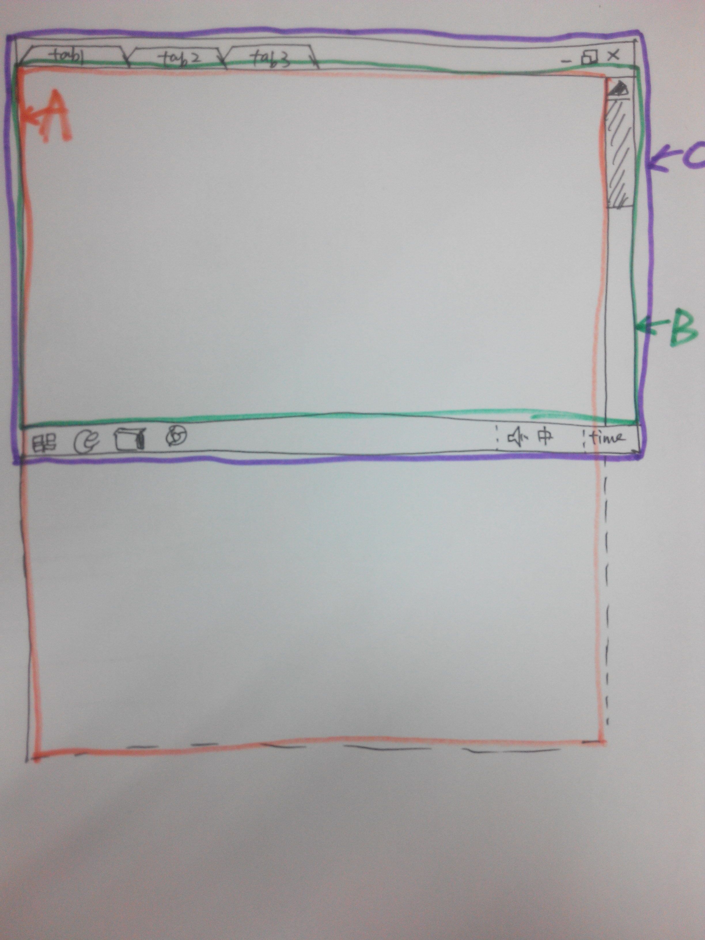
一上图(PC端)为例,
A区域 表示的网页的区域(屏幕下面虚线地方表示的是网页可以滑动的区域):widow.document.body.offsetWidth*window.document.body.offsetHeight。
B区域 表示的是可用区域(有网上的叫做空白区域)也就是显示的屏幕 除掉上面的工具栏(浏览器的标签)和下面的工具栏(电脑的菜单)。注意的是滑动栏是属于可用区域的: window.screen.availWidth*window.screen.availHeight。
C区域 表示的是显示器的宽和高,也就是电脑的分辨率 :window.screen.Width*window.screen.Height。
所以window.screen.Width= window.screen.availWidth
假如是移动设备,由于没有显示滑动条, 所以window.screen.Width= window.screen.availWidth=widow.document.body.offsetWidth,至于高度的话含义和电脑端是一样的。
PS:若想是的页面中的某个元素(Canvas之类的)匹配移动设备的屏幕高宽,可以使用以下代码:
<meta name="viewport" content="width=device-width; initial-scale=1.0">
<meta name="viewport" content="height=device-height, initial-scale=1.0, maximum-scale=1.0, minimum-scale=1.0, user-scalable=0">