小demo 旋转木马
<!doctype html>
<html lang="en">
<head>
    <meta charset="UTF-8">
    <title>翻转导航</title>
    <style>
        body {
            /*添加透视*/
            perspective: 1000px;
        }
        /*最外面的盒子*/
        section {
            position: relative;
             300px;
            height: 200px;
            background: url(img/pig.jpg);
            margin: 200px auto;
            transform-style: preserve-3d;/*给子元素开启三维环境 重点代码*/
            animation: rotate 10s linear infinite;/*调用动画:匀速执行 重复执行*/
        }
        /*鼠标滑过动画暂停*/
        section:hover {
            animation-play-state: paused;
        }
        section div {
            position: absolute;
            left: 0;
            top: 0;
             100%;
            height: 100%;
            background: url(img/dog.jpg);
        }
        section div:nth-child(1) {
            background: url(img/ym.jpg);
            /*第一个做正面 不需要旋转*/  /*先旋转 再移动*/
            transform: rotateY(0) translateZ(300px);
        }
        section div:nth-child(2) {
            /*先旋转 再移动*/
            transform: rotateY(60deg) translateZ(300px);
        }
        section div:nth-child(3) {
            /*先旋转 再移动*/
            transform: rotateY(120deg) translateZ(300px);
        }
        section div:nth-child(4) {
            /*先旋转 再移动*/
            transform: rotateY(180deg) translateZ(300px);
        }
        section div:nth-child(5) {
            /*先旋转 再移动*/
            transform: rotateY(240deg) translateZ(300px);
        }
        section div:nth-child(6) {
            /*先旋转 再移动*/
            transform: rotateY(300deg) translateZ(300px);
        }
        /*定义动画*/
        @keyframes rotate  {
            from {
                transform: rotateY(0deg);
            }
            to {
               transform: rotateY(360deg);
            }
        }
    </style>
</head>
<body>
<section>
    <div>1</div>
    <div>2</div>
    <div>3</div>
    <div>4</div>
    <div>5</div>
    <div>6</div>
</section>
</body>
</html>
demo的图片随意替换
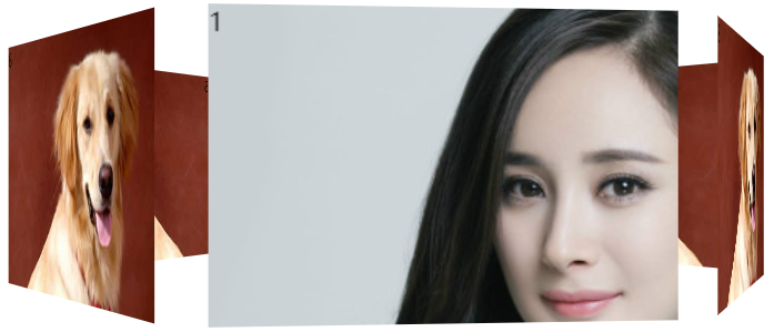 执行效果
执行效果