

基础语法
<style>
/*第一步:定义动画*/
@keyframes move {
//开始状态
0% {
transform: translateX(0px);
}
//结束状态
100% {
transform: translateX(500px);
}
}
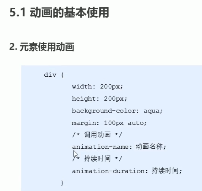
div {
300px;
height: 300px;
background: pink;
transition: all 0.5s;
/*第二步:调用动画*/
/*1 动画名称*/
animation-name: move;
/*2 该动画持续时间*/
animation-duration: 2s;
}
</style>
<div></div>
from = 0% to = 100%
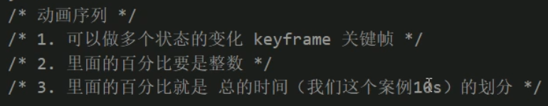
二 动画序列

小demo 盒子顺时针运动一圈
<!doctype html>
<html lang="en">
<head>
    <meta charset="UTF-8">
    <title>Document</title>
    <style>
        @keyframes move {
            0% {
                transform: translate(0,0);
            }
            25% {
                transform: translate(1000px,0px);
            }
            50% {
                transform: translate(1000px,500px);
            }
            75% {
                transform: translate(0,500px);
            }
            100% {
                transform: translate(0,0);
            }
        }
        div {
             300px;
            height: 300px;
            background: pink;
            /*1 动画名称*/
            animation-name: move;
            /*2 该动画持续时间*/
            animation-duration: 3s;
        }
    </style>
</head>
<body>
<div></div>
</body>
</html>
三 动画属性
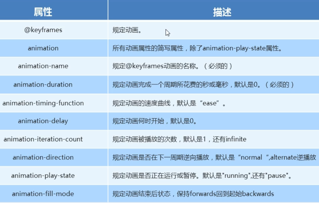
@keyframes 规定动画
//2 要调用的动画名称
animation-name: 动画名称;
//3 动画执行时间
animation-duration: 1s|1ms; [ s秒 ms毫秒 ]
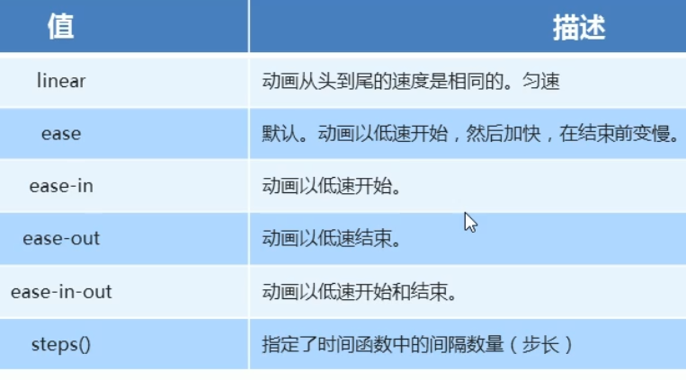
//4 速度曲线
animation-timing-function: ease; [ 默认值 ]
//5 动画开始时间
animation-delay: 0; 默认值0
delay  [dɪˈleɪ] 延迟 延时

//6 重复次数 iteration 迭代 重复
animation-iteration-count: 1;  想播放几次填几 [ 默认值1 ]
animation-iteration-count: infinite; 无限播放

//7 是否反方向播放
animation-direction: normal; 播放完瞬间回到起点 [ 默认值 ]
animation-direction:alternate; 播放完再倒着播放回到原点 [ 跑马灯效果 ]

//8 是否正在运行或暂停
animation-play-state:running; 默认值
animation-paly-state: pause; //鼠标经过时动画停止
单词本意:暂停 停顿 [pɔːz]

//9 规定动画结束后的状态
animation-fill-mode:backwards; 结束后回到起始状态 [ 默认值 ]
animation-fill-mode: forwards; 结束后留在结束状态 不回去了
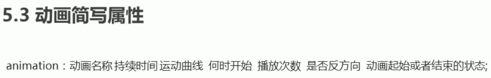
简写语法
简写一共 7个属性

animation: name duration timing-function delay iteration-count direction fill-mode;

animation: 动画名称 持续时间 运动曲线 何时开始 播放次数 是否反方向 动画结束后的状态;

animation: move 2s linear 0s 1 alternate forwards

//name 和 duration 为必填属性
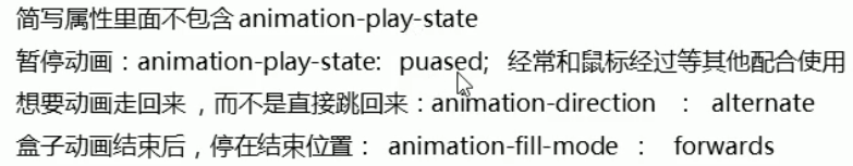
div:hover {
            animation-play-state: paused;
        }
小demo 大数据热点图
<!doctype html>
<html lang="en">
<head>
    <meta charset="UTF-8">
    <title>Document</title>
    <style>
        body {
            background: #333;
        }
        /*最外侧盒子*/
        .map {
            position: relative;
             747px;
            height: 617px;
            background: url(img/map.png);
            margin: 100px auto;
        }
        /*北京坐标*/
        .city {
            position: absolute;
            top: 227px;
            right: 193px;
            color: white;
        }
        /*广州坐标*/
        .gz {
            top: 541px;
            right: 189px;
        }
        /*台北坐标*/
        .tb {
            top: 500px;
            right: 80px;
        }
        .dotted {
             8px;
            height: 8px;
            background: #0099ff;
            border-radius: 50%;
        }
        .city div[class^="pulse"] {
            position: absolute;
            top: 50%;
            left: 50%;
            transform: translate(-50%,-50%);
            /*上面代码保证 小波纹 在父盒子的最中央*/
             8px;
            height: 8px;
            box-shadow: 0 0 12px #0099ff;
            border-radius: 50%;
            animation: move 1s linear infinite;
        }
        /*第二个延迟执行*/
        .city div.pulse2 {
            animation-delay:0.4s;
        }
        /*第三个延迟执行*/
        .city div.pulse3 {
            animation-delay: 0.4s;
        }

        /*定义动画*/
        @keyframes move {
            0% {
                /*这里可以什么也不写 或者直接省略0%*/
            }
            70% {
                 40px;
                height: 40px;
                opacity: 1;
            }
            100% {
                 70px;
                height: 70px;
                opacity: 0;
            }
        }
    </style>
</head>
<body>
<div class="map">
    <!--背景-->
    <div class="city">
        <div class="dotted"></div>
        <div class="pulse1"></div>
        <div class="pulse2"></div>
        <div class="pulse3"></div>
    </div>
    <!--台北-->
    <div class="city tb">
        <div class="dotted"></div>
        <div class="pulse1"></div>
        <div class="pulse2"></div>
        <div class="pulse3"></div>
    </div>
    <!--广州-->
    <div class="city gz">
        <div class="dotted"></div>
        <div class="pulse1"></div>
        <div class="pulse2"></div>
        <div class="pulse3"></div>
    </div>
</div>
</body>
</html>
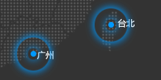 执行效果
执行效果
用到的背景图片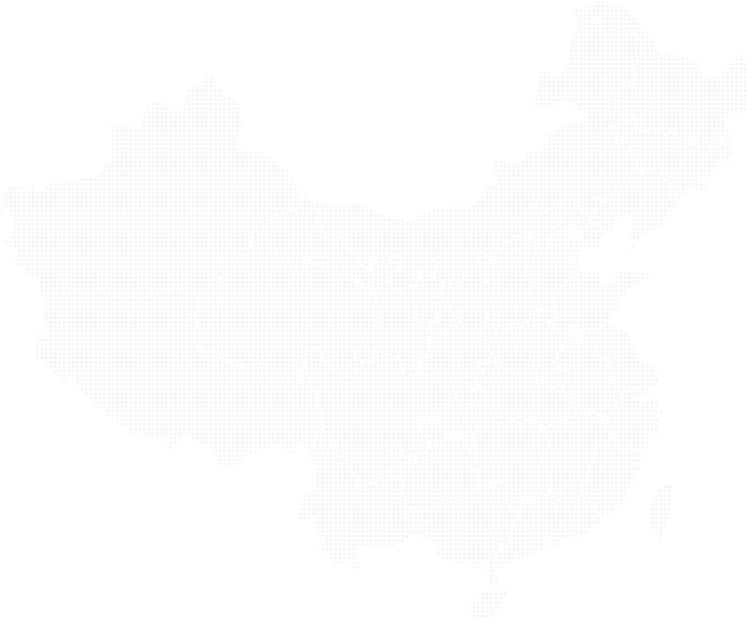
动画速度曲线步长


小demo 打字机效果
<!doctype html>
<html lang="en">
<head>
<meta charset="UTF-8">
<title>打字机效果</title>
<style>
div {
overflow: hidden;
font-size: 20px;
0;
height: 30px;
background: pink;
animation: w 2s steps(10) forwards;
/*steps步长 就是分几步完成动画 不需要跟单位*/
}
@keyframes w {
from {
0;
}
to {
200px;
}
}
</style>
</head>
<body>
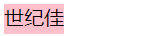
<div>世纪佳缘我在这里等你</div>
</body>
</html>
 执行效果
执行效果小demo 奔跑的小熊
<!doctype html>
<html lang="en">
<head>
    <meta charset="UTF-8">
    <title>奔跑的小熊</title>
    <style>
        body {
            background:#ccc;
        }
        div {
            position: absolute;/**/
             200px;
            height: 100px;
            background: url(img/bear.png) no-repeat;
            /*可以添加多个动画 用逗号分割*/
            animation: bear 0.4s steps(8) infinite,move 3s forwards;
        }
        /*背景切换动画*/
        @keyframes bear {
            from {
                background-position: 0 0;
            }
            to {
                background-position: -1600px 0;
            }
        }
        @keyframes move {
            from {
                left: 0;
            }
            to {
                left: 50%;
                transform: translateX(-50%);
            }
        }
    </style>
</head>
<body>
<div></div>
<div></div>
<div></div>
<div></div>
</body>
</html>
 执行效果
执行效果 
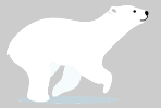
用到的小熊背景图片