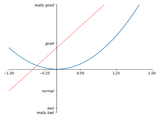
坐标轴的操作
import matplotlib.pyplot as plt
import numpy as np

x = np.linspace(-3, 3, 50)
y1 = 2*x + 1
y2 = x**2

plt.figure()
plt.plot(x, y2)
# plot the second curve in this figure with certain parameters
plt.plot(x, y1, color='red', linewidth=1.0, linestyle='--')
# set x limits
plt.xlim((-1, 2))
plt.ylim((-2, 3))

# set new ticks
new_ticks = np.linspace(-1, 2, 5)
plt.xticks(new_ticks)
# set tick labels
plt.yticks([-2, -1.8, -1, 1.22, 3],
           ['$really bad$', '$bad$', '$normal$', '$good$', '$really good$'])
# to use '$ $' for math text and nice looking, e.g. '$pi$'

# gca = 'get current axis'
ax = plt.gca()
ax.spines['right'].set_color('none')    #让右边的轴消失
ax.spines['top'].set_color('none')    #让上边的轴消失

ax.xaxis.set_ticks_position('bottom')    #设置x轴是底下的轴 其实默认也是bottom
# ACCEPTS: [ 'top' | 'bottom' | 'both' | 'default' | 'none' ]

ax.spines['bottom'].set_position(('data', 0))    #设置位置,当数据的值是0
# the 1st is in 'outward' | 'axes' | 'data'
# axes: percentage of y axis
# data: depend on y data

ax.yaxis.set_ticks_position('left')
# ACCEPTS: [ 'left' | 'right' | 'both' | 'default' | 'none' ]

ax.spines['left'].set_position(('data',0))
plt.show()
legend图例
import matplotlib.pyplot as plt
import numpy as np

x = np.linspace(-3, 3, 50)
y1 = 2*x + 1
y2 = x**2

plt.figure()
# set x limits
plt.xlim((-1, 2))
plt.ylim((-2, 3))

# set new sticks
new_sticks = np.linspace(-1, 2, 5)
plt.xticks(new_sticks)
# set tick labels
plt.yticks([-2, -1.8, -1, 1.22, 3],
           [r'$really bad$', r'$bad$', r'$normal$', r'$good$', r'$really good$'])

l1, = plt.plot(x, y1, label='linear line')        #在plot的时候标记上label
l2, = plt.plot(x, y2, color='red', linewidth=1.0, linestyle='--', label='square line') #在plot的时候标记上label

plt.legend(loc='upper right')
# plt.legend(handles=[l1, l2], labels=['up', 'down'],  loc='best')    如果传入handles参数,就只会legend handles中的线,labels属性是曲线的名称
# the "," is very important in here l1, = plt... and l2, = plt... for this step
"""legend( handles=(line1, line2, line3),
           labels=('label1', 'label2', 'label3'),
           'upper right')
    The *loc* location codes are::
          'best' : 0,          (currently not supported for figure legends)
          'upper right'  : 1,
          'upper left'   : 2,
          'lower left'   : 3,
          'lower right'  : 4,
          'right'        : 5,
          'center left'  : 6,
          'center right' : 7,
          'lower center' : 8,
          'upper center' : 9,
          'center'       : 10,"""

plt.show()

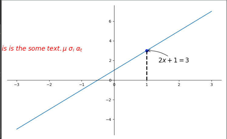
annotation标注
# View more python tutorials on my Youtube and Youku channel!!!

# Youtube video tutorial: https://www.youtube.com/channel/UCdyjiB5H8Pu7aDTNVXTTpcg
# Youku video tutorial: http://i.youku.com/pythontutorial

# 8 - annotation
"""
Please note, this script is for python3+.
If you are using python2+, please modify it accordingly.
Tutorial reference:
http://www.scipy-lectures.org/intro/matplotlib/matplotlib.html
Mathematical expressions:
http://matplotlib.org/users/mathtext.html#mathtext-tutorial
"""

import matplotlib.pyplot as plt
import numpy as np

x = np.linspace(-3, 3, 50)
y = 2*x + 1

plt.figure(num=1, figsize=(8, 5),)
plt.plot(x, y,)

ax = plt.gca()
ax.spines['right'].set_color('none')
ax.spines['top'].set_color('none')
ax.spines['top'].set_color('none')
ax.xaxis.set_ticks_position('bottom')
ax.spines['bottom'].set_position(('data', 0))
ax.yaxis.set_ticks_position('left')
ax.spines['left'].set_position(('data', 0))

x0 = 1        #x坐标
y0 = 2*x0 + 1    #坐标
plt.plot([x0, x0,], [0, y0,], 'k--', linewidth=2.5)     #画出虚线 颜色是'k'即black linewidth 是宽度
plt.scatter([x0, ], [y0, ], s=50, color='b')        #显示点

# method 1:annotation
#####################
plt.annotate(r'$2x+1=%s$' % y0, xy=(x0, y0), xycoords='data', xytext=(+30, -30),
             textcoords='offset points', fontsize=16,
             arrowprops=dict(arrowstyle='->', connectionstyle="arc3,rad=.2"))
#xy是从哪个位置开始 xycoords     以data的值作为基准 xytext是x加30,y减去30  arrowprops是箭头
# method 2:text
########################
plt.text(-3.7, 3, r'$This is the some text. mu sigma_i alpha_t$',
         fontdict={'size': 16, 'color': 'r'})
#text(位置,)
plt.show()
tick能见度:
主要是为了防止tick被线遮挡住
import matplotlib.pyplot as plt
import numpy as np

x = np.linspace(-3, 3, 50)
y = 0.1*x

plt.figure()
plt.plot(x, y, linewidth=10, zorder=1)      # set zorder for ordering the plot in plt 2.0.2 or higher
plt.ylim(-2, 2)
ax = plt.gca()
ax.spines['right'].set_color('none')
ax.spines['top'].set_color('none')
ax.spines['top'].set_color('none')
ax.xaxis.set_ticks_position('bottom')
ax.spines['bottom'].set_position(('data', 0))
ax.yaxis.set_ticks_position('left')
ax.spines['left'].set_position(('data', 0))


for label in ax.get_xticklabels() + ax.get_yticklabels():
    label.set_fontsize(12)
    # set zorder for ordering the plot in plt 2.0.2 or higher
    label.set_bbox(dict(facecolor='white', edgecolor='none', alpha=0.8, zorder=2))
plt.show()

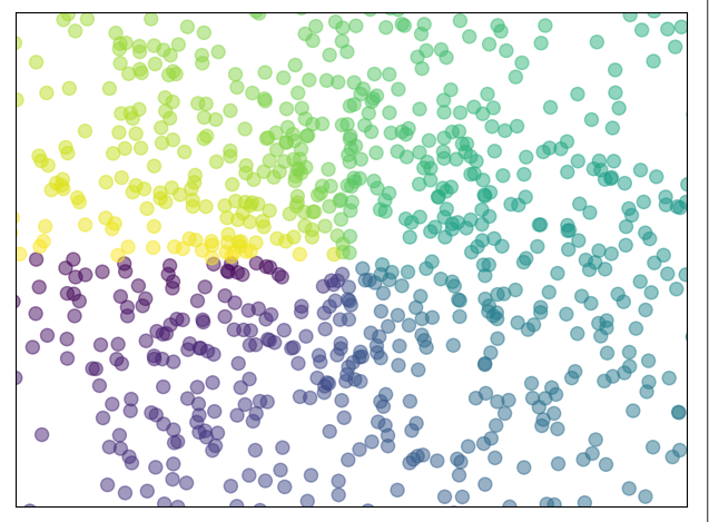
scatter散点图
import matplotlib.pyplot as plt
import numpy as np

n = 1024    # data size
X = np.random.normal(0, 1, n)
Y = np.random.normal(0, 1, n)
T = np.arctan2(Y, X)    # 为了每个点的颜色

plt.scatter(X, Y, s=75, c=T, alpha=.5)

plt.xlim(-1.5, 1.5)
plt.xticks(())  # ignore xticks
plt.ylim(-1.5, 1.5)
plt.yticks(())  # ignore yticks

plt.show()
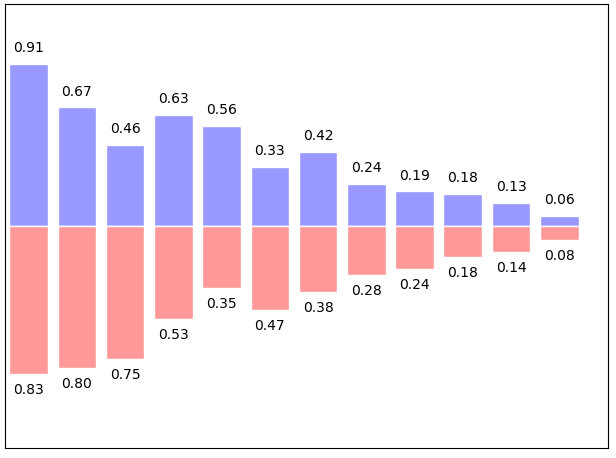
bar柱状图
import matplotlib.pyplot as plt
import numpy as np

n = 12
X = np.arange(n)
Y1 = (1 - X / float(n)) * np.random.uniform(0.5, 1.0, n)
Y2 = (1 - X / float(n)) * np.random.uniform(0.5, 1.0, n)

plt.bar(X, +Y1, facecolor='#9999ff', edgecolor='white')
plt.bar(X, -Y2, facecolor='#ff9999', edgecolor='white')

for x, y in zip(X, Y1):
    # ha: horizontal alignment
    # va: vertical alignment
    plt.text(x , y + 0.05, '%.2f' % y, ha='center', va='bottom')

for x, y in zip(X, Y2):
    # ha: horizontal alignment
    # va: vertical alignment
    plt.text(x , -y - 0.05, '%.2f' % y, ha='center', va='top')

plt.xlim(-.5, n)
plt.xticks(())
plt.ylim(-1.25, 1.25)
plt.yticks(())

plt.show()
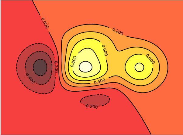
contour 等高线
import matplotlib.pyplot as plt
import numpy as np


def f(x, y):         #定义高度函数
    # the height function
    return (1 - x / 2 + x ** 5 + y ** 3) * np.exp(-x ** 2 - y ** 2)


n = 256
x = np.linspace(-3, 3, n)
y = np.linspace(-3, 3, n)
X, Y = np.meshgrid(x, y)

# use plt.contourf to filling contours
# X, Y and value for (X,Y) point
plt.contourf(X, Y, f(X, Y), 8, alpha=.75, cmap=plt.cm.hot) #填充颜色
                        #数字8代表的意思是分成几块 alpha是不透明度 cmap是颜色对应图

# use plt.contour to add contour lines 画等高线的线
C = plt.contour(X, Y, f(X, Y), 8, colors='black', linewidth=.5)
# adding label  等高线线的数值添加
plt.clabel(C, inline=True, fontsize=10)
                 #画在线里面
plt.xticks(())
plt.yticks(())
plt.show()
img图像 (数值色块 热力图)
import matplotlib.pyplot as plt
import numpy as np

# image data
a = np.array([0.313660827978, 0.365348418405, 0.423733120134,
              0.365348418405, 0.439599930621, 0.525083754405,
              0.423733120134, 0.525083754405, 0.651536351379]).reshape(3,3)

"""
for the value of "interpolation", check this:
http://matplotlib.org/examples/images_contours_and_fields/interpolation_methods.html
for the value of "origin"= ['upper', 'lower'], check this:
http://matplotlib.org/examples/pylab_examples/image_origin.html
"""
plt.imshow(a, interpolation='nearest', cmap='hot', origin='lower')
                                                  #origin大致是色块的整体方向左上角是值最小的还是最大的

plt.colorbar(shrink=0.9)    #colorbar ,这边我们压缩成百分之90

plt.xticks(())
plt.yticks(())
plt.show()
interpolation参数: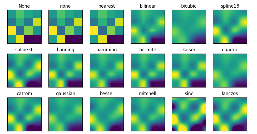
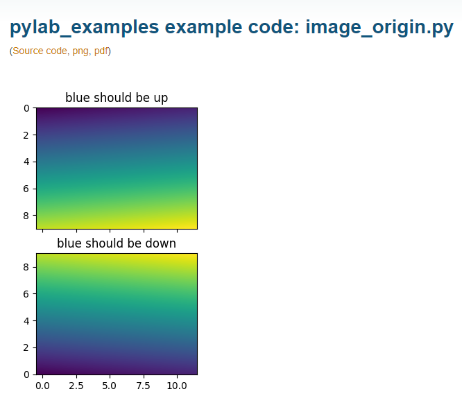
origin参数
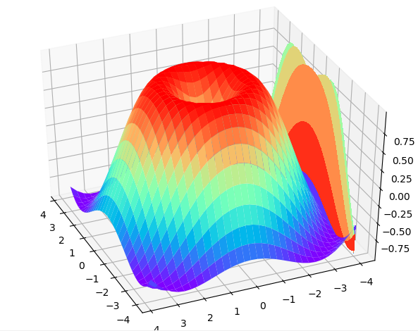
3D数据
import numpy as np
import matplotlib.pyplot as plt
from mpl_toolkits.mplot3d import Axes3D

fig = plt.figure()
ax = Axes3D(fig)
# X, Y value
X = np.arange(-4, 4, 0.25)
Y = np.arange(-4, 4, 0.25)
X, Y = np.meshgrid(X, Y)
R = np.sqrt(X ** 2 + Y ** 2)
# height value
Z = np.sin(R)

ax.plot_surface(X, Y, Z, rstride=1, cstride=1, cmap=plt.get_cmap('rainbow'))
"""
============= ================================================
        Argument      Description
        ============= ================================================
        *X*, *Y*, *Z* Data values as 2D arrays
        *rstride*     Array row stride (step size), defaults to 10
        *cstride*     Array column stride (step size), defaults to 10
        *color*       Color of the surface patches
        *cmap*        A colormap for the surface patches.
        *facecolors*  Face colors for the individual patches
        *norm*        An instance of Normalize to map values to colors
        *vmin*        Minimum value to map
        *vmax*        Maximum value to map
        *shade*       Whether to shade the facecolors
        ============= ================================================
"""

# I think this is different from plt12_contours
ax.contourf(X, Y, Z, zdir='z', offset=-2, cmap=plt.get_cmap('rainbow'))
"""
==========  ================================================
        Argument    Description
        ==========  ================================================
        *X*, *Y*,   Data values as numpy.arrays
        *Z*
        *zdir*      The direction to use: x, y or z (default)
        *offset*    If specified plot a projection of the filled contour
                    on this position in plane normal to zdir
        ==========  ================================================
"""

ax.set_zlim(-2, 2)

plt.show()
rstride和cstride是step大小,决定了线的密集程度
zdir决定了往哪个方向压缩
设置成'z'时

设置成y的时候
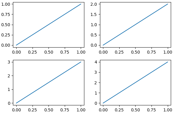
subplot多合一显示图像
import matplotlib.pyplot as plt

# example 1:
###############################
plt.figure(figsize=(6, 4))
# plt.subplot(n_rows, n_cols, plot_num)
plt.subplot(2, 2, 1)
plt.plot([0, 1], [0, 1])

plt.subplot(222)
plt.plot([0, 1], [0, 2])

plt.subplot(223)
plt.plot([0, 1], [0, 3])

plt.subplot(224)
plt.plot([0, 1], [0, 4])

plt.tight_layout()
plt.show()
import matplotlib.pyplot as plt
plt.figure(figsize=(6, 4))
# plt.subplot(n_rows, n_cols, plot_num)
plt.subplot(2, 1, 1)
# figure splits into 2 rows, 1 col, plot to the 1st sub-fig
plt.plot([0, 1], [0, 1])

plt.subplot(234)
# figure splits into 2 rows, 3 col, plot to the 4th sub-fig
plt.plot([0, 1], [0, 2])

plt.subplot(235)
# figure splits into 2 rows, 3 col, plot to the 5th sub-fig
plt.plot([0, 1], [0, 3])

plt.subplot(236)
# figure splits into 2 rows, 3 col, plot to the 6th sub-fig
plt.plot([0, 1], [0, 4])


plt.tight_layout()
plt.show()
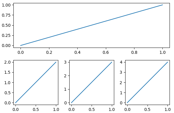
这里要计算好第二张图片的位置是6
分格显示
为了生成这样的绘图

第一种方式 subplot2grid
import matplotlib.pyplot as plt
# method 1: subplot2grid
##########################
plt.figure()
ax1 = plt.subplot2grid((3, 3), (0, 0), colspan=3)  # stands for axes
ax1.plot([1, 2], [1, 2])
ax1.set_title('ax1_title')  #这里注意在plot.title plot.xlabel 等等都变成了axis.set_title , axis.set_xlabel
ax2 = plt.subplot2grid((3, 3), (1, 0), colspan=2)    #colspan列横跨长度
ax3 = plt.subplot2grid((3, 3), (1, 2), rowspan=2)    #rowspan行横跨长度
ax4 = plt.subplot2grid((3, 3), (2, 0))
ax4.scatter([1, 2], [2, 2])
ax4.set_xlabel('ax4_x')
ax4.set_ylabel('ax4_y')
ax5 = plt.subplot2grid((3, 3), (2, 1))
plt.tight_layout()
plt.show()
第二种方式:
import matplotlib.gridspec as gridspec、
import matplotlib.pyplot as plt
import matplotlib.gridspec as gridspec
plt.figure()
gs = gridspec.GridSpec(3, 3)
# use index from 0
ax6 = plt.subplot(gs[0, :])  # 第一行所有列都占了
ax7 = plt.subplot(gs[1, :2])    #第二行占到第三列
ax8 = plt.subplot(gs[1:, 2])     #第二列第二行占到第二列
ax9 = plt.subplot(gs[-1, 0])
ax10 = plt.subplot(gs[-1, -2])
plt.tight_layout()
plt.show()
也就是按照索引的方式
第三种方法subplots (这里注意是复数)
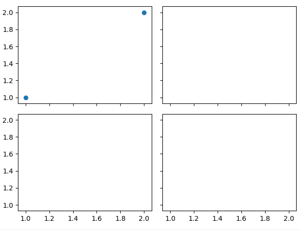
import matplotlib.pyplot as plt
f, ((ax11, ax12), (ax13, ax14)) = plt.subplots(2, 2, sharex=True, sharey=True)  #共享x轴共享y轴
ax11.scatter([1, 2], [1, 2])

plt.tight_layout()
plt.show()
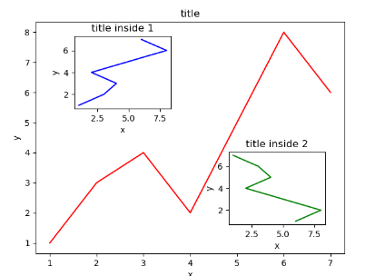
图中图
通过在同一个figure中增加axis实现
import matplotlib.pyplot as plt

fig = plt.figure()
x = [1, 2, 3, 4, 5, 6, 7]
y = [1, 3, 4, 2, 5, 8, 6]

# below are all percentage
left, bottom, width, height = 0.1, 0.1, 0.8, 0.8
ax1 = fig.add_axes([left, bottom, width, height])  # main axes
ax1.plot(x, y, 'r')
ax1.set_xlabel('x')
ax1.set_ylabel('y')
ax1.set_title('title')

ax2 = fig.add_axes([0.2, 0.6, 0.25, 0.25])  # inside axes
ax2.plot(y, x, 'b')
ax2.set_xlabel('x')
ax2.set_ylabel('y')
ax2.set_title('title inside 1')


# different method to add axes
####################################
plt.axes([0.6, 0.2, 0.25, 0.25])
plt.plot(y[::-1], x, 'g')    #因为是跟着当前的axes的,所以直接用plt.plt就行
plt.xlabel('x')
plt.ylabel('y')
plt.title('title inside 2')

plt.show()
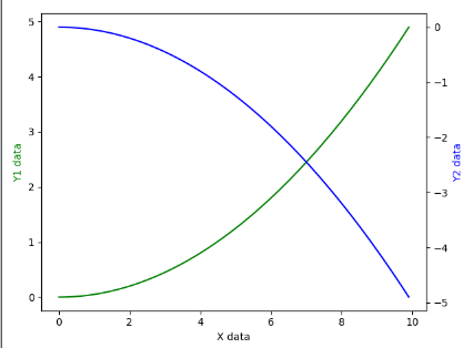
主次坐标轴
import matplotlib.pyplot as plt
import numpy as np

x = np.arange(0, 10, 0.1)
y1 = 0.05 * x**2
y2 = -1 *y1

fig, ax1 = plt.subplots()

ax2 = ax1.twinx()    # mirror the ax1
ax1.plot(x, y1, 'g-')
ax2.plot(x, y2, 'b-')

ax1.set_xlabel('X data')
ax1.set_ylabel('Y1 data', color='g')
ax2.set_ylabel('Y2 data', color='b')

plt.show()
动画animation
# View more python tutorials on my Youtube and Youku channel!!!

# Youtube video tutorial: https://www.youtube.com/channel/UCdyjiB5H8Pu7aDTNVXTTpcg
# Youku video tutorial: http://i.youku.com/pythontutorial

# 19 - animation
"""
Please note, this script is for python3+.
If you are using python2+, please modify it accordingly.
Tutorial reference:
http://matplotlib.org/examples/animation/simple_anim.html
More animation example code:
http://matplotlib.org/examples/animation/
"""

import numpy as np
from matplotlib import pyplot as plt
from matplotlib import animation

fig, ax = plt.subplots()

x = np.arange(0, 2*np.pi, 0.01)
line, = ax.plot(x, np.sin(x))


def animate(i):
    line.set_ydata(np.sin(x + i/10.0))  # update the data
    return line,


# Init only required for blitting to give a clean slate.
def init():
    line.set_ydata(np.sin(x))
    return line,

# call the animator.  blit=True means only re-draw the parts that have changed.
# blit=True dose not work on Mac, set blit=False
# interval= update frequency
ani = animation.FuncAnimation(fig=fig, func=animate, frames=100, init_func=init,
                              interval=20, blit=False)        #frame是帧数 init是动画开始是怎么样的 interval是update的频率(隔多少毫秒) blit 是否更新整张图片的点还是只更新变化的点

# save the animation as an mp4.  This requires ffmpeg or mencoder to be
# installed.  The extra_args ensure that the x264 codec is used, so that
# the video can be embedded in html5.  You may need to adjust this for
# your system: for more information, see
# http://matplotlib.sourceforge.net/api/animation_api.html
# anim.save('basic_animation.mp4', fps=30, extra_args=['-vcodec', 'libx264'])

plt.show()
# View more python tutorials on my Youtube and Youku channel!!!

# Youtube video tutorial: https://www.youtube.com/channel/UCdyjiB5H8Pu7aDTNVXTTpcg
# Youku video tutorial: http://i.youku.com/pythontutorial

# 19 - animation
"""
Please note, this script is for python3+.
If you are using python2+, please modify it accordingly.
Tutorial reference:
http://matplotlib.org/examples/animation/simple_anim.html
More animation example code:
http://matplotlib.org/examples/animation/
"""

import numpy as np
from matplotlib import pyplot as plt
from matplotlib import animation

fig, ax = plt.subplots()

x = np.arange(0, 2*np.pi, 0.01)
line, = ax.plot(x, np.sin(x))


def animate(i):
    line.set_ydata(np.sin(x + i/10.0))  # update the data
return line,


# Init only required for blitting to give a clean slate.
def init():
    line.set_ydata(np.sin(x))
    return line,

# call the animator.  blit=True means only re-draw the parts that have changed.
# blit=True dose not work on Mac, set blit=False
# interval= update frequency
ani = animation.FuncAnimation(fig=fig, func=animate, frames=100, init_func=init,
interval=20, blit=False)    #frame是帧数 init是动画开始是怎么样的 interval是update的频率(隔多少毫秒) blit 是否更新整张图片的点还是只更新变化的点

# save the animation as an mp4.  This requires ffmpeg or mencoder to be
# installed.  The extra_args ensure that the x264 codec is used, so that
# the video can be embedded in html5.  You may need to adjust this for
# your system: for more information, see
# http://matplotlib.sourceforge.net/api/animation_api.html
# anim.save('basic_animation.mp4', fps=30, extra_args=['-vcodec', 'libx264'])

plt.show()