-
1、用dom元素遮挡,想挡几个挡几个,这个就不说了。
2、用css3渐变背景:
background-image: linear-gradient(direction, color-stop1, color-stop2, ...);
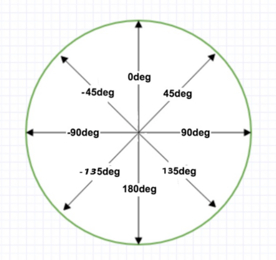
direction:用角度值指定渐变的方向(或角度)。
color-stop1, color-stop2,...:用于指定渐变的起止颜色。
遮挡一个角
background-image: linear-gradient(-45deg,transparent 10px,cadetblue 0);
  /* 或者 */
background-image: linear-gradient(to left top,transparent 10px,cadetblue 0);
遮挡多个角:
background: linear-gradient(135deg, transparent 10px, #58a 0) top left,
          linear-gradient(-135deg, transparent 10px, #58a 0) top right,
          linear-gradient(-45deg, transparent 10px, #58a 0) bottom right,
          linear-gradient(45deg, transparent 10px, #58a 0) bottom left;
  background-size: 50% 50%;
  background-repeat: no-repeat;

这个实际上使用四个图形拼接出来的
background-size: 50% 50%; 表示每个小图形宽50%,高50%
弧形切角:
background: radial-gradient(circle at top left, transparent 10px, #58a 0) top left,
          radial-gradient(circle at top right, transparent 10px, #58a 0) top right,
          radial-gradient(circle at bottom right, transparent 10px, #58a 0) bottom right,
          radial-gradient(circle at bottom left, transparent 10px, #58a 0) bottom left;
  background-size: 50% 50%;
  background-repeat: no-repeat;

clip-path
clip-path CSS 属性可以创建一个只有元素的部分区域可以显示的剪切区域。区域内的部分显示,区域外的隐藏。
clip-path: polygon(x y, x1 y1, x2 y2, x3 y3, ...)
background:cadetblue;
  clip-path: polygon(15px 0, calc(100% - 15px) 0, 100% 15px,  100% calc(100% - 15px), calc(100% - 15px) 100%, 15px 100%, 0 calc(100% - 15px), 0 15px)

clip-path异常强大,可以绘制出很多中缺角多边形
-