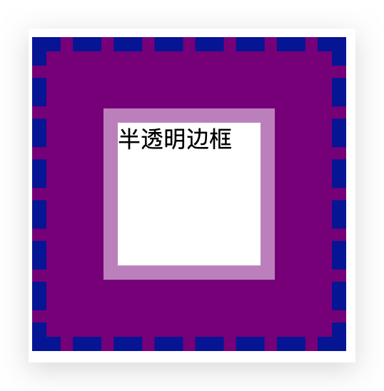
一、半透明边框
关键词:background-clip
.bantouming {
    width: 200px;
    height: 200px;
    background: darkmagenta;
    border: 10px dashed rgb(5, 42, 165);
    display: flex;
    background-clip: border-box;
  }

  .bantouming .bantouming_div {
    width: 100px;
    height: 100px;
    margin: auto;
    border: 10px solid hsla(0, 0%, 100%, .5);
    background: white;
    background-clip: padding-box;
  }
<div class="bantouming">
    <div class="bantouming_div">半透明边框</div>
  </div>
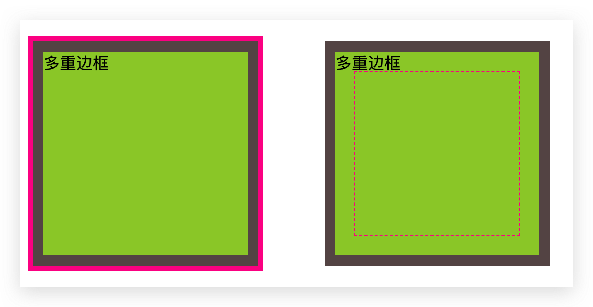
二、多重边框
关键词:box-shadow,outline
.duochong {
    width: 200px;
    height: 200px;
    margin: 30px;
    background: yellowgreen;
    box-shadow: 0 0 0 10px #655,
      0 0 0 15px deeppink,
      0 2px 5px 15px rgba(0, 0, 0, .6);
  }

  .duochong1 {
    width: 200px;
    height: 200px;
    margin: 30px;
    background: yellowgreen;
    box-shadow: 0 0 0 10px #655 inset,
      0 0 0 15px deeppink inset,
      0 2px 5px 15px rgba(0, 0, 0, .6) inset;
  }

  .duochong2 {
    width: 200px;
    height: 200px;
    margin: 30px;
    background: yellowgreen;
    border: 10px solid #655;
    outline: 5px solid deeppink;
  }

  .duochong3 {
    width: 200px;
    height: 200px;
    margin: 30px;
    background: yellowgreen;
    border: 10px solid #655;
    outline: 1px dashed deeppink;
    outline-offset: -30px;
  }
  <div class="duochong">多重边框</div>
  <div class="duochong1">多重边框</div>
  <div class="duochong2">多重边框</div>
  <div class="duochong3">多重边框</div>

三、背景定位
关键词:background-origin,background-position
.beijing {
    width: 300px;
    height: 300px;
    margin: 50px;
    background: url(timg.jpeg) no-repeat #58a;
    background-size: 200px 200px;
    background-position: right 20px bottom 10px;
  }

  .beijing1 {
    width: 300px;
    height: 300px;
    margin: 50px;
    padding: 10px;
    background: url(timg.jpeg) no-repeat #58a bottom right;
    background-size: 200px 200px;
    /* 或 100% 100% */
    background-origin: content-box;
  }

  .beijing2 {
    width: 300px;
    height: 300px;
    margin: 50px;
    background: url(timg.jpeg) no-repeat #58a;
    background-size: 200px 200px;
    background-position: calc(100% - 20px) calc(100% - 10px);
  }
  <div class="beijing"></div>
  <div class="beijing1"></div>
  <div class="beijing2"></div>

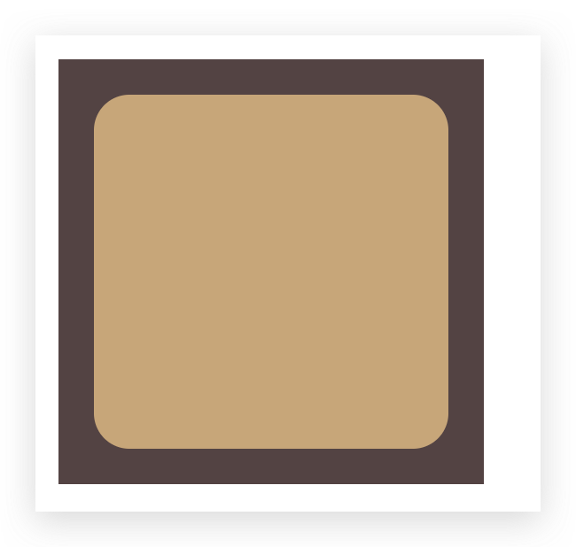
四、边框内圆角
关键词:勾股定理
.yuanjiao {
    background: tan;
    border-radius: 20px;
    padding: 100px;
    margin: 50px;
    box-shadow: 0 0 0 10px #655;
    outline: 20px solid #655;
  }
<div class="yuanjiao"></div>
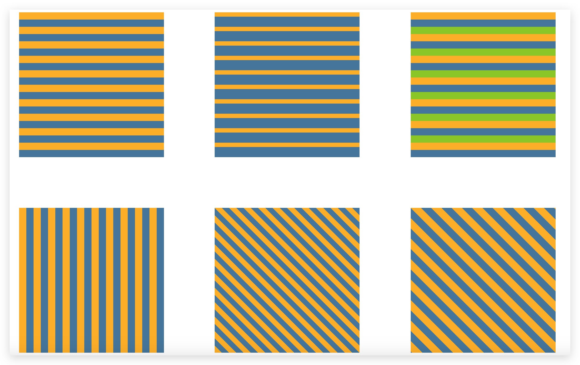
五、条纹背景
关键词:渐变
<div class="tiaowen"></div>
  <div class="tiaowen1"></div>
  <div class="tiaowen2"></div>
  <div class="tiaowen3"></div>
  <div class="tiaowen4"></div>
  <div class="tiaowen5"></div>
<div class="tiaowen6"></div>
  <div class='tongsexi'></div>
.tiaowen {
    width: 300px;
    height: 300px;
    margin: 50px;
    background: linear-gradient(#fb3 50%, #58a 50%);
    background-size: 100% 30px;
  }

  .tiaowen1 {
    width: 300px;
    height: 300px;
    margin: 50px;
    background: linear-gradient(#fb3 30%, #58a 0);
    background-size: 100% 30px;
  }

  .tiaowen2 {
    width: 300px;
    height: 300px;
    margin: 50px;
    background: linear-gradient(#fb3 33.3%,
        #58a 0, #58a 66.6%, yellowgreen 0);
    background-size: 100% 45px;
  }

  .tiaowen3 {
    width: 300px;
    height: 300px;
    margin: 50px;
    background: linear-gradient(to right,
        /* 或 90deg */
        #fb3 50%, #58a 0);
    background-size: 30px 100%;
  }

  .tiaowen4 {
    width: 300px;
    height: 300px;
    margin: 50px;
    background: linear-gradient(45deg,
        #fb3 25%, #58a 0, #58a 50%,
        #fb3 0, #fb3 75%, #58a 0);
    background-size: 30px 30px;
  }

  .tiaowen5 {
    width: 300px;
    height: 300px;
    margin: 50px;
    background: linear-gradient(45deg,
        #fb3 25%, #58a 0, #58a 50%,
        #fb3 0, #fb3 75%, #58a 0);
    background-size: 42.426406871px 42.426406871px;
  }

  .tiaowen6 {
    width: 300px;
    height: 300px;
    margin: 50px;
    background: repeating-linear-gradient(45deg,
        #fb3, #fb3 15px, #58a 0, #58a 30px);
  }

  .tongsexi {
    width: 300px;
    height: 300px;
    margin: 50px;
    background: #58a;
    background-image: repeating-linear-gradient(30deg,
        hsla(0, 0%, 100%, .1),
        hsla(0, 0%, 100%, .1) 15px,
        transparent 0, transparent 30px);
  }

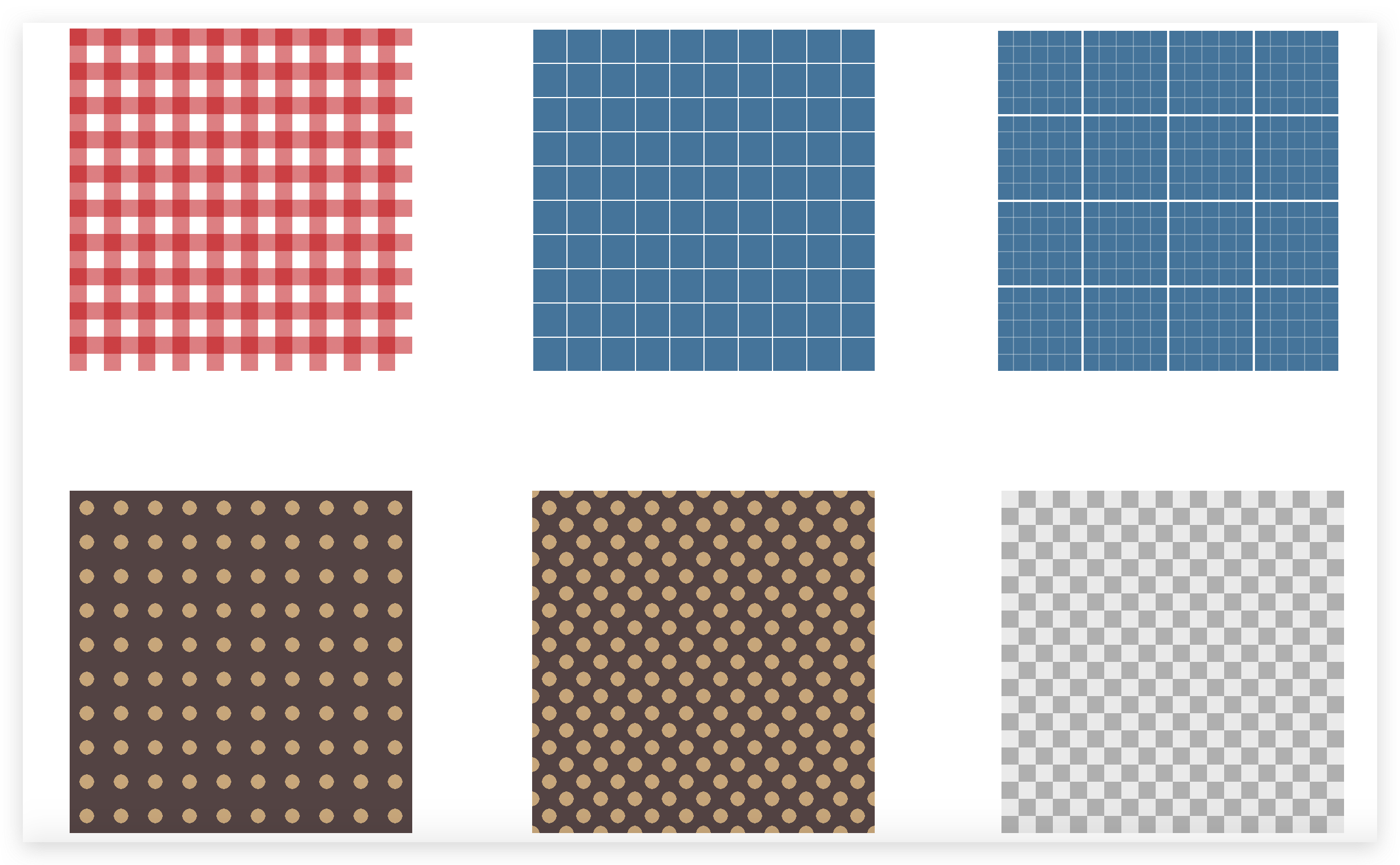
六、复杂背景
关键词:渐变
<div class="wangge1"></div>
  <div class="wangge2"></div>
  <div class="wangge3"></div>
  <div class="bodian1"></div>
  <div class="bodian2"></div>
  <div class="bodian3"></div>
  <div class="qipan"></div>
.wangge1 {
    width: 300px;
    height: 300px;
    margin: 50px;
    background: white;
    background-image: linear-gradient(90deg,
        rgba(200, 0, 0, .5) 50%, transparent 0),
      linear-gradient(rgba(200, 0, 0, .5) 50%, transparent 0);
    background-size: 30px 30px;
  }

  .wangge2 {
    width: 300px;
    height: 300px;
    margin: 50px;
    background: #58a;
    background-image:
      linear-gradient(white 1px, transparent 0),
      linear-gradient(90deg, white 1px, transparent 0);
    background-size: 30px 30px;
  }

  .wangge3 {
    width: 300px;
    height: 300px;
    margin: 50px;
    background: #58a;
    background-image:
      linear-gradient(white 2px, transparent 0),
      linear-gradient(90deg, white 2px, transparent 0),
      linear-gradient(hsla(0, 0%, 100%, .3) 1px,
        transparent 0),
      linear-gradient(90deg, hsla(0, 0%, 100%, .3) 1px,
        transparent 0);
    background-size: 75px 75px, 75px 75px,
      15px 15px, 15px 15px;
  }

  .bodian1 {
    width: 300px;
    height: 300px;
    margin: 50px;
    background: #655;
    background-image: radial-gradient(tan 30%, transparent 0);
    background-size: 30px 30px;
  }

  .bodian2 {
    width: 300px;
    height: 300px;
    margin: 50px;
    background: #655;
    background-image: radial-gradient(tan 30%, transparent 0),
      radial-gradient(tan 30%, transparent 0);
    background-size: 30px 30px;
    background-position: 0 0, 15px 15px;
  }

  .qipan {
    width: 300px;
    height: 300px;
    margin: 50px;
    background: #eee;
    background-image: linear-gradient(45deg,
        rgba(0, 0, 0, .25) 25%, transparent 0,
        transparent 75%, rgba(0, 0, 0, .25) 0),
      linear-gradient(45deg,
        rgba(0, 0, 0, .25) 25%, transparent 0,
        transparent 75%, rgba(0, 0, 0, .25) 0);
    background-position: 0 0, 15px 15px;
    background-size: 30px 30px;
  }

  .suiji {
    width: 700px;
    height: 400px;
    margin: 50px;
    background: hsl(20, 40%, 90%);
    background-image:
      linear-gradient(90deg, #fb3 11px, transparent 0),
      linear-gradient(90deg, #ab4 23px, transparent 0),
      linear-gradient(90deg, #655 41px, transparent 0);
    background-size: 41px 100%, 61px 100%, 83px 100%;
  }
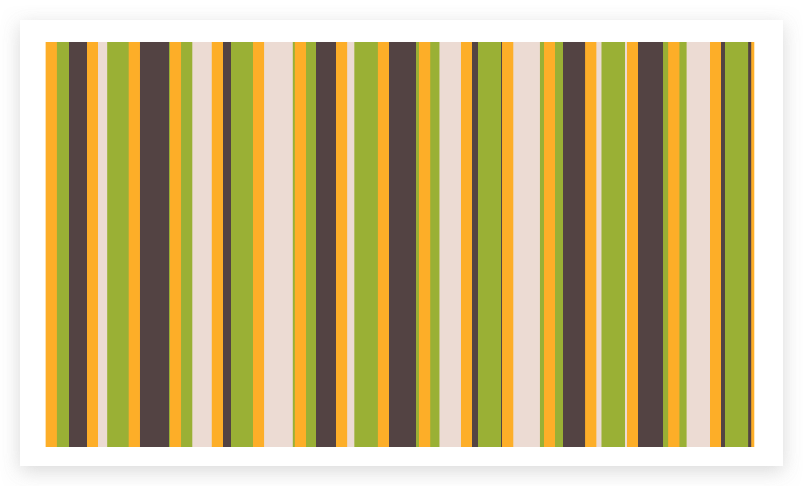
七、随机背景
关键词:质数
.suiji {
    width: 700px;
    height: 400px;
    margin: 50px;
    background: hsl(20, 40%, 90%);
    background-image:
      linear-gradient(90deg, #fb3 11px, transparent 0),
      linear-gradient(90deg, #ab4 23px, transparent 0),
      linear-gradient(90deg, #655 41px, transparent 0);
    background-size: 41px 100%, 61px 100%, 83px 100%;
  }
<div class="suiji"></div>
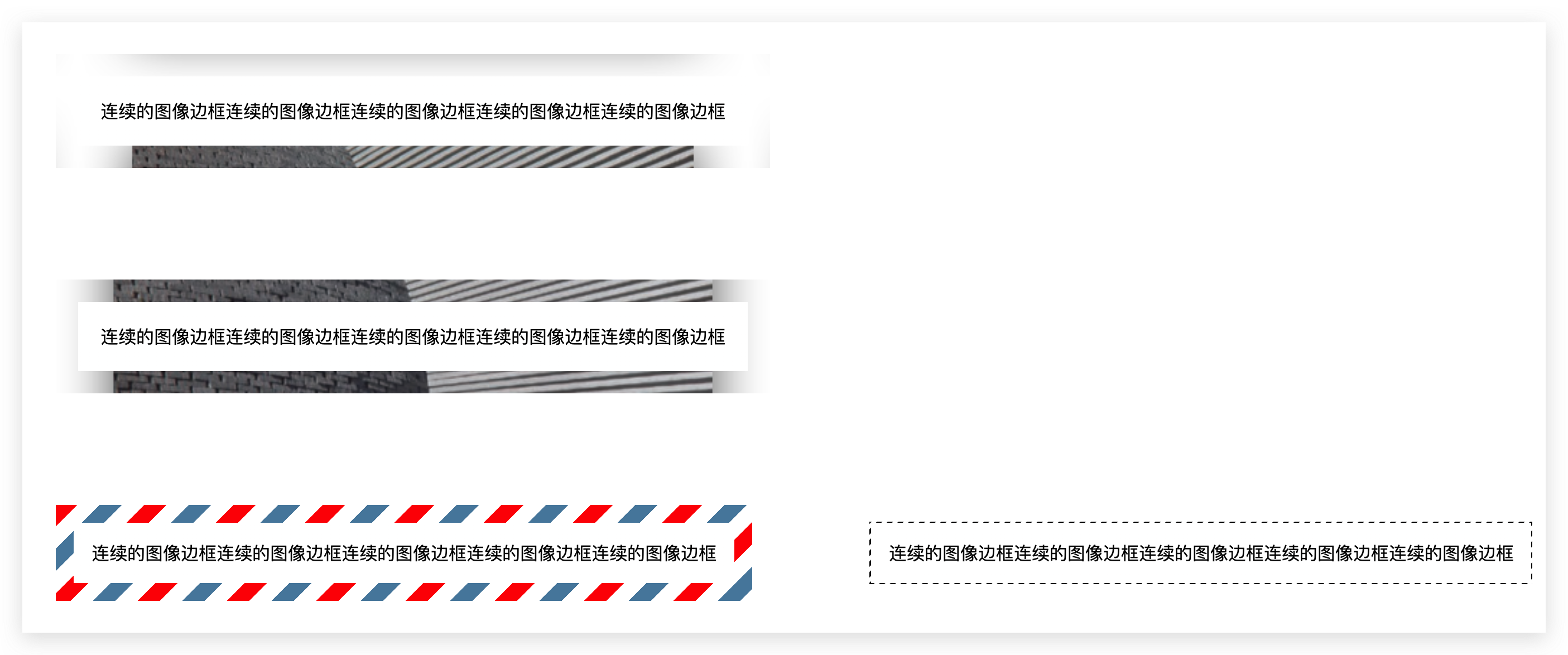
八、连续的图像边框
关键词:渐变
.lianxu {
    margin: 50px;
    padding: 20px;
    border: 20px solid transparent;
    background: linear-gradient(white, white),
      url(stone.png);
    background-size: cover;
    background-clip: padding-box, border-box;
  }

  .lianxu1 {
    margin: 50px;
    padding: 20px;
    border: 20px solid transparent;
    /* background: linear-gradient(white, white),
      url(stone.png);
    background-size: cover;
    background-clip: padding-box, border-box;
    background-origin: border-box; */
    background:
      linear-gradient(white, white) padding-box,
      url(stone.png) border-box 0 / cover;
  }

  .lianxu2 {
    margin: 50px;
    padding: 1em;
    border: 1em solid transparent;
    background: linear-gradient(white, white) padding-box,
      repeating-linear-gradient(-45deg,
        red 0, red 12.5%,
        transparent 0, transparent 25%,
        #58a 0, #58a 37.5%,
        transparent 0, transparent 50%) 0 / 5em 5em;
  }

  @keyframes ants {
    to {
      background-position: 100%
    }
  }

  .lianxu3 {
    margin: 50px;
    padding: 1em;
    border: 1px solid transparent;
    background:
      linear-gradient(white, white) padding-box,
      repeating-linear-gradient(-45deg,
        black 0, black 25%, white 0, white 50%) 0 / .6em .6em;
    animation: ants 12s linear infinite;
  }
<div class="lianxu">连续的图像边框连续的图像边框连续的图像边框连续的图像边框连续的图像边框</div>
  <div class="lianxu1">连续的图像边框连续的图像边框连续的图像边框连续的图像边框连续的图像边框</div>
  <div class="lianxu2">连续的图像边框连续的图像边框连续的图像边框连续的图像边框连续的图像边框</div>
  <div class="lianxu3">连续的图像边框连续的图像边框连续的图像边框连续的图像边框连续的图像边框</div>
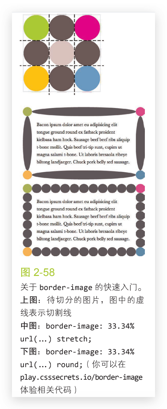
最后:border-image 是如何工作的
结尾:从css揭秘学习