CSS过度约束性质
什么是CSS过度约束
简单的来说就是,父子元素的情况下,子元素的位置是依据一定条件进行计算的,以下则对这些条件进行详细的说明
当没有开启绝对定位或固定定位时
水平布局必须要满足以下等式
子元素在父元素中的水平布局必须要满足以下等式
margin-left + border-left + padding-left + width + paddind-right + border-right + margin-right = 包含块的内容区的width
探寻能够设置成auto的CSS属性
这里七个值在中能设置auto的属性有
 auto;
margin-left: auto;
margin-right: auto;
等式不成立(过度约束)时的几种情况
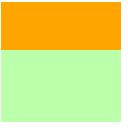
当margin与width都没有设置为auto
浏览器自动计算margin-right
<style>
    .box1{
         800px;
        height: 200px;
        border: 1px red solid;
    }

    .box2{
         200px;
        height: 200px;
        background-color: orange;

        /* margin-right无论设置多少都没用,因为浏览器会自动计算此值 */
        margin-right: 2000px;

        /* 此时margin-right = 600px
        margin-left + border-left + padding-left + width + paddind-right + border-right + margin-right = 包含块的内容区的width
        0 + 0 + 0 + 200 + 0 + 0 + margin-right = 800
        */
    }
</style>
<body>
    <div class="box1">
        <div class="box2"></div>
    </div>
</body>
当margin或width中有一个被设置为auto
会自动调整那个被设置为auto的属性
<style>
    .box1{
         800px;
        height: 200px;
        border: 1px red solid;
    }

    .box2{
         200px;
        height: 200px;
        background-color: orange;
        margin-left: auto;

        /* 此时margin-right = 0px
        margin-left + border-left + padding-left + width + paddind-right + border-right + margin-right = 包含块的内容区的width
        auto + 0 + 0 + 200 + 0 + 0 + margin-right = 800
        会自动调整那个被设置为auto的属性
        600px + 0 + 0 + 200 + 0 + 0 + margin-right = 800
        */
    }
</style>
<body>
    <div class="box1">
        <div class="box2"></div>
    </div>
</body>

当margin与width都被设置为auto
宽度会被调整到最大,外边距为0
<style>
    .box1{
         800px;
        height: 200px;
        border: 1px red solid;
    }

    .box2{
         auto;
        height: 200px;
        background-color: orange;
        margin-left: auto;
        margin-right: auto;


        /* 此时width会是800px
        margin-left + border-left + padding-left + width + paddind-right + border-right + margin-right = 包含块的内容区的width
        auto + 0 + 0 + auto + 0 + 0 + auto = 800
        宽度会被调整到最大,外边距为0
        0 + 0 + 0 + width=auto=>800px + 0 + 0 + 0 = 800
        */
    }
</style>
<body>
    <div class="box1">
        <div class="box2"></div>
    </div>
</body>
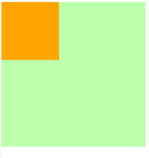
当margin都被设置为auto,width是固定值时
会自动平均分配给两个为auto的margin
这也是元素水平居中的原理
<style>
    .box1{
         800px;
        height: 200px;
        border: 1px red solid;
    }

    .box2{
         200px;
        height: 200px;
        background-color: orange;

        margin-left: auto;
        margin-right: auto;

        /* margin-left = margin-right = 300px
        margin-left + border-left + padding-left + width + paddind-right + border-right + margin-right = 包含块的内容区的width
        auto + 0 + 0 + 200 + 0 + 0 + auto = 800
        */
    }
</style>
<body>
    <div class="box1">
        <div class="box2"></div>
    </div>
</body>
当开启绝对定位或固定定位时
水平布局必须要满足以下等式
子元素在父元素中的水平布局必须要满足以下等式
left + margin-left + border-left + padding-left + width + paddind-right + border-right + margin-right + right = 包含块的内容区的width
垂直布局必须要满足以下等式(没开定位时垂直布局不受约束)
子元素在父元素中的垂直布局必须要满足以下等式
top + margin-top + border-top + padding-top + height + paddind-bottom + border-bottom + margin-bottom + bottom = 包含块的内容区的height
垂直布局的情况与水平布局一致
探寻可以设置为auto的CSS属性
left: auto;
right: auto;
margin-left: auto;
margin-right: auto;
 auto;
当都没有设置auto时
会自动调整right值以使等式满足,注意: 没开启定位时,是自动调整margin-right
<style>
    .box1{
         500px;
        height: 500px;
        background-color: #bfa;
        position: relative;
    }

    .box2{
         200px;
        height: 200px;
        background-color: orange;
        position: absolute;


        /* 水平布局必须要满足以下等式
            left + margin-left + border-left + padding-left + width + paddind-right + border-right + margin-right + right = 包含块的内容区的width


        */
        left: 0;
        right: 0;   /* right将不会生效,因为需要满足过度约束*/
        /* 0 + 0 + 0 + 0 + 200px + 0 + 0 + 0 + right = 500px
            right => 300px
         */
    }
</style>
<body>
    <div class="box1">
        <div class="box2"></div>
    </div>
</body>
当其中有一个属性被设置auto时
自动调整auto的值使等式成立
<style>
    .box1{
         500px;
        height: 500px;
        background-color: #bfa;
        position: relative;
    }

    .box2{
         auto;
        height: 200px;
        background-color: orange;
        position: absolute;


        /* 水平布局必须要满足以下等式
            left + margin-left + border-left + padding-left + width + paddind-right + border-right + margin-right + right = 包含块的内容区的width


        */
        left: 0;
        right: 0;

        /* 0 + 0 + 0 + 0 + auto + 0 + 0 + 0 + 0 = 500px
            auto => 500px
         */
    }
</style>
<body>
    <div class="box1">
        <div class="box2"></div>
    </div>
</body>
当width和margin被设置auto时(与其他水平布局一样当同时存在总是优先调整width)
会调整width,并将margin设置为0
<style>
    .box1{
         500px;
        height: 500px;
        background-color: #bfa;
        position: relative;
    }

    .box2{
         auto;
        height: 200px;
        background-color: orange;
        position: absolute;
        margin-left: auto;
        margin-right: auto;


        /* 水平布局必须要满足以下等式
            left + margin-left + border-left + padding-left + width + paddind-right + border-right + margin-right + right = 包含块的内容区的width


        */
        left: 0;
        right: 0;

        /* 0 + auto + 0 + 0 + width + 0 + 0 + auto + 0 = 500px
            auto => 0px

            width => 500px
            当width和margin被设置auto时只会调整width
         */
    }
</style>
<body>
    <div class="box1">
        <div class="box2"></div>
    </div>
</body>

当margin left right被设置auto时
因为left,right两个属性的默认值是auto,所以会优先调整left和right
<style>
    .box1{
         500px;
        height: 500px;
        background-color: #bfa;
        position: relative;
    }

    .box2{
         200px;
        height: 200px;
        background-color: orange;
        position: absolute;
        margin-left: auto;
        margin-right: auto;

        /* 水平布局必须要满足以下等式
            left + margin-left + border-left + padding-left + width + paddind-right + border-right + margin-right + right = 包含块的内容区的width


        */

        /* 不指定时left与right默认值就是auto*/
        /* left: auto;
        right: auto; */


        /* auto + auto + 0 + 0 + 200px + 0 + 0 + auto + auto = 500px
            优先调整left或right(相当于回到第一种情况==>优先调整right)
            0 + 0 + 0 + 0 + 200px + 0 + 0 + 0 + 300px = 500px
        */
    }
</style>
<body>
    <div class="box1">
        <div class="box2"></div>
    </div>
</body>
所以实现水平居中时需要显式的指定left和right的值
<style>
    .box1{
         500px;
        height: 500px;
        background-color: #bfa;
        position: relative;
    }

    .box2{
         200px;
        height: 200px;
        background-color: orange;
        position: absolute;
        margin-left: auto;
        margin-right: auto;

        /* 水平布局必须要满足以下等式
            left + margin-left + border-left + padding-left + width + paddind-right + border-right + margin-right + right = 包含块的内容区的width
        */

        /* 水平居中时需要显式的指定left和right的值*/
        left: 0;
        right: 0;

        /* 0 + auto + 0 + 0 + 200px + 0 + 0 + auto + 0 = 500px
            调整margin-left和margin-right
            0 + 150px + 0 + 0 + 200px + 0 + 0 + 0 + 150px = 500px
        */
    }
</style>
<body>
    <div class="box1">
        <div class="box2"></div>
    </div>
</body>

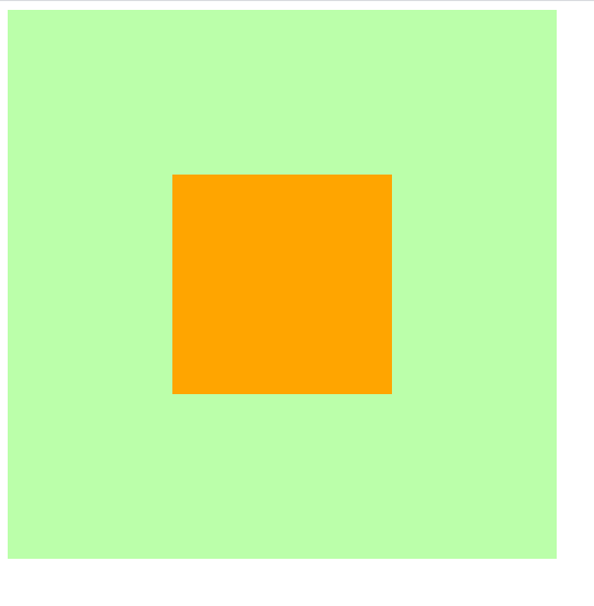
集合开启定位后水平与垂直方向的过度约束的知识实现在父元素中垂直水平居中
<style>
    .father{
         500px;
        height: 500px;
        background-color: #bfa;
    }

    .son{
         200px;
        height: 200px;
        background-color: orange;
    }

    /* 实现在父元素中垂直水平居中 */

    /* ====================水平居中样式开始================= */
    .father{
        position: relative; /* 确定father为包含块,不然定位就会以html为原点 */
    }
    .son{
        position: absolute;
        left: 0;
        right: 0;
        margin-left: auto;
        margin-right: auto;
    }
    /*
        此时条件约束等式为
        left + margin-left + border-left + padding-left + width + paddind-right + border-right + margin-right + right = 包含块的内容区的width
        0 + auto + 0 + 0 + 200px + 0 + 0 + auto + 0 = 500px
        auto => 150px
    */

    /* ====================水平居中样式结束================= */


    /* ====================垂直居中样式开始================= */
    .father{
        position: relative;
    }
    .son{
        position: absolute;     /* 只有开启定位才受过度约束 */
        top: 0;
        bottom: 0;
        margin-top: auto;
        margin-bottom: auto;
    }

    /*
        此时条件约束等式为
        top + margin-top + border-top + padding-top + height + paddind-bottom + border-bottom + margin-bottom + bottom = 包含块的内容区的height
        0 + auto + 0 + 0 + 200px + 0 + 0 + auto + 0 = 500px
        auto => 150px
    */

    /* ====================垂直居中样式结束================= */

    /* 实现在父元素中垂直水平居中 */
</style>
<body>
    <div class="father">
        <div class="son"></div>
    </div>
</body>