提起:before :after首先想到的是 —— 用它来去浮动来我们来换个方式玩接下来展示三种用:before :after来实现的特效 希望能起到抛砖引玉的作用
<一>第一种就是常见的小三角
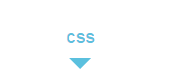
直接上干货了:
//在你想要添加三角的地方加上
.demo:after
{
content: "";
position: absolute;
top: 80%; left: 50%;
border-top: .6em solid #5BC0DE;
border-left: .6em solid transparent;
border-right: .6em solid transparent;
margin-left: -.6em;
}
<二>多色border-bottom

.blog-nav
{
font-size:2em;
padding: 0 1em 0 1em;
position: relative;
}
.blog-nav:before
{
content: "";
height: .25em;
62.5%;
position: absolute;
left: 8%;
background: #b1cf37;
bottom: -.25em;
}
.blog-nav:after{
content: "";
height: .25em;
30%;
position: absolute;
left: 70%;
background: #f48123;
bottom: -.25em;
}
<三>鼠标hover往两端扩展特效

底部横线在鼠标移到元素上从中间往两端出现
.title {
color:black;
font-weight: 500;
font-size: 2em;
transition: color .3s;
position: relative;
display: inline-block; }
.title:before{
height: 3px;
background-color:
#5BC0DE;
transform: scaleX(0) ;
content: "";
position: absolute; 100%;
bottom: 0; left: 0;
transition-duration: .2s;
transition-timing-function: ease-in-out;
transition-delay: 0s;
}
.title:hover:before
{
transform: scaleX(1);
content: "";
float:left;
100%;
bottom: 0;
left: 0;
transition-duration: .2s;
transition-timing-function: ease-in-out;
transition-delay: 0s;
}