1 matplotlib API入门
约定:
import matplotlib.pyplot as plt
1.1 Figure 和 Subplot
plt.figure创建一个figure空对象;空的figure不能绘图,需要创建sub_plot。
plt.add_subplot增加子图。
如:
import numpy as np
import matplotlib.pyplot as plt

fig = plt.figure()

ax1 = fig.add_subplot(2,2,1)
ax2 = fig.add_subplot(2,2,2)
ax3 = fig.add_subplot(2,2,3)

# 默认在最后一个sub_plot上绘图
plt.plot(np.random.randn(50),'k--')
# “k--”:表示黑色虚线

_  = ax1.hist(np.random.randn(100), bins = 20, color='k', alpha=0.3)

ax2.scatter(np.arange(30), np.arange(30)+ 3* np.random.randn(30))
形成绘图:

更加简便的方法,plt.subplots一次创建fig和sub_plot
fig, axes = plt.subplots(2,3)

axes
Out[7]:
array([[<matplotlib.axes._subplots.AxesSubplot object at 0x000000000B7BBCC0>,
        <matplotlib.axes._subplots.AxesSubplot object at 0x000000000C4E4390>,
        <matplotlib.axes._subplots.AxesSubplot object at 0x000000000C5BC128>],
       [<matplotlib.axes._subplots.AxesSubplot object at 0x000000000C82DCC0>,
        <matplotlib.axes._subplots.AxesSubplot object at 0x000000000C334048>,
        <matplotlib.axes._subplots.AxesSubplot object at 0x000000000C3B6400>]], dtype=object)
# 使用axes[i,j] 即可进行索引。

1.2 调整subplot周围的间距
使用plt.subplots_adjust()调整间距,有left,right,bottom,top,wspace和hspace。
wspace和hspace表示宽度和高度的百分比。
import numpy as np
import matplotlib.pyplot as plt

fig, axes = plt.subplots(2,2, sharex=True, sharey=True)

for i in range(2):
    for j in range(2):
        axes[i,j].hist(np.random.randn(500),bins=50,color='r',alpha=0.5)

plt.subplots_adjust(wspace=0,hspace=0)
绘图结果:
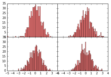
标签有点重叠,只能调整标签。
1.3 颜色、标记和线形
下面两个写法等价:
ax.plot(x,y,'g--')
## 等价于
ax.plot(x,y, linestyle='--', color='g')
下面两个也是:
plt.plot(np.random.randn(50).cumsum(),'ko--')
## 等价于
plt.plot(np.random.randn(50).cumsum(), color='k', linestyle='dashed', marker='o')
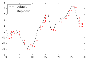
import numpy as np
import matplotlib.pyplot as plt

data = np.random.randn(30).cumsum()
plt.plot(data,'k--',label='Default')  # 默认都是折线图
plt.plot(data,'r--',label='step-post',drawstyle='steps-post')
plt.legend(loc='best')
结果:
1.4 刻度、标签和图例
import numpy as np
from numpy.random import randn
import matplotlib.pyplot as plt
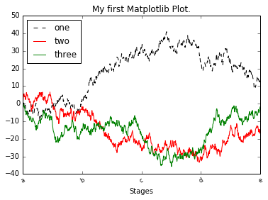
fig = plt.figure()
ax = fig.add_subplot(1,1,1)
ax.plot(randn(1000).cumsum(),'k--',label='one') # label:增加标签
ax.plot(randn(1000).cumsum(),'r',label='two')
ax.plot(randn(1000).cumsum(),'g-',label='three')
ticks = ax.set_xticks([0,250,500,750,1000]) # 设置横坐标,默认直接显示数值
labels = ax.set_xticklabels(list('abcde'),rotation=30,fontsize='small') # 给横坐标值增加标签,
ax.set_title('My first Matplotlib Plot.') # 增加图标题
ax.set_xlabel('Stages') # 增加横坐标 的标题
ax.legend(loc='best') # 在最好(best)的位置 自动放置图例
结果:
1.4 注解及在subplot上绘图
import matplotlib.pyplot as plt

plt.plot(76, 0.75, 'o')
plt.annotate('This is awesome!',
             xy=(76, 0.75),
             xycoords='data',
             textcoords='offset points',
             arrowprops=dict(arrowstyle="->"))
plt.show()

1.6 图表保存到文件
将图表保存到文件中:
plt.savefig('figpath.png', dpi=400, bbox_inches='tight')

待续。。。