XML
如果没了解过xml,可以先花30分钟了解下 https://www.w3cschool.cn/xml/xml-xml-tutorialhc4o1t5m.html
控件

上图是我们下载的NIM_Duilib_Framework工程的结构,红色区域的duilib就是下面要讲的内容。
所有控件的属性列表,下面的连接是作者提供的文档:
https://github.com/netease-im/NIM_PC_UIKit/edit/master/doc/duilib属性列表.xml
也就是这些:
<?xml version="1.0" encoding="UTF-8"?>

<Resources>
	<Global comment="定义了全局公用资源,包含了字体、class、文字颜色。定义Global标签的xml文件需要放到资源目录的根位置,目前命名为硬编码“global.xml”,详见GlobalManager::Startup函数代码">
		<Attribute name="disabledfontcolor" default="0xFFA7A6AA" type="DWORD" comment="默认的disabled字体颜色,如(0xFFA7A6AA)"/>
		<Attribute name="defaultfontcolor" default="0xFF000000" type="DWORD" comment="默认的字体颜色,如(0xFF000000)"/>
		<Attribute name="linkfontcolor" default="0xFF0000FF" type="DWORD" comment="默认的link字体颜色,如(0xFF0000FF)"/>
		<Attribute name="linkhoverfontcolor" default="0xFFD3215F" type="DWORD" comment="默认的linkhoverfont字体颜色,如(0xFFD3215F)"/>
		<Attribute name="selectedcolor" default="0xFFBAE4FF" type="DWORD" comment="默认的selected字体颜色,如(0xFFBAE4FF)"/>
	</Global>
	<Font comment="需要在Global标签内定义">
		<Attribute name="name" default="" type="STRING" comment="字体名字,如果指定为system,则使用系统默认字体(在xp上为新宋体,高版本系统上为微软雅黑)"/>
		<Attribute name="size" default="12" type="INT" comment="字体大小,如(13)"/>
		<Attribute name="bold" default="false" type="BOOL" comment="字体是否加粗,如(true)"/>
		<Attribute name="underline" default="false" type="BOOL" comment="字体是否加下划线,如(true)"/>
		<Attribute name="italic" default="false" type="BOOL" comment="字体是否为斜体,如(true)"/>
	</Font>
	<Class comment="需要在Global标签或者Window标签内定义">
		<Attribute name="Class" default="" type="STRING" comment="自定义的控件样式的名字,在需要使用样式的地方直接指定这个名字,如(btn_default)"/>
		<Attribute name="Value" default="" type="STRING" comment="内置的控件属性,如(text="测试" height="12")"/>
	</Class>
	<TextColor comment="用字符串常量代替数值来定义颜色,需要在Global标签内定义">
		<Attribute name="name" default="" type="STRING" comment="颜色的名字,如(white)"/>
		<Attribute name="value" default="0x00000000" type="DWORD" comment="常量对应的颜色,如(0xFFFFFFFF)"/>
	</TextColor>
	<Language comment="实际并不存在此标签,这里说明多语言的用法。语言文件文件需要放到“langzh_CNgdstrings.ini”(相对可执行程序,并不是相对资源目录),详见GlobalManager::Startup函数代码。语言定义的例子:“STRING_OK 			= 确 定”,其中STRING_OK是文本ID,确定是此ID代表的实际文本,需要设置多语言文本的地方直接指定文本ID即可,每行定义一个ID">
	</Language>
	<Include comment="用于xml文件的复用和较大xml文件的分割,指定此标签的地方会在对应位置自动展开指定的xml文件,需要包含在根标签内部,不能独立于根标签使用">
		<Attribute name="source" default="" type="STRING" comment="要插入的xml文件的路径,如(list_item.xml)"/>
		<Attribute name="count" default="1" type="INT" comment="重复插入的数量"/>
	</Include>
</Resources>

<Events>
	<Event comment="此需要包含在某个控件标签内使用。当包含Event标签的控件触发接收的消息时会动态设置接受者控件的属性,设置为applyattribute代表的值">
		<Attribute name="type" default="" type="STRING" comment="接收的消息类型,用空格分隔多个消息,如(killfocus,完整的消息类型见duilib库Define.h文件)"/>
		<Attribute name="receiver" default="" type="STRING" comment="接受者控件的名字,用空格分隔多个名字,如(btn_test).如果名字以“./”或者“.开头”,则代表接受者控件是包含Event标签的控件的子控件,否则代表整个窗体内的某个控件"/>
		<Attribute name="applyattribute" default="" type="STRING" comment="动态设置的属性值,可以设置多个属性(就是被绑定控件的某个要被设置的属性值)"/>
	</Event>
	<BubbledEvent comment="此需要包含在某个控件标签内使用。当包含BubbledEvent标签的控件或者其子控件触发接收的消息时会动态设置接受者控件的属性,设置为applyattribute代表的值,此标签只能用于容器控件">
		<Attribute name="type" default="" type="STRING" comment="接收的消息类型,用空格分隔多个消息,如(killfocus,完整的消息类型见duilib库Define.h文件)"/>
		<Attribute name="receiver" default="" type="STRING" comment="接受者控件的名字,用空格分隔多个名字,如(btn_test).如果名字以“./”或者“.开头”,则代表接受者控件是包含Event标签的控件的子控件,否则代表整个窗体内的某个控件"/>
		<Attribute name="applyattribute" default="" type="STRING" comment="动态设置的属性值,可以设置多个属性"/>
	</BubbledEvent>
</Events>

<Controls>
	<Window parent="">
		<Attribute name="size" default="0,0" type="SIZE" comment="窗口的初始化大小,如(800,600)"/>
		<Attribute name="mininfo" default="0,0" type="SIZE" comment="窗口最小大小,如(320,240)"/>
		<Attribute name="maxinfo" default="0,0" type="SIZE" comment="窗口最大大小,如(1600,1200)"/>
		<Attribute name="heightpercent" default="0.0" type="DOUBLE" comment="窗口的初始高度占屏幕高度的百分比,应该写在size、mininfo、maxinfo属性后面"/>
		<Attribute name="sizebox" default="0,0,0,0" type="RECT" comment="窗口可拖动改变窗口大小的边距,如(4,4,6,6)"/>
		<Attribute name="caption" default="0,0,0,0" type="RECT" comment="窗口可拖动的标题栏大小的边距,最后一个参数是指离上边框的距离,如(0,0,0,28)"/>
		<Attribute name="textid" default="" type="STRING" comment="窗体标题字符串的ID,ID在多语言文件中指定,如(STRID_MIANWINDOW_TITLE)"/>
		<Attribute name="roundcorner" default="0,0" type="SIZE" comment="窗口圆角大小,如(4,4)"/>
		<Attribute name="shadowattached" default="true" type="BOOL" comment="窗口是否附加阴影效果,如(true)"/>
		<Attribute name="shadowimage" default="" type="STRING" comment="使用自定义的阴影素材去代替默认的阴影效果,设置的路径要注意相对路径以及九宫格属性,如(file='../public/bk/bk_shadow.png' corner='30,30,30,30')"/>
		<Attribute name="shadowcorner" default="0,0,0,0" type="RECT" comment="设置了shadowimage属性后,设置此属性来指定阴影素材的九宫格描述,这个属性一定要写在size属性前面"/>
		<Attribute name="alphafixcorner" default="14,14,14,14" type="RECT" comment="透明通道修补范围的的九宫格描述"/>
		<Attribute name="custom_shadow" default="14,14,14,14" type="RECT" comment="与alphafixcorner完全一样,为了兼容老版本xml所以没有去掉这个属性"/>
	</Window>
	<Control parent="" notifies="暂时不写">
		<Attribute name="class" default="" type="STRING" comment="控件样式,用样式里面的属性值来设置本控件的属性,如(btn_default),可以同时指定多个样式,各个样式之间用空格分隔,需要写在第一个属性位置,"/>
		<Attribute name="name" default="" type="STRING" comment="控件名字,同一窗口内必须唯一,如(testbtn)"/>
		<Attribute name="halign" default="left" type="STRING" comment="控件的横向位置,如(center),支持left、center、right三种位置"/>
		<Attribute name="valign" default="top" type="STRING" comment="控件的纵向位置,如(center),支持top、center、bottom三种位置"/>
		<Attribute name="margin" default="0,0,0,0" type="RECT" comment="外边距,如(2,2,2,2)"/>
		<Attribute name="bkcolor" default="" type="STRING" comment="背景颜色字符串常量,如(white)"/>
		<Attribute name="bkcolor1" default="" type="STRING" comment="背景渐变色1,和bkcolor配合使用,如(blue)"/>
		<Attribute name="normalcolor" default="" type="STRING" comment="普通状态颜色,如(white)"/>
		<Attribute name="hotcolor" default="" type="STRING" comment="悬浮状态颜色,如(white)"/>
		<Attribute name="pushedcolor" default="" type="STRING" comment="按下状态颜色,如(white)"/>
		<Attribute name="disabledcolor" default="" type="STRING" comment="禁用状态颜色,如(white)"/>
		<Attribute name="bordercolor" default="" type="STRING" comment="边框颜色,如(blue)"/>
		<Attribute name="bordersize" default="0" type="INT | RECT" comment="可以设置INT或RECT类型的值。当值为ING时则左、上、右、下都用该值作为宽。值为RECT类型时则分别设置左、上、右、下的边框"/>
		<Attribute name="leftbordersize" default="0" type="INT" comment="左边边框大小,如(1),设置该值大于0,则将忽略bordersize属性的设置"/>
		<Attribute name="topbordersize" default="0" type="INT" comment="顶部边框大小,如(1),设置该值大于0,则将忽略bordersize属性的设置"/>
		<Attribute name="rightbordersize" default="0" type="INT" comment="右边边框大小,如(1),设置该值大于0,则将忽略bordersize属性的设置"/>
		<Attribute name="bottombordersize" default="0" type="INT" comment="底部边框大小,如(1),设置该值大于0,则将忽略bordersize属性的设置"/>
		<Attribute name="borderround" default="0,0" type="SIZE" comment="边框圆角半径,如(2,2)"/>
		<Attribute name="width" default="stretch" type="INT | STRING" comment="可以设置INT或STRING类型的值.当值为INT是则设置控件的最小宽度,如(100);当值为STRING时,stretch代表由父容器计算控件宽度,auto代表根据内容情况自动计算宽度"/>
		<Attribute name="height" default="stretch" type="INT | STRING" comment="可以设置INT或STRING类型的值.当值为INT是则设置控件的最小高度,如(100);当值为STRING时,stretch代表由父容器计算控件高度,auto代表根据内容情况自动计算高度"/>
		<Attribute name="minwidth" default="-1" type="INT" comment="控件的最小宽度,如(30)"/>
		<Attribute name="minheight" default="-1" type="INT" comment="控件的最小高度,如(30)"/>
		<Attribute name="maxwidth" default="9999999" type="INT | STRING" comment="控件的最大宽度,描述同width"/>
		<Attribute name="maxheight" default="9999999" type="INT | STRING" comment="控件的最大高度,描述同height"/>
		<Attribute name="bkimage" default="" type="STRING" comment="背景图片,如(bk.bmp或file='aaa.jpg' res='' dest='0,0,0,0' source='0,0,0,0' corner='0,0,0,0' fade='255' xtiled='false' ytiled='false')"/>

		<Attribute name="tooltiptext" default="" type="STRING" comment="鼠标悬浮提示,如(请在这里输入你的密码)"/>
		<Attribute name="tooltiptextid" default="" type="STRING" comment="鼠标悬浮提示,指定多语言模块的ID,当tooltiptext为空时则显示此属性,如(TOOL_TIP_ID)"/>
		<Attribute name="dataid" default="" type="STRING" comment="自定义字符串数据,辅助函数,供用户使用"/>
		<Attribute name="enabled" default="true" type="BOOL" comment="是否可以响应用户操作,如(true)"/>
		<Attribute name="mouse" default="true" type="BOOL" comment="本控件是否可以响应鼠标操作,如(true)"/>
		<Attribute name="keyboard" default="true" type="BOOL" comment="非CButtonUI类忽略该值,为false时不支持TAB_STOP,且该对象不处理键盘信息"/>
		<Attribute name="visible" default="true" type="BOOL" comment="是否可见,如(true)"/>
		<Attribute name="fadevisible" default="true" type="BOOL" comment="是否可见,如(true),此属性会触发控件动画效果"/>
		<Attribute name="float" default="false" type="BOOL" comment="是否使用绝对定位,如(true)"/>
		<Attribute name="menu" default="false" type="BOOL" comment="是否需要右键菜单,如(true)"/>
		<Attribute name="nofocus" default="false" type="BOOL" comment="是否可以获取焦点,如(true)"/>
		<Attribute name="alpha" default="255" type="INT" comment="控件的整体透明度,如(128)"/>
		<Attribute name="state" default="normal" type="STRING" comment="控件的当前状态,支持normal、hot、pushed、disabled状态"/>
		<Attribute name="cursortype" default="arrow" type="STRING" comment="鼠标移动到控件上时的鼠标光标,arrow、hand、ibeam"/>
		<Attribute name="normalimage" default="" type="STRING" comment="普通状态图片"/>
		<Attribute name="hotimage" default="" type="STRING" comment="鼠标悬浮的状态图片"/>
		<Attribute name="pushedimage" default="" type="STRING" comment="鼠标按下的状态图片"/>
		<Attribute name="disabledimage" default="" type="STRING" comment="禁用的状态图片"/>
		<Attribute name="forenormalimage" default="" type="STRING" comment="普通状态前景图片"/>
		<Attribute name="forehotimage" default="" type="STRING" comment="鼠标悬浮的状态前景图片"/>
		<Attribute name="forepushedimage" default="" type="STRING" comment="鼠标按下的状态前景图片"/>
		<Attribute name="foredisabledimage" default="" type="STRING" comment="禁用的状态前景图片"/>
		<Attribute name="renderoffset" default="0,0" type="SIZE" comment="控件绘制时的偏移量,如(10,10),一般用于绘制动画"/>
		<Attribute name="fadealpha" default="false" type="BOOL" comment="是否启用控件透明渐变动画,如(true)"/>
		<Attribute name="fadehot" default="false" type="BOOL" comment="是否启用控件悬浮状态下 的透明渐变动画,如(true)"/>
		<Attribute name="fadewidth" default="false" type="BOOL" comment="是否启用控件宽度渐变动画,如(true)"/>
		<Attribute name="fadeheight" default="false" type="BOOL" comment="是否启用控件高度渐变动画,如(true)"/>
		<Attribute name="fadeinoutxfromleft" default="false" type="BOOL" comment="是否启用控件从左到右的动画,如(true)"/>
		<Attribute name="fadeinoutxfromright" default="false" type="BOOL" comment="是否启用控件从右到左的动画,如(true)"/>
		<Attribute name="fadeinoutyfromtop" default="false" type="BOOL" comment="是否启用控件从上到下的动画,如(true)"/>
		<Attribute name="fadeinoutyfrombottom" default="false" type="BOOL" comment="是否启用控件从下到上的动画,如(true)"/>
	</Control>

	<Label parent="Control" notifies="暂时不写" >
		<Attribute name="width" default="auto" type="INT | STRING" comment="可以设置INT或STRING类型的值.当值为INT是则设置控件的最小宽度,如(100);当值为STRING时,stretch代表由父容器计算控件宽度,auto代表根据内容情况自动计算宽度"/>
		<Attribute name="height" default="auto" type="INT | STRING" comment="可以设置INT或STRING类型的值.当值为INT是则设置控件的最小高度,如(100);当值为STRING时,stretch代表由父容器计算控件高度,auto代表根据内容情况自动计算高度"/>
		<Attribute name="text" default="" type="STRING" comment="显示文本,如(测试文本)"/>
		<Attribute name="textid" default="" type="STRING" comment="多语言功能的ID,如(TEXT_OUT)"/>
		<Attribute name="align" default="left" type="STRING" comment="文本的输出位置,如(center),支持left、center、right、top、vcenter、bottom"/>
		<Attribute name="font" default="-1" type="INT" comment="字体id,如(0)"/>
		<Attribute name="endellipsis" default="false" type="BOOL" comment="句末显示不完是否使用...代替,如(true)"/>
		<Attribute name="textpadding" default="0,0,0,0" type="RECT" comment="文字显示的边距,如(2,2,2,2)"/>
		<Attribute name="normaltextcolor" default="" type="STRING" comment="普通字体颜色,不指定则使用默认颜色,如(blue)"/>
		<Attribute name="hottextcolor" default="" type="STRING" comment="鼠标悬浮字体颜色,不指定则使用默认颜色,如(blue)"/>
		<Attribute name="pushedtextcolor" default="" type="STRING" comment="鼠标按下字体颜色,不指定则使用默认颜色,如(blue)"/>
		<Attribute name="disabledtextcolor" default="" type="STRING" comment="disabled字体颜色,不指定则使用默认颜色,如(blue)"/>
		<Attribute name="linelimit" default="false" type="BOOL" comment="是否限制正行输出,如(true)"/>
		<Attribute name="singleline" default="true" type="BOOL" comment="是否单行输出文字,如(true)"/>
	</Label>
	<LabelBox parent="Box" notifies="暂时不写" comment="属性同Label">
	</LabelBox>

	<Button parent="Label" notifies="暂时不写" comment="属性同Label">
	</Button>
	<ButtonBox parent="LabelBox" notifies="暂时不写" comment="属性同Label">
	</ButtonBox>

	<CheckBox parent="Button" notifies="暂时不写" >
		<Attribute name="selected" default="false" type="BOOL" comment="是否选中"/>
		<Attribute name="selectednormalimage" default="" type="STRING" comment="选中的普通状态图片"/>
		<Attribute name="selectedhotimage" default="" type="STRING" comment="选中的鼠标悬浮的状态图片"/>
		<Attribute name="selectedpushedimage" default="" type="STRING" comment="选中的鼠标按下的状态图片"/>
		<Attribute name="selecteddisabledimage" default="" type="STRING" comment="选中的禁用的状态图片"/>
		<Attribute name="selectedtextcolor" default="" type="STRING" comment="选中状态字体颜色,不指定则使用默认颜色,如(blue)"/>
		<Attribute name="selectednormalcolor" default="" type="STRING" comment="选中的普通状态字体颜色,不指定则使用默认颜色,如(blue)"/>
		<Attribute name="selectedhotcolor" default="" type="STRING" comment="选中的鼠标悬浮状态字体颜色,不指定则使用默认颜色,如(blue)"/>
		<Attribute name="selectedpushedcolor" default="" type="STRING" comment="选中的鼠标按下状态字体颜色,不指定则使用默认颜色,如(blue)"/>
		<Attribute name="selecteddisabledcolor" default="" type="STRING" comment="选中的禁用状态字体颜色,不指定则使用默认颜色,如(blue)"/>
		<Attribute name="selectedforenormalimage" default="" type="STRING" comment="选中的前景图片"/>
		<Attribute name="selectedforehotimage" default="" type="STRING" comment="选中的鼠标悬浮状态的图片"/>
		<Attribute name="selectedforepushedimage" default="" type="STRING" comment="选中的鼠标按下状态的前景图片"/>
		<Attribute name="selectedforedisabledimage" default="" type="STRING" comment="选中的禁用状态的前景图片"/>
	</CheckBox>
	<CheckBoxBox parent="ButtonBox" notifies="暂时不写" comment="属性同CheckBox" >
	</CheckBoxBox>

	<Option parent="CheckBox" notifies="暂时不写"  >
		<Attribute name="group" default="" type="STRING" comment="所属组的名称"/>
	</Option>
	<OptionBox parent="CheckBox" notifies="暂时不写" comment="属性同Option" >
	</OptionBox>

	<Progress parent="Label" notifies="暂时不写" >
		<Attribute name="hor" default="true" type="BOOL" comment="水平或垂直,如(true)"/>
		<Attribute name="min" default="0" type="INT" comment="进度最小值,如(0)"/>
		<Attribute name="max" default="100" type="INT" comment="进度最大值,如(100)"/>
		<Attribute name="value" default="0" type="INT" comment="进度值,如(50)"/>
		<Attribute name="isstretchfore" default="TRUE" type="BOOL" comment="指定进度条前景图片是否缩放显示"/>
		<Attribute name="progresscolor" default="" type="STRING" comment="进度条前景颜色,不指定则使用默认颜色,如(blue)"/>
		<Attribute name="progressimage" default="" type="STRING" comment="进度条前景图片"/>
	</Progress>

	<Slider parent="Progress" notifies="暂时不写" >
		<Attribute name="thumbnormalimage" default="" type="STRING" comment="拖动滑块普通状态图片"/>
		<Attribute name="thumbhotimage" default="" type="STRING" comment="拖动滑块鼠标悬浮状态图片"/>
		<Attribute name="thumbpushedimage" default="" type="STRING" comment="拖动滑块鼠标按下状态图片"/>
		<Attribute name="thumbdisabledimage" default="" type="STRING" comment="拖动滑块鼠标禁用状态图片"/>
		<Attribute name="thumbsize" default="10,10" type="SIZE" comment="拖动滑块大小,如(10,10)"/>
		<Attribute name="step" default="1" type="INT" comment="进度步长,如(1)"/>
		<Attribute name="progressbarpadding" default="0,0,0,0" type="RECT" comment="滑动条绘制时缩小的内边距"/>
	</Slider>

	<ScrollBar parent="Control" notifies="暂时不写">
		<Attribute name="button1normalimage" default="" type="STRING" comment="左或上按钮普通状态图片"/>
		<Attribute name="button1hotimage" default="" type="STRING" comment="左或上按钮鼠标悬浮状态图片"/>
		<Attribute name="button1pushedimage" default="" type="STRING" comment="左或上按钮鼠标按下状态图片"/>
		<Attribute name="button1disabledimage" default="" type="STRING" comment="左或上按钮禁用状态图片"/>
		<Attribute name="button2normalimage" default="" type="STRING" comment="右或下按钮普通状态图片"/>
		<Attribute name="button2hotimage" default="" type="STRING" comment="右或下按钮鼠标悬浮状态图片"/>
		<Attribute name="button2pushedimage" default="" type="STRING" comment="右或下按钮鼠标按下状态图片"/>
		<Attribute name="button2disabledimage" default="" type="STRING" comment="右或下按钮禁用状态图片"/>
		<Attribute name="thumbnormalimage" default="" type="STRING" comment="滑块普通状态图片"/>
		<Attribute name="thumbhotimage" default="" type="STRING" comment="滑块鼠标悬浮状态图片"/>
		<Attribute name="thumbpushedimage" default="" type="STRING" comment="滑块鼠标按下状态图片"/>
		<Attribute name="thumbdisabledimage" default="" type="STRING" comment="滑块禁用状态图片"/>
		<Attribute name="railnormalimage" default="" type="STRING" comment="滑块中间标识普通状态图片"/>
		<Attribute name="railhotimage" default="" type="STRING" comment="滑块中间标识鼠标悬浮状态图片"/>
		<Attribute name="railpushedimage" default="" type="STRING" comment="滑块中间标识鼠标按下状态图片"/>
		<Attribute name="raildisabledimage" default="" type="STRING" comment="滑块中间标识禁用状态图片"/>
		<Attribute name="bknormalimage" default="" type="STRING" comment="背景普通状态图片"/>
		<Attribute name="bkhotimage" default="" type="STRING" comment="背景鼠标悬浮状态图片"/>
		<Attribute name="bkpushedimage" default="" type="STRING" comment="背景鼠标按下状态图片"/>
		<Attribute name="bkdisabledimage" default="" type="STRING" comment="背景禁用状态图片"/>
		<Attribute name="hor" default="false" type="BOOL" comment="水平或垂直,如(true)"/>
		<Attribute name="linesize" default="8" type="INT" comment="滚动一行的大小,如(8)"/>
		<Attribute name="thumbminlength" default="30" type="INT" comment="滑块的最小长度"/>
		<Attribute name="range" default="100" type="INT" comment="滚动范围,如(100)"/>
		<Attribute name="value" default="0" type="INT" comment="滚动位置,如(0)"/>
		<Attribute name="showbutton1" default="true" type="BOOL" comment="是否显示左或上按钮,如(true)"/>
		<Attribute name="showbutton2" default="true" type="BOOL" comment="是否显示右或下按钮,如(true)"/>
		<Attribute name="autohidescroll" default="true" type="BOOL" comment="是否自动隐藏滚动条,如(true)"/>
	</ScrollBar>

	<Box parent="Control" notifies="暂时不写">
		<Attribute name="padding" default="0,0,0,0" type="RECT" comment="内边距,如(2,2,2,2)"/>
		<Attribute name="childmargin" default="0" type="INT" comment="子控件之间的额外距离,如(4)"/>
		<Attribute name="mousechild" default="true" type="BOOL" comment="本控件的子控件是否可以响应用户操作,如(true)"/>
	</Box>

	<VBox parent="Box" notifies="暂时不写" comment="属性同Box" >
	</VBox>

	<HBox parent="Box" notifies="暂时不写" comment="属性同Box" >
	</HBox>

	<ChildBox parent="Box" notifies="暂时不写" >
		<Attribute name="xmlfile" default="" type="STRING" comment="要嵌入的xml文件的地址,如(childxml.xml)"/>
	</ChildBox>

	<TabBox parent="Box" notifies="暂时不写" >
		<Attribute name="fadeswitch" default="false" type="BOOL" comment="当切换页面时是否使用动画效果,如(false)"/>
		<Attribute name="selectedid" default="0" type="INT" comment="默认选中的页面id,如(0)"/>
	</TabBox>

	<TileBox>
		<Attribute name="columns" default="1" type="INT" comment="列数,如(4)"/>
		<Attribute name="itemsize" default="0,0" type="SIZE" comment="子项固定大小,如(128,128)"/>
	</TileBox>

	<ScrollableBox parent="Box" notifies="暂时不写">
		<Attribute name="vscrollbar" default="false" type="BOOL" comment="是否使用竖向滚动条,如(true)"/>
		<Attribute name="hscrollbar" default="false" type="BOOL" comment="是否使用横向滚动条,如(true)"/>
		<Attribute name="vscrollbarstyle" default="" type="STRING" comment="设置本容器的纵向滚动条的样式"/>
		<Attribute name="hscrollbarstyle" default="" type="STRING" comment="设置本容器的横向滚动条的样式"/>
		<Attribute name="scrollbarpadding" default="0,0,0,0" type="RECT" comment="滚动条的外边距,可以让滚动条不占满容器,如(2,2,2,2)"/>
		<Attribute name="vscrollunit" default="30" type="INT" comment="容器的纵向滚动条滚动步长,0代表使用默认步长"/>
		<Attribute name="scrollbarfloat" default="true" type="BOOL" comment="容器的滚动条是否悬浮在子控件上面,如(true)"/>
		<Attribute name="defaultdisplayscrollbar" default="true" type="BOOL" comment="暂时无用,未开发"/>
		<Attribute name="holdend" default="false" type="BOOL" comment="是否一直保持显示末尾位置,如(true)"/>
	</ScrollableBox>

	<ListContainerElement parent="OptionBox" notifies="暂时不写" comment="属性同OptionBox"  >
	</ListContainerElement>

	<Combo parent="Box" notifies="暂时不写">
		<Attribute name="dropbox" default="" type="STRING" comment="设置弹出框的样式,如(padding="1,1,1,1")"/>
		<Attribute name="dropboxsize" default="0,150" type="SIZE" comment="弹出框大小设置"/>
		<Attribute name="vscrollbar" default="false" type="BOOL" comment="是否使用竖向滚动条,如(true)"/>
	</Combo>

	<ListBox parent="ScrollableBox" notifies="暂时不写">
		<Attribute name="scrollselect" default="false" type="BOOL" comment="是否随滚动改变选中项,如(false)"/>
	</ListBox>

	<HListBox parent="ScrollableBox" notifies="暂时不写" comment="属性同ListBox">
	</HListBox>

	<VListBox parent="ScrollableBox" notifies="暂时不写" comment="属性同ListBox">
	</VListBox>

	<TileListBox parent="ScrollableBox" notifies="暂时不写" comment="属性同ListBox">
	</TileListBox>


	<TreeNode parent="ListContainerElement" notifies="暂时不写" comment="属性同OptionBox">
	</TreeNode>

	<TreeView parent="ListBox" notifies="暂时不写" >
		<Attribute name="indent" default="0" type="INT" comment="子控件的缩进,如(3)"/>
	</TreeView>

	<RichEdit parent="Box" notifies="setfocus killfocus timer menu return windowinit(root)">
		<Attribute name="vscrollbar" default="false" type="BOOL" comment="是否使用竖向滚动条,如(true)"/>
		<Attribute name="autovscroll" default="false" type="BOOL" comment="是否随输入竖向滚动,如(true)"/>
		<Attribute name="hscrollbar" default="false" type="BOOL" comment="是否使用横向滚动条,如(true)"/>
		<Attribute name="autohscroll" default="false" type="BOOL" comment="是否随输入横向滚动,如(true)"/>
		<Attribute name="wanttab" default="true" type="BOOL" comment="是否接受tab按键消息,如(true)"/>
		<Attribute name="wantreturnmsg" default="true" type="BOOL" comment="是否接受return按键消息,如(true)"/>
		<Attribute name="returnmsgwantctrl" default="true" type="BOOL" comment="是否接受ctrl+return按键消息,如(true)"/>
		<Attribute name="rich" default="true" type="BOOL" comment="是否使用富格式,如(true)"/>
		<Attribute name="multiline" default="true" type="BOOL" comment="是否使用多行,如(true)"/>
		<Attribute name="readonly" default="false" type="BOOL" comment="是否只读,如(false)"/>
		<Attribute name="password" default="false" type="BOOL" comment="是否显示密码符,如(true)"/>
		<Attribute name="number" default="false" type="BOOL" comment="是否只允许输入数字,如(false)"/>
		<Attribute name="align" default="left" type="STRING" comment="文字对齐方式,取值left、right、hcenter、top、vcenter、bottom,如(right)"/>
		<Attribute name="text" default="" type="STRING" comment="显示文本,如(测试文本)"/>
		<Attribute name="font" default="-1" type="INT" comment="字体id,如(0)"/>
		<Attribute name="normaltextcolor" default="" type="STRING" comment="普通状态文字颜色,不指定则使用默认颜色,如(blue)"/>
		<Attribute name="disabledtextcolor" default="" type="STRING" comment="禁用状态文字颜色,不指定则使用默认颜色,如(blue)"/>
		<Attribute name="promptmode" default="false" type="BOOL" comment="是否显示提示文字,如(true)"/>
		<Attribute name="prompttext" default="" type="STRING" comment="文本框内提示文字,当文本框text为空时显示"/>
		<Attribute name="prompttextid" default="" type="STRING" comment="多语言功能的ID,如(TEXT_OUT)"/>
		<Attribute name="promptcolor" default="" type="STRING" comment="文本框内提示文字的颜色"/>
	</RichEdit>
</Controls>
布局类控件
原文档的一些说明
https://github.com/netease-im/NIM_PC_UIKit/blob/master/doc/nim_duilib_layout.md
布局控件包括:Box、VBox、HBox、TabBox、TileBox、ChildBox、ListBox、HListBox、VListBox;LabelBox、ButtonBox、OptionBox、CheckBoxBox。
其中Box对应原版Duilib的Container,HBox对应HorizaontalLayout,VBox对应VerticalLayout,TabBox对应TabLayout、TileBox对应TileLayout,ChildBox对应ChildLayout。
VListBox对应List。ListBox、HListBox、LabelBox、ButtonBox、OptionBox、CheckBoxBox属于新增布局,原版Duilib不存在。其中LabelBox、ButtonBox、OptionBox、CheckBoxBox布局相当于Label、Button等控件与Box控件的结合体,他们具有原控件的外观和功能,同时也可以作为容器来使用。
Control控件布局属性介绍:
Control是云信Duilib的最基础控件,也是所有其他控件的基类。首先介绍一下所有控件的通用布局属性,这在云信Duilib中非常频繁被使用。这些属性包括:margin、width、height、float、halign、valign。其中margin、width、height三个属性在任何布局中都有效,halign、valign属性在只有控件开启了float属性时才有效。Box布局把所有子控件都认为开启了float属性,其他布局不会。
width、height属性
这两个属性用于设置控件的宽度和高度,与原版Duilib不同的是:新增加了stretch、auto两个属性值,控件width、height属性默认的属性值为stretch。当属性值为stretch时,代表由父容器计算本控件宽或者高,并且尽量填充满父容器;当属性值为auto时,代表本控件会根据控件内容自动计算本控件的宽或者高(比如对于文本内容,可以文本的长度来自动设置控件的宽度;对于图片内容,可以根据图片的尺寸来自适应控件的尺寸),使用了auto属性值后,对于很多要设置自身尺寸为图片尺寸的控件来说会省去许多麻烦。
对于Label控件,width、height属性默认的属性值为auto,会自动根据文本内容自适应控件宽高。
对于Box等容器控件,如果width、height属性设置为auto,容器就会根据所有子控件的尺寸来自适应自己的尺寸。很经典的例子就是云信Demo的登录窗口,窗口最外层布局的height属性设置为auto,所以登录窗口的高度是根据子控件自适应的。而所有子控件的总高度可能因为切换到注册页面而改变,所以这个时候登录窗口的高度就会自动跟着改变。有了这个属性后,就完全不需要我们通过代码来设置登录窗口的高度,它可以自适应高度。
margin属性
margin属性相当于原本Duilib中的padding属性,也就是外边距属性,在做相对布局时,经常需要设置此属性值来调整本控件与其他控件之间的边距
float属性
float属性默认是关闭的,用于所浮动布局(相对于原本Duilib的绝对布局的叫法、在这里称为浮动布局更合适)。开启了float属性后,控件的位置就不受父容器控件的布局功能影响了,配合halign、valign、margin三个属性,可以做出非常灵活的布局效果。因为valign、margin属性的加入,让float的浮动布局功能比原版的Duilib的float绝对布局功能大大增强。
halign属性
当开启了float属性,或者父容器为Box控件时,这个属性有效。这个属性可以指定left、center、right中的一种,作用是设置控件的横向位置。使用了这个属性以后,方便我们在不知道父容器具体大小的情况下,就可以指定控件的横向位置。
valign属性
当开启了float属性,或者父容器为Box控件时,这个属性有效。这个属性可以指定top、center、bottom中的一种,作用是设置控件的纵向位置。 halign、valign、margin三个属性配合,可以灵活的在界面上把某个控件悬浮到某个位置。比如会话窗口中使用Box配合valign属性属性把aduio_capture_view、at_me_view对应的语音录制和@me提示贴到聊天框上面
Box
Box是所有布局容器的基类,也是经常会被使用的布局。Box布局的最基本功能是:让所有子控件依次叠加显示出来。与原版Duilib的Container最大不同在于,他会根据子控件的margin、width、height、halign、valign属性来定位子控件的位置,而不会自动把子控件填充满整个Box布局(当然如果需要的话也可以填充满)。在云信Demo的XML中经常会看到Box配合子控件的halign、valign属性来一起布局。
所有布局用的容器控件都拥有padding、和childmargin属性。
padding属性
padding属性相当于原版Duilib中的inset属性,也就是内边距属性,
childmargin属性
childmargin属性相当于原版Duilib中的childpadding属性,也就是子控件之间的额外间距。各个子控件之间可以通过margin属性设置外边据,同时容器控件通过childmargin属性可以指定各个子控件在排版时的额外间距。
Box控件的childmargin属性是无效的。对于其他布局,不同的布局childmargin属性的作用不一样。比如对于VBox布局用于指定子控件纵向排列的额外间距,对于HBox布局用于指定子控件横向排列的额外间距。
因为Box控件是叠加的,所以如下的布局的效果:
VBox和HBox
VBox布局对应原版Duilib的VerticalLayout,他会自动让所有非float状态的子控件依次纵向排列。如果子控件的height属性指定为stretch,则会根据布局空间去自动计算子控件应有的高度。VBox布局不会影响子控件的宽度。
HBox布局对应原版Duilib的HorizaontalLayout,他会自动让所有非float状态的子控件依次横向排列。如果子控件的width属性指定为stretch,则会根据布局空间去自动计算子控件应有的宽度。HBox布局不会影响子控件的高度。
VBox
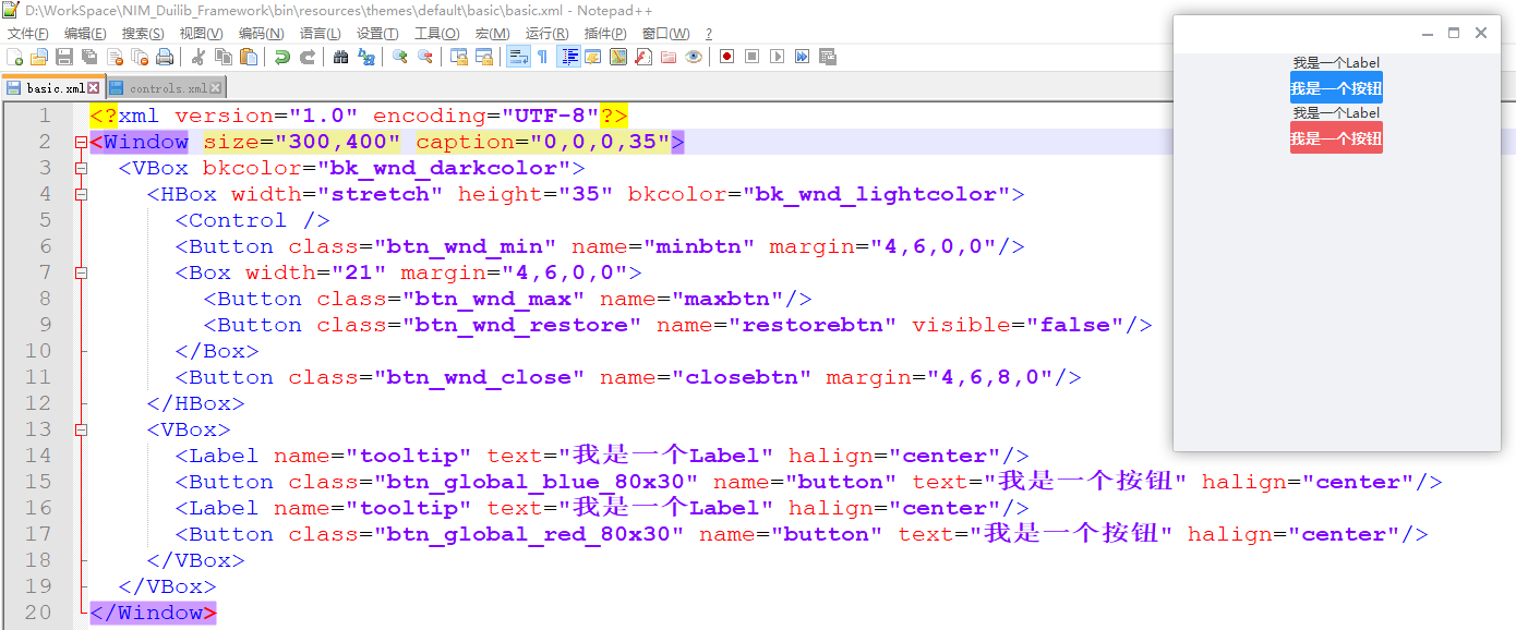
<?xml version="1.0" encoding="UTF-8"?>
<Window size="300,400" caption="0,0,0,35">
<VBox bkcolor="bk_wnd_darkcolor">
<HBox width="stretch" height="35" bkcolor="bk_wnd_lightcolor">
<Control />
<Button class="btn_wnd_min" name="minbtn" margin="4,6,0,0"/>
<Box width="21" margin="4,6,0,0">
<Button class="btn_wnd_max" name="maxbtn"/>
<Button class="btn_wnd_restore" name="restorebtn" visible="false"/>
</Box>
<Button class="btn_wnd_close" name="closebtn" margin="4,6,8,0"/>
</HBox>
<VBox>
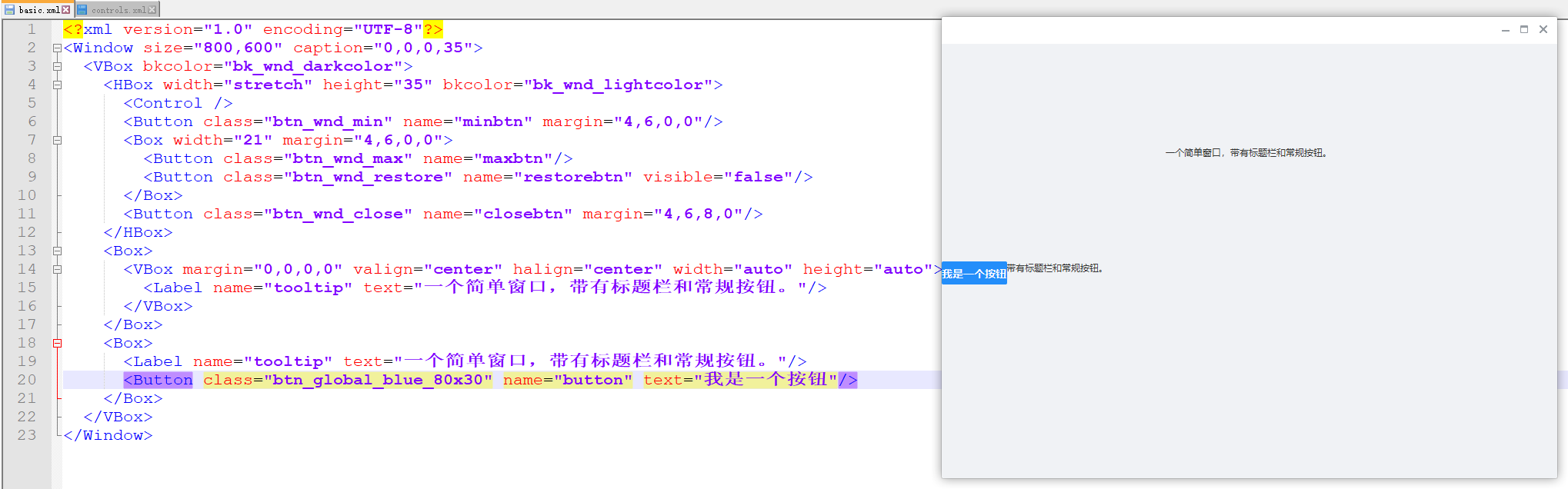
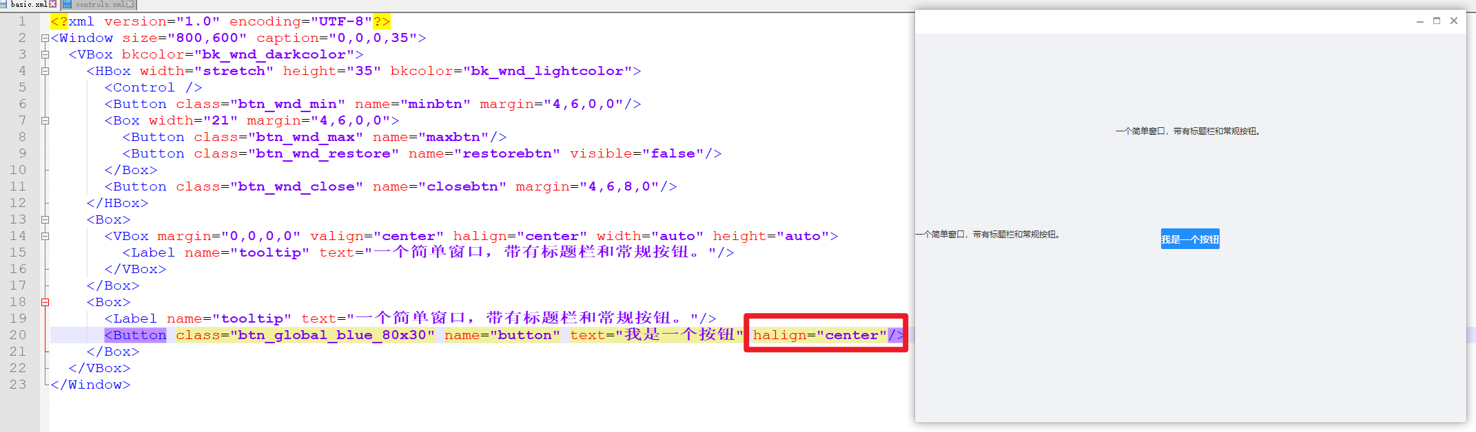
<Label name="tooltip" text="我是一个Label" halign="center"/>
<Button class="btn_global_blue_80x30" name="button" text="我是一个按钮" halign="center"/>
<Label name="tooltip" text="我是一个Label" halign="center"/>
<Button class="btn_global_red_80x30" name="button" text="我是一个按钮" halign="center"/>
</VBox>
</VBox>
</Window>
HBox:
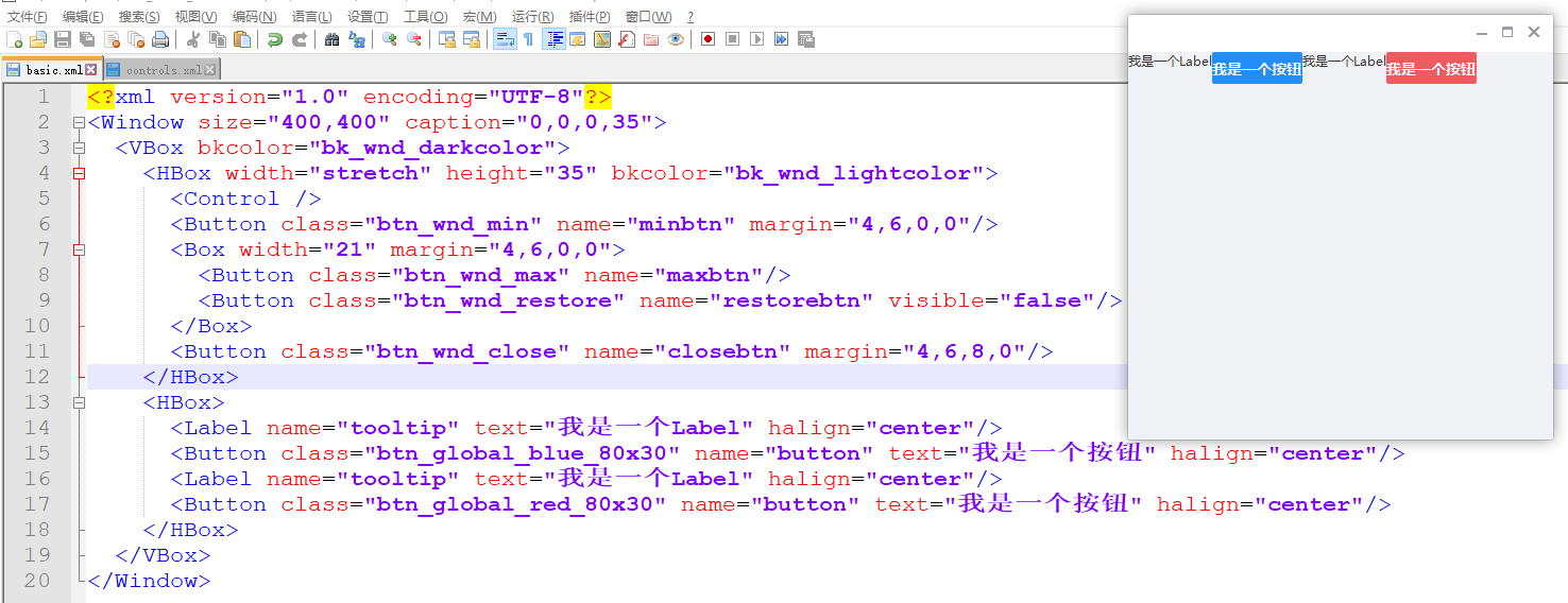
<?xml version="1.0" encoding="UTF-8"?>
<Window size="400,400" caption="0,0,0,35">
  <VBox bkcolor="bk_wnd_darkcolor">
    <HBox width="stretch" height="35" bkcolor="bk_wnd_lightcolor">
      <Control />
      <Button class="btn_wnd_min" name="minbtn" margin="4,6,0,0"/>
      <Box width="21" margin="4,6,0,0">
        <Button class="btn_wnd_max" name="maxbtn"/>
        <Button class="btn_wnd_restore" name="restorebtn" visible="false"/>
      </Box>
      <Button class="btn_wnd_close" name="closebtn" margin="4,6,8,0"/>
    </HBox>
	<HBox>
      <Label name="tooltip" text="我是一个Label" halign="center"/>
	  <Button class="btn_global_blue_80x30" name="button" text="我是一个按钮" halign="center"/>
	  <Label name="tooltip" text="我是一个Label" halign="center"/>
	  <Button class="btn_global_red_80x30" name="button" text="我是一个按钮" halign="center"/>
    </HBox>
  </VBox>
</Window>
TabBox
TabBox布局对应原版Duilib的TabLayout,是一个分页布局控件,可以包含多个页面,并且切换显示其中的某一个页面。同一时间只能由一个页面被显示。云信Demo主界面的各个列表页面的切换就是使用TabBox布局

TabBox布局拥有fadeswitch、和selectedid属性。
fadeswitch属性
fadeswitch属性可以指定当切换页面时是否使用动画效果,默认不使用动画效果
selectedid属性
selectedid属性可以指定默认选中的页面id
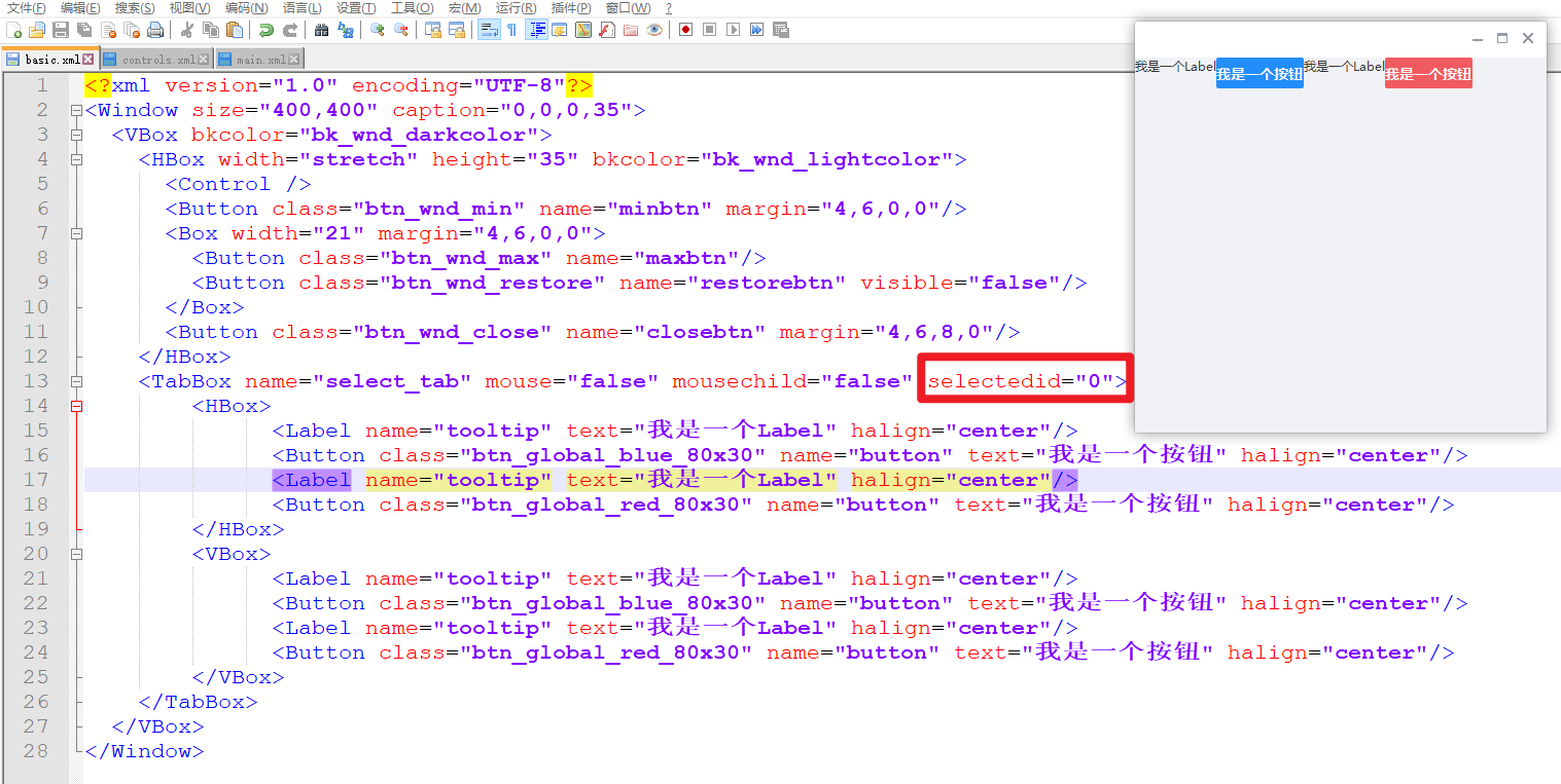
下面的例子,创建了两个页面,一个是横向排列,零一个是纵向排列,先设置选中的id是0:
<?xml version="1.0" encoding="UTF-8"?>
<Window size="400,400" caption="0,0,0,35">
  <VBox bkcolor="bk_wnd_darkcolor">
    <HBox width="stretch" height="35" bkcolor="bk_wnd_lightcolor">
      <Control />
      <Button class="btn_wnd_min" name="minbtn" margin="4,6,0,0"/>
      <Box width="21" margin="4,6,0,0">
        <Button class="btn_wnd_max" name="maxbtn"/>
        <Button class="btn_wnd_restore" name="restorebtn" visible="false"/>
      </Box>
      <Button class="btn_wnd_close" name="closebtn" margin="4,6,8,0"/>
    </HBox>
	<TabBox name="select_tab" mouse="false" mousechild="false" selectedid="0">
		<HBox>
			  <Label name="tooltip" text="我是一个Label" halign="center"/>
			  <Button class="btn_global_blue_80x30" name="button" text="我是一个按钮" halign="center"/>
			  <Label name="tooltip" text="我是一个Label" halign="center"/>
			  <Button class="btn_global_red_80x30" name="button" text="我是一个按钮" halign="center"/>
		</HBox>
		<VBox>
			  <Label name="tooltip" text="我是一个Label" halign="center"/>
			  <Button class="btn_global_blue_80x30" name="button" text="我是一个按钮" halign="center"/>
			  <Label name="tooltip" text="我是一个Label" halign="center"/>
			  <Button class="btn_global_red_80x30" name="button" text="我是一个按钮" halign="center"/>
		</VBox>
	</TabBox>
  </VBox>
</Window>
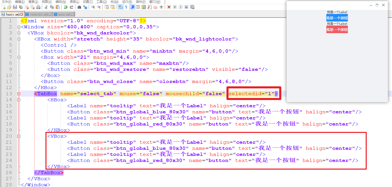
设置选中的id是1:
TileBox
瓷砖布局
TileBox布局对应原版Duilib的TileLayout,平铺布局可以做类似系统桌面平铺桌面图标的效果,云信Demo的联系人选择器中每个分类的联系人就是使用TilbeBox平铺布局

TileBox布局拥有columns、和itemsize属性。这两个属性冲突、不能同时使用
columns属性
columns属性可以来设置每行中包含的列数,他会自动把包含的元素从左到右从上到下按照columns属性的设置排列起来,每行的列数是固定的。
itemsize属性
itemsize属性会设置每个元素所占的区域,比如容器的宽度是500,给itemsize设置为 100 x 10,那个每行就会容纳5个元素,当我们拉伸了窗体让容器宽度变为700,那么每行就会自动容纳7个元素,这意味着使用这个属性会让每行容纳的元素个数是自动可变的。
下面的示例我设置了两列
<?xml version="1.0" encoding="UTF-8"?>
<Window size="400,400" caption="0,0,0,35">
  <VBox bkcolor="bk_wnd_darkcolor">
    <HBox width="stretch" height="35" bkcolor="bk_wnd_lightcolor">
      <Control />
      <Button class="btn_wnd_min" name="minbtn" margin="4,6,0,0"/>
      <Box width="21" margin="4,6,0,0">
        <Button class="btn_wnd_max" name="maxbtn"/>
        <Button class="btn_wnd_restore" name="restorebtn" visible="false"/>
      </Box>
      <Button class="btn_wnd_close" name="closebtn" margin="4,6,8,0"/>
    </HBox>
	<TileBox columns="2">
		<Label name="tooltip" text="我是一个Label" halign="center"/>
		<Button class="btn_global_blue_80x30" name="button" text="我是一个按钮" halign="center"/>
		<Label name="tooltip" text="我是一个Label" halign="center"/>
		<Button class="btn_global_red_80x30" name="button" text="我是一个按钮" halign="center"/>
	</TileBox>
  </VBox>
</Window>

ChildBox
ChildBox布局对应原版Duilib的ChildLayout,ChildBox布局比较少用,他的作用就是从一个XML文件中加载布局来嵌入到ChildBox布局所在的地方,设置xmlfile属性来指定XML文件位置就可以。他的意义在于可以把繁杂的大量XML代码分隔开。比如他和TabBox布局结合,让TabBox布局包含5个ChildBox布局,而每个ChildBox布局分别从5个XML文件加载自己的布局文件,这样就可以分块化的编写布局代码。ChildLayout不可以识别XML中的自定义控件
ListBox、HListBox、VListBox
ListBox布局对应原版Duilib的List控件,严格来说他不是布局而是列表控件。ListBox、HListBox、VListBox三个都是列表控件他们的区别在于他们对子控件的排版方法不一样。他们的排版方法与Box、HBox、VBox对应,提供了比原Duilib更丰富的List布局功能。其中最常用的还是VListBox,用于纵向列表布局.
<?xml version="1.0" encoding="UTF-8"?>
<Window size="400,400" caption="0,0,0,35">
  <VBox bkcolor="bk_wnd_darkcolor">
    <HBox width="stretch" height="35" bkcolor="bk_wnd_lightcolor">
      <Control />
      <Button class="btn_wnd_min" name="minbtn" margin="4,6,0,0"/>
      <Box width="21" margin="4,6,0,0">
        <Button class="btn_wnd_max" name="maxbtn"/>
        <Button class="btn_wnd_restore" name="restorebtn" visible="false"/>
      </Box>
      <Button class="btn_wnd_close" name="closebtn" margin="4,6,8,0"/>
    </HBox>
	<VListBox>
		<Label name="tooltip" text="我是一个Label" halign="center"/>
		<Button class="btn_global_blue_80x30" name="button" text="我是一个按钮" halign="center"/>
		<Label name="tooltip" text="我是一个Label" halign="center"/>
		<Button class="btn_global_red_80x30" name="button" text="我是一个按钮" halign="center"/>
	</VListBox>
  </VBox>
</Window>

LabelBox、ButtonBox、OptionBox、CheckBoxBox
LabelBox、ButtonBox、OptionBox、CheckBoxBox布局相当于Label、Button等控件与Box控件的结合体,他们具有原控件的外观和功能,同时也可以作为容器来使用。
我们不应该那这几个控件直接当作常规的容器来使用,他们只应该用来满足一些特殊的场景。比如某些情况下我们需要一个按钮控件,但是我们希望按钮里面可以包含多个文本内容和多张图片,显然这种情况下基本的Button控件不能满足我们的需要。如果是原版Duilib的话,我们就需要自定义一个新的控件,但是在云信Duilib里我们可以使用ButtonBox控件,他既具有按钮的单击功能逻辑,又可以包含其他子控件进去。这几个控件的存在可以增加开发效率,原本很多需要自定义控件才能解决的需求现在可以直接使用这几个控件。
这几个控件配合云信Duilib新增的Event功能,可以大大增强布局能力。Event可以在XML中给控件配置一些简单的事件处理代码,当触发了某个事件后自动的修改本控件的一些属性。关于XML中Event功能的介绍可以看属性列表以及云信Demo。
关于带有容器控件的控件以及Event的用法,很经典的例子就是云信主界面用于切换好友列表的三个OptionBox控件
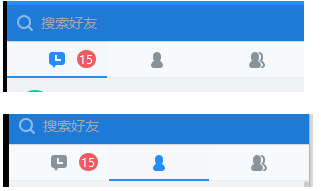
其中最左面的代码会话列表的OptionBox控件的XMl代码如下:
<OptionBox group="session_friend_tab" name="btn_friend_list" tooltiptextid="STRID_MIANWINDOW_ADDRESSBOOK" cursortype="hand">
    <Event type="select" receiver=".select_tab" applyattribute="selectedid="1""/>
    <Event type="unselect" receiver=".select_tab" applyattribute="selectedid="0""/>
    <Event type="unselect" receiver=".friend_option_icon" applyattribute="state="normal""/>
    <Event type="select" receiver=".friend_option_icon" applyattribute="state="pushed""/>
    <Event type="select" receiver="session_or_friend_list_tabbox" applyattribute="selectedid="1""/>

    <TabBox name="select_tab" mouse="false" mousechild="false">
        <HBox>
            <Control normalimage="file='bk_tab_unselected.png' source='0,0,15,36' corner='5,5,5,5'"/>
            <Control width="20" normalimage="file='bk_tab_unselected.png' source='60,0,80,36' corner='5,5,5,5'"/>
            <Control normalimage="file='bk_tab_unselected.png' source='125,0,140,36' corner='5,5,5,5'"/>
        </HBox>
        <HBox>
            <Control normalimage="file='bk_tab_selected.png' source='0,0,15,36' corner='5,5,5,5'"/>
            <Control width="20" normalimage="file='bk_tab_selected.png' source='60,0,80,36' corner='5,5,5,5'"/>
            <Control normalimage="file='bk_tab_selected.png' source='125,0,140,36' corner='5,5,5,5'"/>
        </HBox>
    </TabBox>

    <Control name="friend_option_icon" mouse="false" width="auto" height="auto" halign="center" valign="center"
             normalimage="icon_tab_user_unselected.png" pushedimage="file='icon_tab_user_selected.png'"/>
    <Button name ="unread_number" bkimage="file='../public/icon/icon_number.png' corner='8,0,8,0'" font="1" normaltextcolor="white"
            margin="60,0,0,0" halign="center" valign="center" visible="false"/>
</OptionBox>
为了达到切换功能,需要用到Option的单选功能。但是因为我们的需求需要包含选中和非选中状态的效果,而且每种效果中涉及到多个背景图片,同时里面还需要包含消息未读数等界面效果,所以Option控件完全无法满足需求。这时我们使用OptionBox控件,在里面包含了多个子控件来打到了需求的效果。同时我们为OptionBox添加了多个Event,让他可以自动的处理选中和非选中状态下背景图片的切换功能。这样做就不需要自定义控件、也不需要c++代码来控制切换效果了。
Event
还是使用上面的代码例子,说明下Event,下面介绍了Event的属性,代码是从上面控件属性列表xml中摘抄下来的
<Events>
    <Event comment="此需要包含在某个控件标签内使用。当包含Event标签的控件触发接收的消息时会动态设置接受者控件的属性,设置为applyattribute代表的值">
        <Attribute name="type" default="" type="STRING" comment="接收的消息类型,用空格分隔多个消息,如(killfocus,完整的消息类型见duilib库Define.h文件)"/>
        <Attribute name="receiver" default="" type="STRING" comment="接受者控件的名字,用空格分隔多个名字,如(btn_test).如果名字以“./”或者“.开头”,则代表接受者控件是包含Event标签的控件的子控件,否则代表整个窗体内的某个控件"/>
        <Attribute name="applyattribute" default="" type="STRING" comment="动态设置的属性值,可以设置多个属性"/>
    </Event>
    <BubbledEvent comment="此需要包含在某个控件标签内使用。当包含BubbledEvent标签的控件或者其子控件触发接收的消息时会动态设置接受者控件的属性,设置为applyattribute代表的值,此标签只能用于容器控件">
        <Attribute name="type" default="" type="STRING" comment="接收的消息类型,用空格分隔多个消息,如(killfocus,完整的消息类型见duilib库Define.h文件)"/>
        <Attribute name="receiver" default="" type="STRING" comment="接受者控件的名字,用空格分隔多个名字,如(btn_test).如果名字以“./”或者“.开头”,则代表接受者控件是包含Event标签的控件的子控件,否则代表整个窗体内的某个控件"/>
        <Attribute name="applyattribute" default="" type="STRING" comment="动态设置的属性值,可以设置多个属性"/>
    </BubbledEvent>
</Events>
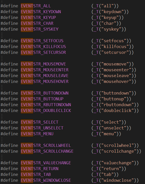
Event的所有类型在Define.h中定义:
再次把上一节的代码贴出来详细说明下Event的含义,
<OptionBox group="session_friend_tab" name="btn_friend_list" tooltiptextid="STRID_MIANWINDOW_ADDRESSBOOK" cursortype="hand">
    <!--类型是select,接收控件是select_tab也就是下面的TabBox,当前控件被选中后接受控件的selectedid会被设置成1-->
    <Event type="select" receiver=".select_tab" applyattribute="selectedid="1""/>
    <!--类型是unselect,接收控件是select_tab也就是下面的TabBox,当前控件被选中后接受控件的selectedid会被设置成0-->
    <Event type="unselect" receiver=".select_tab" applyattribute="selectedid="0""/>
    <!--类型是unselect,接收控件是friend_option_icon,当前控件被设置成unselect之后,接受控件的state被设置成normal-->
    <Event type="unselect" receiver=".friend_option_icon" applyattribute="state="normal""/>
    <Event type="select" receiver=".friend_option_icon" applyattribute="state="pushed""/>
    <Event type="select" receiver="session_or_friend_list_tabbox" applyattribute="selectedid="1""/>

    <TabBox name="select_tab" mouse="false" mousechild="false">
        <HBox>
            <Control normalimage="file='bk_tab_unselected.png' source='0,0,15,36' corner='5,5,5,5'"/>
            <Control width="20" normalimage="file='bk_tab_unselected.png' source='60,0,80,36' corner='5,5,5,5'"/>
            <Control normalimage="file='bk_tab_unselected.png' source='125,0,140,36' corner='5,5,5,5'"/>
        </HBox>
        <HBox>
            <Control normalimage="file='bk_tab_selected.png' source='0,0,15,36' corner='5,5,5,5'"/>
            <Control width="20" normalimage="file='bk_tab_selected.png' source='60,0,80,36' corner='5,5,5,5'"/>
            <Control normalimage="file='bk_tab_selected.png' source='125,0,140,36' corner='5,5,5,5'"/>
        </HBox>
    </TabBox>

    <Control name="friend_option_icon" mouse="false" width="auto" height="auto" halign="center" valign="center"
             normalimage="icon_tab_user_unselected.png" pushedimage="file='icon_tab_user_selected.png'"/>
    <Button name ="unread_number" bkimage="file='../public/icon/icon_number.png' corner='8,0,8,0'" font="1" normaltextcolor="white"
            margin="60,0,0,0" halign="center" valign="center" visible="false"/>
</OptionBox>
控件
button、Label
上文示例已经用了很多了,不再赘述。
其他
https://github.com/feipeng8848/NIM_Duilib_Framework/blob/master/docs/SUMMARY.md
一些原版Duilib的布局资料 https://blog.csdn.net/zhuhongshu/article/details/38531447