线性渐变(linear gradients)沿着一根轴线改变颜色,从起点到终点颜色进行顺序渐变。
语法:
background:linear-gradient(direction,color-stop1,color-stop2,……);
1、线性渐变从上到下(默认)
语法
background:linear-gradient(color-stop1,color-stop2……);
实例
div {
     800px;
    height: 500px;
    margin: 0 auto;
    background: -webkit-linear-gradient(red, blue);
    /* Safari 5.1 - 6.0*/
    background: -o-linear-gradient(red, blue);
    /* Opera 11.1 - 12.0 */
    background: -moz-linear-gradient(red, blue);
    /* Firefox 3.6 - 15 */
    background: linear-gradient(red, blue);
    /* 标准的语法 */
}
2、线性渐变从左到右
语法:
background: -webkit-linear-gradient(begin-level begin-vertical,color-stop1,color-stop2,……);
/* Safari 5.1 - 6.0 */
background: -o-linear-gradient(end-level end-vertical,color-stop1,color-stop2,……);
/* Opera 11.1 - 12.0 */
background: -moz-linear-gradient(end-level end-vertical,color-stop1,color-stop2,……);
/* Firefox 3.6 - 15 */
background: linear-gradient(to end-level end-vertical,color-stop1,color-stop2,……);
/*标准的语法*/
实例
div {
   800px;
  height: 500px;
  margin: 0 auto;
  background: -webkit-linear-gradient(left, red, blue);
  /* Safari 5.1 - 6.0 */
  background: -o-linear-gradient(right, red, blue);
  /* Opera 11.1 - 12.0 */
  background: -moz-linear-gradient(right, red, blue);
  /* Firefox 3.6 - 15 */
  background: linear-gradient(to right, red, blue);
  /* 标准的语法 */
}
3、线性渐变对角
语法
background: -webkit-linear-gradient(begin-level begin-vertical,color-stop1,color-stop2,……);
/* Safari 5.1 - 6.0 */
background: -o-linear-gradient(end-level end-vertical,color-stop1,color-stop2,……);
/* Opera 11.1 - 12.0 */
background: -moz-linear-gradient(end-level end-vertical,color-stop1,color-stop2,……);
/* Firefox 3.6 - 15 */
background: linear-gradient(to end-level end-vertical,color-stop1,color-stop2,……);
/*标准的语法*/
小提示:线性渐变对角时关键字的顺序无关紧要,“to left bottom”与“to bottom left”相同。
实例
div {
   800px;
  height: 500px;
  margin: 0 auto;
  background: -webkit-linear-gradient(left top, red , blue); /* Safari 5.1 - 6.0 */
  background: -o-linear-gradient(bottom right, red, blue); /* Opera 11.1 - 12.0 */
  background: -moz-linear-gradient(bottom right, red, blue); /* Firefox 3.6 - 15 */
  background: linear-gradient(to bottom right, red , blue); /* 标准的语法 */
}
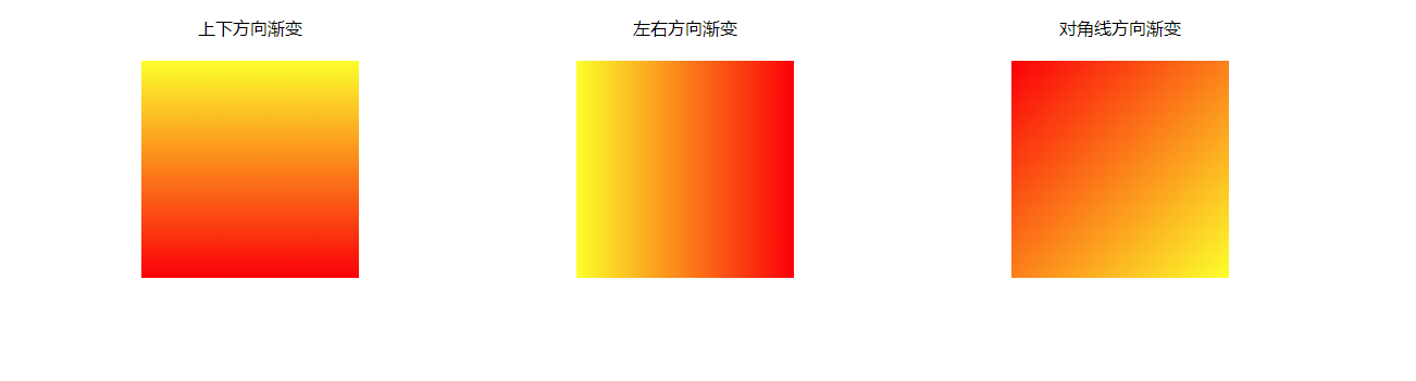
3-3编程练习
小伙伴们,我们学习了怎样使用CSS3写颜色的渐变效果,那么根据效果图,写出代码,实现3中方式的渐变把!
效果图如下:
任务
第一步:写出html代码(3个div元素)
第二部:给div元素设置CSS样式(宽和高。三个元素在一行上)
第三部:给三个div元素设置相应的背景颜色
(1)第一个div元素是从上向下发生渐变,暗色由黄色变成红色
(2)第二个div元素是从左到右发生渐变,颜色由黄色变为红色
第三个div元素是从左上角到右下角发生渐变,颜色由红色变为黄色
参考代码:
<!DOCTYPE html>
<html lang="zh-CN">

<head>
  <meta charset="UTF-8">
  <title>background-clip</title>
  <meta name='description' content='background-clip'>
  <meta name='keywords' content='background-clip'>
  <style>
    /* 此处写代码 */
    html,
    body {
      margin: 0;
      padding: 0;

    }

    .container {
       1000px;
      margin: 20px auto;
      display: flex;
      justify-content: space-between;
    }
    .font{
      display:flex;
      justify-content:center;
       200px;

    }

    div.item{
       200px;
      height: 200px;
      background: #ccc;
    }

    div.item:nth-child(1) {
      background: linear-gradient(yellow, red);

    }

    div.item:nth-child(2) {
      background: linear-gradient(to right,yellow, red);

    }
    div.item:nth-child(3) {
      background: linear-gradient(to bottom right, red,yellow);

    }
  </style>

</head>

<body>
  <!-- 此处写代码 -->

  <div class='container'>
    <div class='font'>上下方向渐变</div>
    <div class='font'>左右方向渐变</div>
    <div class='font'>对角线方向渐变</div>
  </div>
  <div class='container'>
    <div class='item'></div>
    <div class='item'></div>
    <div class='item'></div>
  </div>
</body>

</html>
4、线性渐变-使用角度
语法:
background:linear-gradient(angle,color-stop1,color-stop2,……);
角度说明
0deg创建一个从下到上的渐变,正角表示顺时针旋转,90deg创建一个从左到右的渐变。
实例
#grad {
  background: -webkit-linear-gradient(180deg, red, blue); /* Safari 5.1 - 6.0 */
  background: -o-linear-gradient(180deg, red, blue); /* Opera 11.1 - 12.0 */
  background: -moz-linear-gradient(180deg, red, blue); /* Firefox 3.6 - 15 */
  background: linear-gradient(180deg, red, blue); /* 标准的语法 */
}
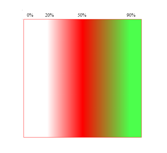
编程练习
小伙伴们,根据效果图,补充代码,实现元素的背景颜色在水平方向上发生渐变,其中:
(1)0%-20%处,颜色是红色全透明
(2)20%-50%处,颜色是从白色渐变到红色
(3)50%-90%处,颜色从红色渐变到绿色,其中绿色的透明度是0.7
效果图如下:
任务
给元素设置背景颜色渐变
(1)用角度表示法让颜色在水平方向发生渐变
(2)水平方向的0%-20%处,渐变的颜色是红色全透明
(3)水平方向的20%-50%处,渐变的颜色是红色,颜色没有透明度
(4)水平方向50%-90%处,渐变的颜色是绿色,透明度为0.7
参考代码:
<!DOCTYPE html>
<html lang="zh-CN">

<head>
  <meta charset="UTF-8">
  <title>em</title>
  <meta name='description' content='em'>
  <meta name='keywords' content='em'>
  <style>
    /* 此处写代码 */
    div {
       400px;
      height: 400px;
      border:1px solid red;
      background:linear-gradient(90deg,rgba(255, 0, 0,0) 20%,rgba(255, 0, 0,1) 50%,rgba(0,255,0,0.7) 90%);
      margin:0 auto;
    }
  </style>

</head>

<body>
  <!-- 此处写代码 -->
  <div></div>

</body>

</html>
5、线性渐变-重复渐变
语法:
background:repeating-linear-gradient(color1 length|percentage,color2 length|percentage,……);
实例
div {
background:repeating-linear-gradient(red,blue 20%);
}
3-9编程练习
小伙伴们,我们学习了CSS3现象渐变中的重复渐变,接下来,根据效果图补充代码,实现元素中多个彩虹的重复。
提示:彩虹的颜色,用英语单词表达即可
效果图如下
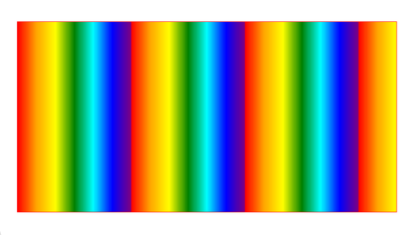
任务
给元素设置背景颜色重复渐变
(1)效果图中的完整彩虹重复了最少3次,占据了元素的90%的位置,所以一个彩虹占据元素的比例是30%
(2)将一个彩虹的7个颜色,均摊到30%中,每个颜色的比重是5%,比如红色占据的位置是0%,橙色占据的是5%,黄色占据的是10%,以此类推。
参考代码:
<!DOCTYPE html>
<html lang="zh-CN">

<head>
  <meta charset="UTF-8">
  <title>em</title>
  <meta name='description' content='em'>
  <meta name='keywords' content='em'>
  <style>
    /* 此处写代码 */
    div {
       400px;
      height: 300px;
      border:1px solid red;
      background:repeating-linear-gradient(90deg,red 0%,orange 5%,yellow 10%,green 15%,blue 20%,indigo 25%,purple 30%);
      margin:0 auto;
    }
  </style>

</head>

<body>
  <!-- 此处写代码 -->
  <div></div>

</body>

</html>