基础知识:
html页面中的空格:
div在默认情况下是独占一行的。
在网页布局上,一般不能出现水平滚动条
padding会把原始的div撑大
clear:both和float:none的区别
{
float:none把之前的浮动效果不当回事,完全当浮动不存在,覆盖样式
clear:both清除浮动效果
}
一行文字的大小=字体大小+4px(字体大小默认大小是16px)
margin的塌陷问题(可以通过设置父div的border来解决问题)
div默认宽度100%,默认高度和内容相等
背景图和前景图的区别(背景图会重复排列)【background-image和img】,background-repeat【no-repeat,repeat-x,repeat-y】;background-size:cover;【background-position:-20px -10px;(相对于左上角的位置来说)】
<hr/>和<br/>
hr属性(margin,border,height,background-color)
height不好设置百分比
CSS样式的一些特征:同等级别的样式可以写在一起,中间用逗号隔开;组合选择器,层次之间要用空格隔开;伪类选择器,冒号;
border:2px solid red;--- solid(实现),dashed(虚线),dotted(点线)
百分比是可以用小数点的。
margin:auto;margin-top:10px;是可以同时使用的,会存在简单的覆盖关系。相当于margin:30px auto 0px auto;
        html,body{
            height: 100%;
            margin: 0px;
        }
网页的高度从内而外来固定高度,这样子才可以高度的自适应和border式布局很好
width百分比和min-height绝对值和max-height绝对值配合使用可以增加网页的灵活性和适应性
td属性colsspan,rowsspab进行合并单元格
table做三栏式布局很简单
默认1em=16px;但是可以这样子修改基准值body{font-size:10px;}
一个元素使用多个class,一个class也可以被多个class使用
特殊的属性:
display属性
display:none;隐藏div
dispaly:block;显示div
float属性
position属性
overflow属性【auto,scroll,hidden】,overflow-x,overflow-y
overflow:hidden;overflow:auto;将内容超出div的部分设置成隐藏或者是设置成滚动条
overflow:scroll;强制加滚动条,即使没有溢出;overflow-x:scroll;overflow-y:scroll;
border-radius(border-bottom-left-radius,border-bottom-right-radius,border-top-left-radius,border-top-right-radius)
字体的样式:
color font-size font-family font-weight(加粗) font-style(斜体) text-decoration(下划线)
p:first-child{
            font-size: 200px;
            font-weight: bold;
            font-family: SimSun-ExtB;
            color: #00bcd5;
            font-style: italic;
            text-decoration: underline;
        }
图片的特性:
        img{
            border: 5px solid red;
            width: 100px;
            height: 100px;
       vertical-align:middle;
        }
图片的属性:title,alt
表格的特性:
table标签属性:border cellpadding cellspacing width bgcolor align
tr标签属性:bgcolor
td标签的属性:width height align(水平位置)[left,center,right] valign(垂直位置)[top,middle,bottom] bgcolor
border-spacing用来代替表格的cellspacing样式
margin用来代替表格的align-center样式
a标签的特性:
a标签属性:target(重新打开一个窗口)
a:link a:hover a:active a:visited (CSS样式)(伪类选择器)
伪类选择器(:)和属性选择器([]):
span:first-child span:last-child span:nth-child(2) td:first-child (伪类选择器)
a:hover td:hover (展示悬停效果的伪类)
input[type=text],input[id=username]
水平居中:
margin:auto(相对于自己的父容器)
text-align:center(容器里的内容【图片和文字和超链接】)(不适用于子div)
垂直居中:
display:flex;
justify-content:center;
align-items:center;
vertical-align: middle;和display:table-cell这两个属性要配合才可以使用,否则不行的。
line-height(不适用于多行文本)【适用于单行文本和图片和超链接和input和button标签】
padding-top(这个是需要计算的)【适用于文本和图片】
(padding或者padding-top)+(line-height或者height或者font-size)适用于图片(height)和文字(line-height或者font-size)[div不需要设置高度,让内容和padding自动把div撑开,这样子肯定就是居中的]【这种使用方法也适用于父子div容器垂直居中,这时候子容器也可以通过设置margin来达到垂直居中的效果】
用另一个子div把容器中的内容框起来,利用父子容器的关系解决问题。(适用于父子容器)
1、子div样式【margin:auto】,父div样式【padding-top】(需要计算);
2、子div样式【margin:auto,margin-top】,父div样式【border】
3、子div样式【margin:auto,margin-top】,父div样式【overflow:hidden;】
DIV特性:
div四要素:margin,padding,border,content
position:
(z-index值没有具体范围,谁大谁在前面)(z-index必须和使用定位position(脱离平面)的元素一起才生效)
fixed相对于body做绝对定位,脱离平面
absolute相对于父容器做绝对定位,脱离平面【注意其父容器也需要定位(fixed),否则和fixed是没有区别的】
relative相对于元素自身进行偏移,不脱离平面
static静态定位默认值,和不设一致
inherit继承自其前辈的元素的相同的值
如果父div脱离平面。这个父容器里面的其他元素(子div)也会跟着脱离容器。
        div{
            top:0;
            left: 0;
            bottom: 0;
            right: 0;
            margin: auto;
       position:absolute;
        }
实现半透明效果:
opacity:0.5;(文字看不到了)
background-color: rgba(0,0,255,0.5);
ol和ul和li的特点
ol的css属性:lists-style,padding-left,background-position,line-height
        ul li{
            float: left;
            margin: 20px;
        }
input标签
文本框前面的小图片怎么放置的:实际上是给文本框设置了一个背景图
type:text,password,button,image,radio[需要使用同一个name],checkbox[需要使用同一个name],
select标签
option
    <select name="app1">
        <option value="0" selected>请选择</option>
        <option value="p">苹果</option>
        <option value="x">香蕉</option>
        <option value="l">荔枝</option>
    </select>
textarea标签
属性rows和cols制定文本域的初始大小(width,height有同样的效果)
其他的标签
iframe标签,marquee标签[滚动字幕,属性direction],audio标签[属性source,preload,controls],video标签[属性:source,preload,controls]
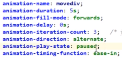
CSS动画属性
transform
transition-group
<!DOCTYPE html>
<html lang="en">
<head>
    <meta charset="UTF-8">
    <title>Title</title>
    <style>
        #top {
            width: 300px;
            height: 150px;
            background-color: greenyellow;
            position: fixed;
            top: 100px;
            left: 500px;
            transform: skewX(-45deg);
        }

        #left {
            width: 300px;
            height: 300px;
            background-color: orange;
            position: fixed;
            top: 250px;
            left: 425px;
        }

        #right {
            width: 150px;
            height: 300px;
            background-color: darkorchid;
            position: fixed;
            top: 175px;
            left: 725px;
            transform: skewY(-45deg);
        }

        #back {
            width: 300px;
            height: 300px;
            position: fixed;
            top: 100px;
            left: 575px;
            border-left: dashed 2px white;
            border-bottom: dashed 2px white;
        }

        #bottom {
            width: 300px;
            height: 150px;
            position: fixed;
            top: 400px;
            left: 500px;
            transform: skewX(-45deg);
            border-left: dashed 2px white;
        }
    </style>
</head>
<body>
<div id="top"></div>
<div id="left"></div>
<div id="right"></div>
<div id="back"></div>
<div id="bottom"></div>
</body>
</html>
响应式布局
        @media screen and (min- 1200px){
            div{
                width: 600px;
                height: 400px;
                background-color: #17b555;
                font-size: 60px;
            }
        }
        @media screen and (min- 800px) and (max- 1200px){
            div{
                width: 600px;
                height: 400px;
                background-color: #17b555;
                font-size: 40px;
            }
        }
        @media screen and (max- 800px){
            div{
                width: 600px;
                height: 400px;
                background-color: #5359ff;
                font-size: 20px;
            }
        }
移动端才需要:<meta name="viewport" content="width=device-width,initial-scale=1,minimum-scale=0.5,maximum-scale=2,user-scalable=no">
bootstrap栅格系统