今天随便翻了一下antd的组件库,看到下面这样的组件,当时我就震惊了:
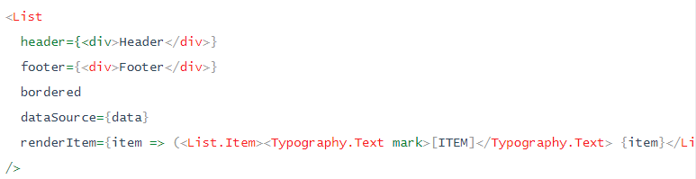
这尼玛,这是出于什么样的考虑,一个列表还要用户编写子项的渲染方式。
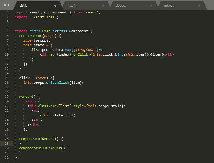
所以,我就自己写了一个
List.js:
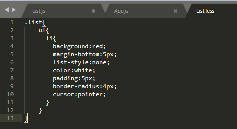
List.less:
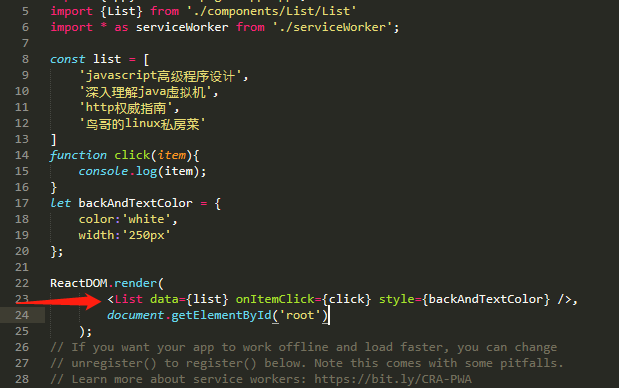
index.js:
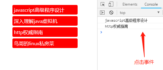
效果:
当然,可以根据需要添加更多的事件以及对其他数据格式的支持。
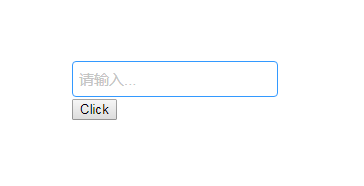
自个儿写了个Input输入框组件:
X_UI.js:
import React, { Component } from 'react';
import './X_UI.less';


/*输入框*/
export class Input extends Component {
    constructor(props) {
        super(props);
        this.state = {
            value:props.value,
        }
    }
    /*双向数据绑定更新父组件*/
    onchange = (e)=>{
        var value = e.target.value;
        this.setState({
            value:value
        });
        if(this.props.onChange){
            this.props.onChange(value);
        }
    }
    /*双向数据绑定更新子组件*/
    componentWillReceiveProps = (nextProps) => {
      this.setState({
        value:nextProps.value,
      })
    }
    render() {
        console.log(this.props.size);
        var style;
        switch (this.props.size){
            case 'large':
                style={
                    height:'36px',
                    inlineHeight:'36px',
                    fontSize:'18px'
                }
                break;
            case 'small':
                style={
                    height:'24px',
                    inlineHeight:'24px',
                    fontSize:'12px'
                }
                break;
            default:
                style={
                    height:'30px',
                    inlineHeight:'30px',
                    fontSize:'15px'
                }
                break;
        }
        //与props.style属性合并
        style = Object.assign(this.props.style||{},style)
        var placeholder = this.props.placeholder||'请输入...';
        return (
            <div className="x_input">
                <input placeholder={placeholder} style={style} onChange={this.onchange} value={this.state.value}></input>
            </div>
            );
    }
}
X_UI.less:
@gray:rgb(197,197,197);
@blue:rgb(51,153,255);

input::-webkit-input-placeholder{
  color:@gray !important;
}
input::-moz-placeholder{
  color:@gray !important;
}
input:-ms-input-placeholder {
  color:@gray !important;
}

.x_input{
    >input{
      border:1px solid @gray;
      padding:2px 6px;
      border-radius:4px;
    }
    >input:hover{
        border:1px solid @blue;
    }
    >input:focus{
        border:1px solid transparent;
        box-shadow:0 0 3px 1px @blue;
        outline:none
    }
}
App.js:
import React, { Component } from 'react';
import {Input} from '../../components/X_UI'
import './App.less';

export class App extends Component {
  constructor(props) {
    super(props);
    this.state = {
      value:'hello'
    };
  }
  change=(value)=>{
    this.setState({
      value:value
    })
  }
  render() {
    return (
      <div className="app">
        <Input size="small" value={this.state.value} onChange={this.change} />
        {this.state.value}
        <button onClick={this.change.bind(this,'world')}>Click</button>
      </div>
    );
  }
}
效果: