Bootstrap 是一个用于快速开发 Web 应用程序和网站的前端框架。Bootstrap 是基于 HTML、CSS、JAVASCRIPT 的。
Bootstrap 提供了一些辅助类,以便更快地实现对移动设备友好的开发。这些可以通过媒体查询结合大型、小型和中型设备,实现内容对设备的显示和隐藏。
row 行,
-md 桌面显示器
-ms 平板显示器
-xs 手机显示器
1行有12列
<div class= "row">
<div class = "col-md-12"></div>
<div class = "col-ms-12"></div>
<div class = "col-xs-12"></div> //表示一行中有12列
</div>
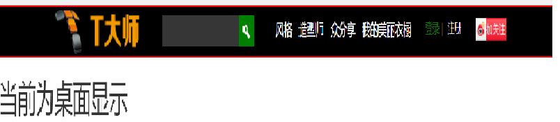
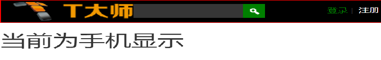
<!DOCTYPE html> <html> <head lang="en"> <meta charset="UTF-8"> <title></title> <meta name="viewport" content="width=device-width, initial-scale=1"> <link rel="stylesheet" href="css/bootstrap.min.css"/> <script language="JavaScript" src="js/jquery-3.js"></script> <style type="text/css"> *{ top: 0px; padding: 0px; text-decoration: none; list-style-type: none; } .top-styl{ height: 50px; border: 1px solid red; background-color: #000000; } .img-styl{ width: 174px; height: 50px; background: url("imges/logo.png")no-repeat 0px 3px; background-size: contain; float: left; } .sousuo-styl{ width: 187px; float: left; } .top-search-input{ width: 150px; padding: 0 5px; height: 30px; border: 0; background: #363636; float: left; color: #ccc; } .top-search-submit{ width: 30px; height: 30px; border: 0; background: green url("imges/zoom.gif")center center no-repeat; float: left; cursor: pointer; //光标指针 } .dao-styll{ float: left; font-size: 16px; width: 329px; margin-left: 33px; margin-top: 11px; } .dao-styll li{ float: left; position: relative; //相对定位 text-align: center; //居中 padding: 0 7px; } .dao-styll >li:hover{ background-color: #999; } .dao-styll >li >a{ color: #FFF; width: 100%; height: 34px; text-decoration: none; //取消下划线 } .dz-styl{ float: right; margin: -19px -9px 6px 21px; } .imgs-styl{ padding: 11px 0px 0px 114px; float: right; margin: 0px -98px -3px 8px; } .green-styl{ color: green; } .zc-styl{ color: white; } a{ text-decoration: none; } </style> </head> <body> <div class="container-fluid"> //fluid表示用 百分比 <div class="row"> //row 行 <div class="top-styl col-md-12"> //col-md-12 每行桌面占12列 <div class="row"> <div class=" col-md-offset-1 col-md-9"> //col-md-offset-1 列偏移1列 <div class="row"> <div class="col-md-3 col-xs-4"> <div class="img-styl"></div> </div> <div class="col-md-3 "> <div class="sousuo-styl" style="padding-left: 7px; margin: 8px auto;"> <input class="top-search-input" value="" type="text"><input class="top-search-submit" type="submit" value="" /> </div> </div> <div class="col-md-4 hidden-xs" style="padding: 0px"> <ul class="dao-styll"> <li class=""><a href="#">风格</a> </li> <li class=""><a href="#">造型师</a></li> <li class=""><a href="#">众分享</a> </li> <li class=""><a href="#">我的美丽衣橱</a></li> </ul> </div> <div class="col-md-2"> <div class="imgs-styl"> <img src="imges/sina.gif"> </div> <div class="dz-styl"> <span><a href="#" class="green-styl">登录</a> | </span><span> <a href="#" class="zc-styl">注册</a></span> </div> </div> </div> </div> </div> </div> </div> <div class="row"> <div class="visible-md"><h1>当前为桌面显示</h1></div> //visible默认占满整行 <div class="visible-sm"><h1>当前为平面显示</h1></div> <div class="visible-xs"><h1>当前为手机显示</h1></div> </div> </div> </body> </html
效果显示图: