新建div,取名progress,如下
<div class="progress"></div>
在里面插入条纹进度条,以及进度显示文本进度:
<div class="progress-bar progress-bar-info progress-bar-striped active" style=" 75%;">
        <div class="progress-value">75%</div>
 </div>
添加样式
.progress{
            height: 25px;
            background: #262626;
            padding: 5px;
            overflow: visible;
            border-radius: 20px;
            border-top: 1px solid #000;
            border-bottom: 1px solid #7992a8;
            margin-top: 50px;
}
.progress-bar {
            float: left;
             0;
            height: 100%;
            font-size: 12px;
            line-height: 20px;
            color: #fff;
            text-align: center;
            background-color: #337ab7;
            -webkit-box-shadow: inset 0 -1px 0 rgba(0,0,0,.15);
            box-shadow: inset 0 -1px 0 rgba(0,0,0,.15);
            -webkit-transition: width .6s ease;
            -o-transition: width .6s ease;
            transition: width .6s ease;
 }
.progress .progress-bar{
          border-radius: 20px;
          position: relative;
          animation: animate-positive 2s;
 }
.progress .progress-value{
                      display: block;
                      padding: 3px 7px;
                      font-size: 13px;
                      color: #fff;
                      border-radius: 4px;
                      background: #191919;
                      border: 1px solid #000;
                      position: absolute;
                      top: -40px;
                      right: -10px;
}
.progress-bar-info {
            background-color: #5bc0de;
}
.progress .progress-value:after{
                      content: "";
                      border-top: 10px solid #191919;
                      border-left: 10px solid transparent;
                      border-right: 10px solid transparent;
                      position: absolute;
                      bottom: -6px;
                      left: 26%;
}
.progress-bar-striped {
            background-image: -webkit-linear-gradient(45deg,rgba(255,255,255,.15) 25%,transparent 25%,transparent 50%,rgba(255,255,255,.15) 50%,rgba(255,255,255,.15) 75%,transparent 75%,transparent);
            background-image: -o-linear-gradient(45deg,rgba(255,255,255,.15) 25%,transparent 25%,transparent 50%,rgba(255,255,255,.15) 50%,rgba(255,255,255,.15) 75%,transparent 75%,transparent);
            background-image: linear-gradient(45deg,rgba(255,255,255,.15) 25%,transparent 25%,transparent 50%,rgba(255,255,255,.15) 50%,rgba(255,255,255,.15) 75%,transparent 75%,transparent);
            -webkit-background-size: 20px 20px;
            background-size: 20px 20px;
}
@-webkit-keyframes animate-positive{
              0% {  0; }
}
@keyframes animate-positive{
              0% {  0; }
 }
最后效果如下:

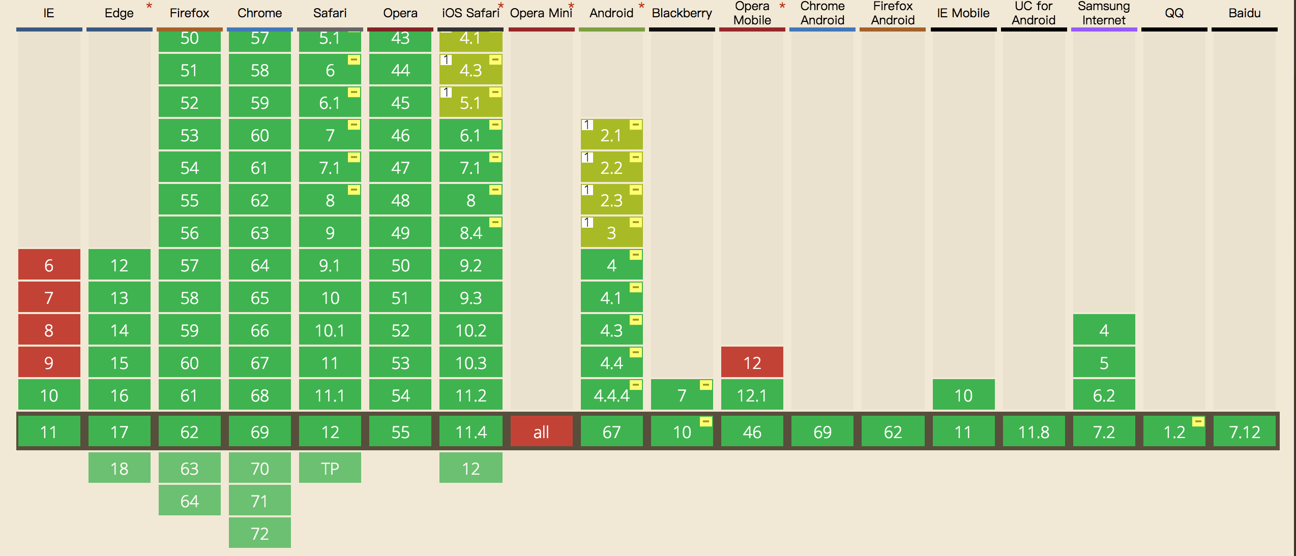
这里需要注意的是css3,keyframes的兼容性如下,ie9及以下就别用了: