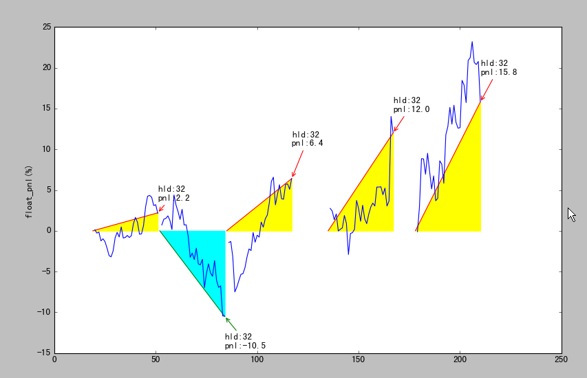
用matplotlib绘制每次交易的盈亏三角形
结果:
代码:
python
def plot_trade_triangle(self):
    # plot each trade as a trade-triangle, and annotate pnl
    trade = self.trade
    equity = self.equity.equity
    fig,ax=plt.subplots()
    for dt, row in trade.iterrows():
        bars = row.buybar, row['sellbar']
        pnl = 0 , row['pnl']
        colors = 'r' if row.pnl>0 else 'g'

        ax.plot( bars, pnl, color=colors)
        arrowprops = dict(facecolor='black',
                          edgecolor=colors,
                          #shrink=0.05,
                          arrowstyle='->',)
        y_factor = 1.2 if abs(row.pnl) > 10. else 1.6
        colors = 'yellow' if row.pnl>0 else 'cyan'
        valignment = 'bottom' if row['pnl']>0 else 'top'
        note= 'hld:%s
pnl:%s'% (bars[1]-bars[0], str(row['pnl']))
        ax.annotate(note, xy=(row.sellbar, row.pnl),
                    xytext=(row.sellbar, row.pnl*y_factor),
                    va=valignment,
                    arrowprops=arrowprops,)
        ax.fill_between(bars, pnl, color=colors)

        # 画: 持股期间的浮动盈亏:
        float_pnl=(roc1[row.buybar+1:row.sellbar+1]+1).cumprod()
        iloc =  [equity.index.get_loc(key) for key in float_pnl.index]
        float_pnl = pd.Series( (float_pnl.values-1)*100., index=iloc)
        ax.plot(float_pnl, color='b')
        ax.set_ylabel('float_pnl(%)')