matlab 画图进阶
applications of matlab in engineering
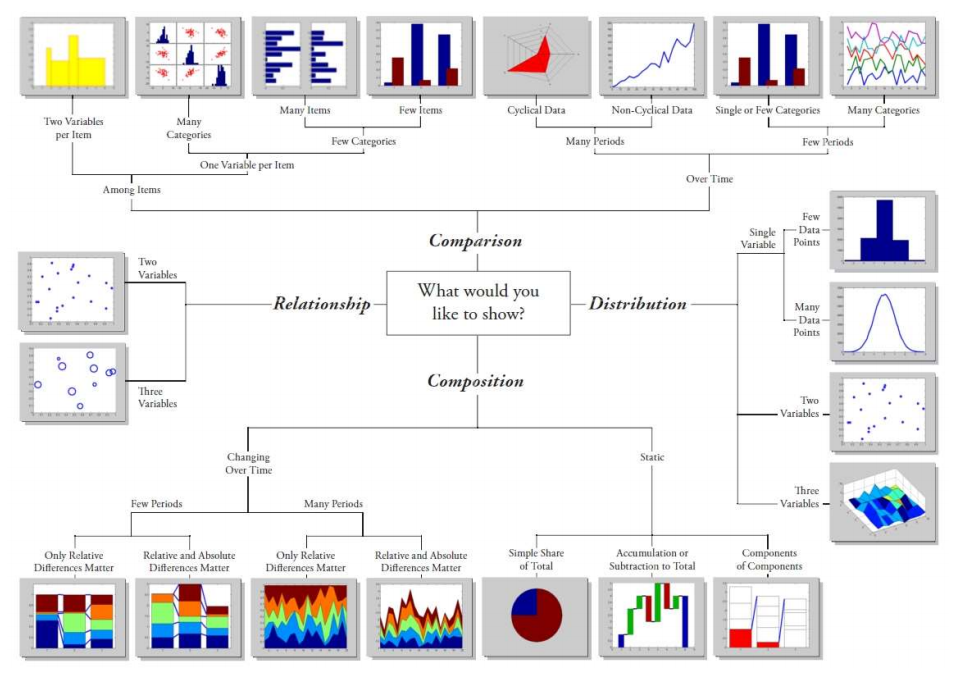
图表类型的选择
first:advanced 2d plots
special plots
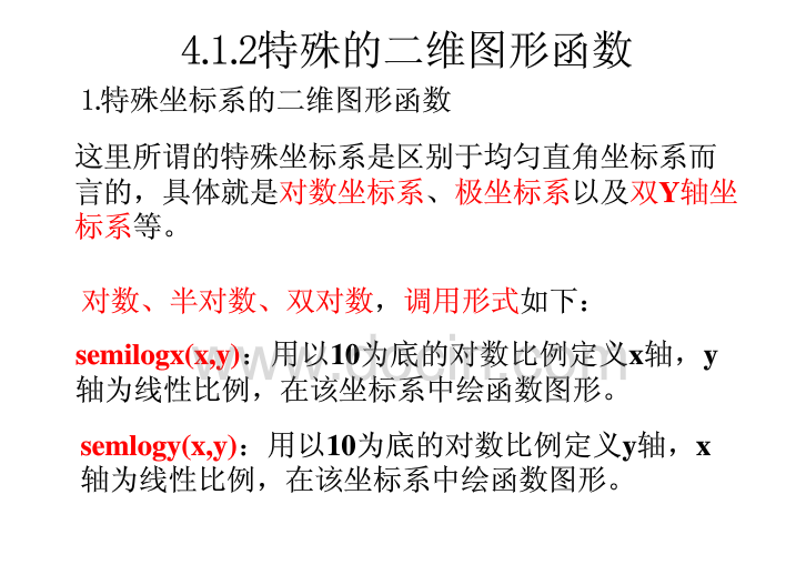
loglog graph with logarithmic scales for both axes 对数图形
semilogx graph with a logarithmic scale for the x-axis and a linear scale for the y-axis
semilogy graph with a logarithmic scale for the y-axis and a linear scale for the x-axis
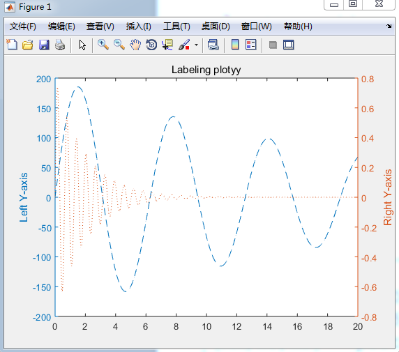
plotyy graph with y-tick labels on the left and right side
hist histogram plot
bar bar graph
pie pie chart
ploar polar coordinate plot
logarithm Plots 对数图形
例子 x=logspace(0,1,5) 从0到1 共分为5个数 分别是0 0.25 0.5 0.75 1 步进为0.25= ((1-0)/(5-1)) ,然后分别取值10^0 10^0.25 10^0.5 10^0.75 10^1 五个值分别在图像线中显示的点x坐标
但是x轴的标签值仍然显示整数 从1到10 也就是10^0 到10^1 ;
example:
x=logspace(-1,1,100); logspace 以10^-1 到10^1 共100个数作为x的值 显示为整数值
y=x.^2;
subplot(2,2,1);
plot(x,y); 线性对数图 x范围[0.1,10] 标签为0-10
title('plot');
subplot(2,2,2);
semilogx(x,y); 看下面解释 x轴取对数 x范围 [-1,1] 标签为10^-1 到10^1
title('semilogx');
subplot(2,2,3);
semilogy(x,y); y轴取对数 实际的数值为[-2,2] 标签为10^-2到10^2
title('semilogy');
subplot(2,2,4);
loglog(x,y); x y轴均取对数 就变为直线 称为双对数坐标
title('loglog');
set(gca,'XGrid','on');

example2: semilogx(x,y);x=logspace(0,1,5);
y=x.^2;
如下图所示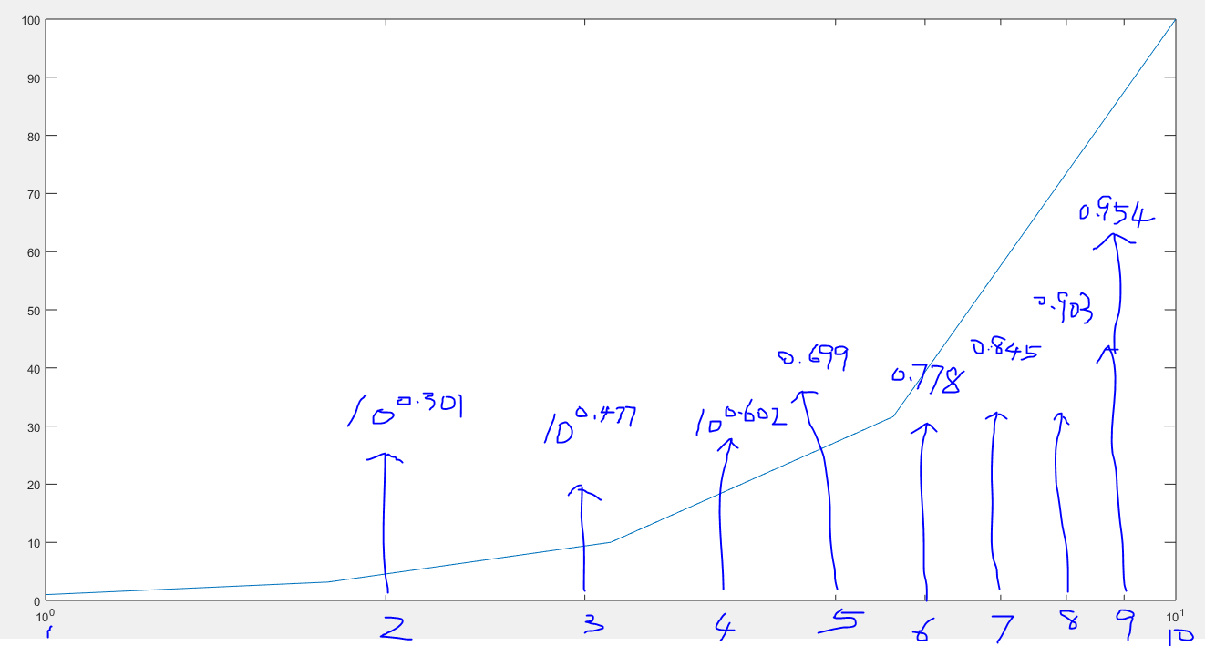
semilogx(x,y) 此时x轴的实际数值是1-10 但是显示的是10^0-10^1 且坐标点位置间隔不相等 标签以10^x 中的指数值作为分割 即0 0.1 0.2 0.3 0.4 0.5 0.6 0.7 0.8 0.9 1 以0.1为步进的值等距离分割
即x为指数位置变量 x=10^-1 t=以10为底 10^-1为对数的值
x轴取对数后替代原来的x值
同理 semilogy(x,y) x值未变 y轴取对数后作为新值替换原来的y
plotyy()
x=0:0.01:20;
y1=200*exp(-0.05*x).*sin(x); exp以自然常数e为底的指数函数 exp(2)=e^2=2.7183^2
y2=0.8*exp(-0.5*x).*sin(10*x);
[AX,H1,H2]=plotyy(x,y1,x,y2); 双y坐标轴 常用于连个函数比较
set(get(AX(1),'Ylabel'),'String','Left Y-axis');
set(get(AX(2),'Ylabel'),'String','Right Y-axis');
title('Labeling plotyy');
set(H1,'LineStyle','--');
set(H2,'LineStyle',':');
如图
Histogram
直方图 质量分布图 一种统计报告 由一系列高度不等的纵向条纹或线段表示数据分布情况
hist()
y=randn(1,1000);
subplot(2,1,1);
hist(y,10);
title('Bins=10');
subplot(2,1,2);
hist(y,50);
title('Bins=50');
second:color space
third:3d plots