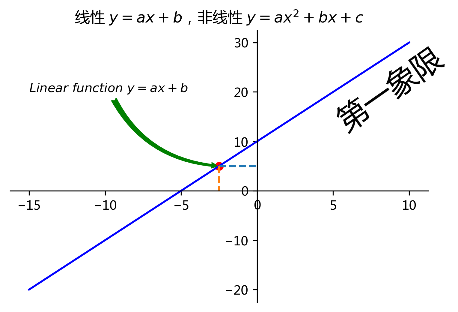
 1 import matplotlib.pyplot as plt
 2 plt.rcParams['font.family'] = ['Arial Unicode MS', 'Microsoft Yahei', 'SimHei', 'sans-serif']
 3
 4
 5 x = [-15,-5,0,5,8,10]
 6
 7 a = 2
 8 b = 10
 9
10 # y = a * x
11 y3 = []
12 for i in x:
13 #     print(i)
14     y3.append(a * i + b)
15
16 plt.figure(dpi=300)
17 plt.plot(x, y3, color='b')
18
19 # 标题
20 plt.title('线性 $y=ax+b$,非线性 $y=ax^{2}+bx+c$')
21
22 # 坐标轴标注
23 # plt.xlabel(r'X axis')
24 # plt.ylabel('y轴')
25
26 # 操作轴线
27 ax = plt.gca()
28
29 # 交换轴线
30 # ax.xaxis.set_ticks_position('top')
31 # ax.yaxis.set_ticks_position('right')
32
33 # 去除上侧和右侧的空白轴线
34 ax.spines['top'].set_color('none')
35 ax.spines['right'].set_color('none')
36
37 # 移位轴线
38 ax.spines['bottom'].set_position(['data', 0])
39 ax.spines['left'].set_position(['data', 0])
40
41 ###############
42
43 # 添加注解标识
44
45 # 标记点
46 x0 = -2.5
47 y0 = a * x0 + b
48 plt.scatter(x0, y0, color='r')
49
50 # 标记线
51 plt.plot(  # 横线
52     [x0, 0],
53     [y0, y0],
54     '--',
55 )
56 plt.plot(  # 竖线
57     [x0, x0],
58     [y0, 0],
59     '--',
60 )
61
62 # 增加文本
63 plt.text(
64     5,
65     25,
66     '第一象限',
67     fontsize=24,
68     rotation=35,
69 )
70
71 # 任意位置增加带箭头的注释文本
72
73 plt.annotate(
74     r'$Linear function y=ax+b$',  # 注释文本内容
75     xytext=(-15, 20),  # 文本位置
76     xy=(x0, y0),  # 箭头位置
77
78     arrowprops=dict(  # 字典类型,定义箭头样式
79         arrowstyle = 'fancy',  # 箭头样式,例如 -> <- |-| simple fancy
80         color = 'green',  # 箭头颜色
81         connectionstyle="arc3,rad=.3",  # 箭头弧度
82     ),
83 )
84
85 plt.show()