我们的UI每天都能给一个惊喜,甚至两个...
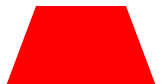
1. 梯形
html:
<div class="box"></div>
CSS:
.box{
            width: 30px;
            border-left: 30px solid transparent;
            border-right: 30px solid transparent;
            border-bottom: 80px solid red;
        }
效果如图:
2.多个齿轮状相扣的六角形
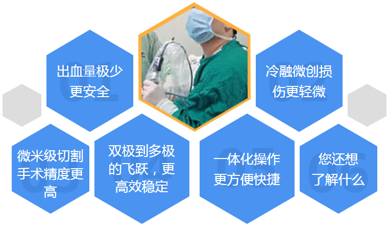
如果我用最简单的方式,除了文字,把后面的数字阴影和8个菱形用背景图展示,再去控制文字的位置,感觉似乎也有点麻烦。
而且切出来的图,也经不起放大,放大一点点,六角形边界就出现锯齿。
鬼知道用户还会干些什么出来,我还是多花30分钟画下这些六角形,分配它们的位置吧...
这里只举出其中一个六角形的例子。
<!DOCTYPE html>
<html lang="en">
<head>
    <meta charset="UTF-8">
    <title>Title</title>
    <meta name="viewport" content="width=device-width,minimum-scale=1.0,maximum-scale=1.0,user-scalable=no">
    <meta name="format-detection" content="telephone=no">
    <!--移动端模板-->
    <style type="text/css">
        .hexagon_box_04 {
            width: 186px;
            height: 216px;
            margin: 0 10px;
        }
        .hexagon_box_04 .box1 {
            width: 0;
            border-left: 93px solid transparent;
            border-right: 93px solid transparent;
            border-bottom: 54px solid #4a93f0;
        }
        .hexagon_box_04 .box2 {
            width: 100%;
            height: 50%;
            background-color: #4a93f0;
        }
        .hexagon_box_04 .box3 {
            width: 0;
            border-top: 54px solid #4a93f0;
            border-left: 93px solid transparent;
            border-right: 93px solid transparent;
        }
        .box2 {
            position: relative;
        }
        .box2 b {
            font-size: 100px;
            color: #4287E1;
            height: 100px;
            line-height: 100px;
            text-align: center;
            position: absolute;
            top: 0;
            bottom: 0;
            left: 0;
            right: 0;
            /* display: block; */
            /* margin: auto; */
            z-index: 1;
            font-weight: 900;
        }
        .box2 span {
            color: #fff;
            font-size: 26px;
            position: absolute;
            z-index: 2;
            top: 0;
            bottom: 0;
            left: 0;
            right: 0;
            display: block;
            margin: auto;
            width: 130px;
            text-align: center;
        }
    </style>
    <script src="js/jquery-1.9.1.min.js"></script>
</head>
<body>
<div>
    <ul>
        <li class="hexagon_box_04">
            <div class="box1"></div>
            <div class="box2">
                <b>04</b>
                <span>用CSS画出六角形</span>
            </div>
            <div class="box3"></div>
        </li>
    </ul>
</div>
</body>
</html>