这篇主要来帮助大家打造一款属于自己的时钟,没有用到canvas,因为目前我也不会canvas,一直想学,却迟迟没有落实。还是老规矩先上成品图吧!有图有真相
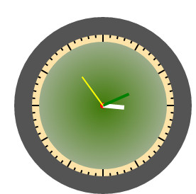
怎么样还不错吧,下面就来告诉大家,如何一步步实现。
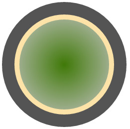
首先我们按照如下组织我们的HTML架构
<div class="outer">
     <div class="middle">
             <div class="inner"></div>
    </div>
</div>
没错.outer就是黑色的圆,.middle就是中间黄色的圆,.inner就是最里面的绿色的圆。然后加入如下css样式。
.outer{
width: 250px;
height: 250px;
background:#545454;
border-radius: 150px;
position: relative;
}

.middle{
width : 200px;
height : 200px;
background : #FDE3A8;
border-radius : 50%;

margin : auto;
position : absolute;
top: 0;
left: 0;
right: 0;
bottom: 0;
}

.inner{
width: 180px;height: 180px;border-radius: 100px;
background: radial-gradient(circle,#407908, #C3C3C3);
position: absolute;
margin: auto;
top: 0;
left: 0;
right: 0;
bottom: 0;
}
此时就会看到下图 ,上面红色代码是使元素绝对垂直水平居中的一种方式。
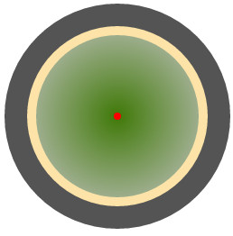
样子轮廓已经出来了,然后我们在中间添加一个小红点,作为指针的旋转中心
<div class="outer">
    <div class="middle">
        <div class="inner">
            <div class="center"></div>
        </div>
    </div>
</div>
添加css代码
.center {
width : 8px;
height : 8px;
background : red;
position : absolute;
margin: auto;
top: 0;
left: 0;
right: 0;
bottom: 0;
border-radius : 50%;
}
效果图
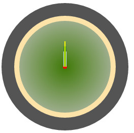
接着我们就要添加时分秒针了,就是要将时分秒针的一端固定在,我刚刚加的那个红点上。
在.center的div里面加入如下HTML代码:
<div class="hour hand"></div>
<div class="min hand"></div>
<div class="second hand"></div>
css代码:
.hour{
width : 6px;
height : 30px;
background : #fff;
}

.min {
width : 4px;
height : 40px;
background : green;
}


.second {
width : 2px;
height : 50px;
background : yellow;
}

.hand{
position : absolute;
margin: 0 auto;
bottom: 50%;
left: 0;
right: 0;
transform-origin : bottom center;
}
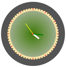
现在就变成下面的样子了:
ok,接下来最重要的就是,刻度盘了,首先我们在<div class="second hand"></div>下面加入一个ul
<ul id="deg"></ul>
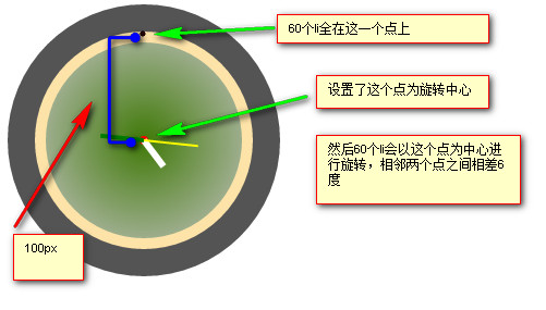
然后通过js代码,循环60次,创建60个li元素,这60个li元素就是,刻度
for (var i = 60; i > 0; i--) {
    var degLi=document.createElement("li");
    degLi.style.transform="rotate("+6*i+"deg)";//每个li相应的进行旋转,每个li之间相差6度,6*60刚好就是360度
    idDom("deg").appendChild(degLi);//然后将这60个li加入ul内。
}
然后给这些li元素加入基本样式
#deg li{
width : 2px;
height : 4px;
background : #000;
position : absolute;
top : -100px;
left: 3px;
transform-origin : center 100px;//尤为重要的一句,设置旋转中心
}
见图解,大家下来可以自行动手实践。
然后加入下面css代码,使刻度更为真实
#deg li:nth-child(5n +1){
height : 7px;
background : red;
}
好了样子已经完全出来了,下面只需要加入js代码使指针正确的运动起来就OK了;
function runtime(){
    var date=new Date();
    var secs=date.getSeconds();
    var minus=date.getMinutes();
    //换成12小时制,并加上小时的小数部分
    var hours=date.getHours()-12+minus/60;
    classDomList("hour")[0].style.transform="rotate("+30*hours+"deg)"
    classDomList("min")[0].style.transform="rotate("+6*minus+"deg)"
    classDomList("second")[0].style.transform="rotate("+6*secs+"deg)"
}

function classDomList(className){
    return  domItems=document.getElementsByClassName(className);
}

setInterval(function(){
    runtime();
},1000)

function idDom(id){
    return document.getElementById(id);
}
OK,大功告成。
完整代码:
ul,li{list-style: none;margin: 0}
        .outer{
            width: 250px;
            height: 250px;
            background:#545454;
            border-radius: 150px;
            position: relative;
        }

        .middle{
            width : 200px;
            height : 200px;
            background : #FDE3A8;
            margin : auto;
            border-radius : 50%;
            position : absolute;
            top: 0;
            left: 0;
            right: 0;
            bottom: 0;
        }

        .inner{
            width: 180px;height: 180px;border-radius: 100px;
                background: radial-gradient(circle,#407908, #C3C3C3);
                position: absolute;
                margin: auto;
                top: 0;
                left: 0;
                right: 0;
                bottom: 0;
        }            .center {
                width : 8px;
                height : 8px;
                background : red;
                position : absolute;
                margin: auto;
                top: 0;
                left: 0;
                right: 0;
                bottom: 0;
                border-radius : 50%;
            }

            .hour{
                width : 6px;
                height : 30px;
                background : #fff;

            }

            .min {
            width : 4px;
            height : 40px;
            background : green;

            }
            .second {
            width : 2px;
            height : 50px;
            background : yellow;

            }

            .hand{
            position : absolute;
            margin: 0 auto;
            bottom: 50%;
            left: 0;
            right: 0;
            transform-origin : bottom center;
            }

            #deg li{
            width : 2px;
            height : 4px;
            background : #000;
            position : absolute;
            top : -96px;
            left: 3px;
            transform-origin : center 100px;
            }

            #deg li:nth-child(5n +1){
            height : 7px;
            background : red;
            }
  <div class="outer">
        <div class="middle">
            <div class="inner">
                <div class="center">
                    <div class="hour hand"></div>
                    <div class="min hand"></div>
                    <div class="second hand"></div>

                    <ul id="deg"></ul>
                </div>
            </div>
        </div>
    </div>
     for (var i = 60; i > 0; i--) {
            var degLi=document.createElement("li");

            degLi.style.transform="rotate("+6*i+"deg)";

            idDom("deg").appendChild(degLi);
        }

        function runtime(){
            var date=new Date();
            var secs=date.getSeconds();
            var minus=date.getMinutes();
            //换成12小时制,并加上小时的小数部分
            var hours=date.getHours()-12+minus/60;
            classDomList("hour")[0].style.transform="rotate("+30*hours+"deg)"
            classDomList("min")[0].style.transform="rotate("+6*minus+"deg)"
            classDomList("second")[0].style.transform="rotate("+6*secs+"deg)"
        }

        function classDomList(className){
            return  domItems=document.getElementsByClassName(className);

        }

        setInterval(function(){
            runtime();
        },1000)

        function idDom(id){
            return document.getElementById(id);
        }
DJL箫氏,就读于一个三流学校,酷爱前端,欢迎大家关注我的公众号:hbutblgzs,充满了惊喜!